How To Make A Website Mobile Friendly
150 likes | 179 Vues
The digital world of business has become a harsh place to reach the top of the food chain. Even harder is the challenge to remain on the top once you reach it.<br><br>However, one of the best solutions to this challenge is to adapt to the needs of your target audience. When in doubt, always accommodate the needs of your potential customers.<br><br>And when you take into consideration that more than 80 percent of online users have mobile devices and that more than half of traffic online comes from those mobile users, you get a clear image of how vital it is to make a website mobile friendly.

How To Make A Website Mobile Friendly
E N D
Presentation Transcript
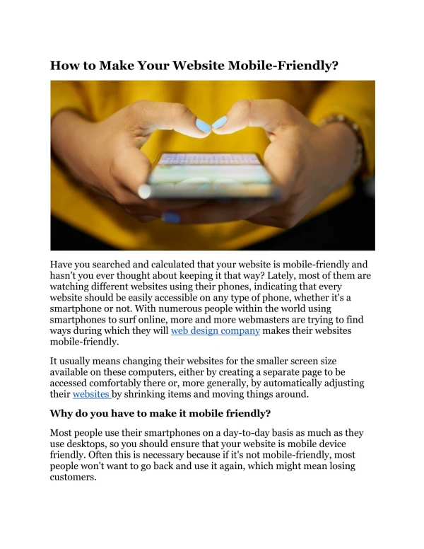
How To Make A Website Mobile Friendly?
Introduction The digital world of business has become a harsh place to reach the top of the food chain. Even harder is the challenge to remain on the top once you reach it. However, one of the best solutions to this challenge is to adapt to the needs of your target audience. When in doubt, always accommodate the needs of your potential customers. And when you take into consideration that more than 80 percent of online users have mobile devices and that more than half of traffic online comes from those mobile users, you get a clear image of how vital it is to make a website mobile friendly. Technology moon
Not having mobile friendly website leads to: ● ● ● Devaluation of your entire website Loss of potential clients and revenue Failure to attract a vast amount of online traffic your way
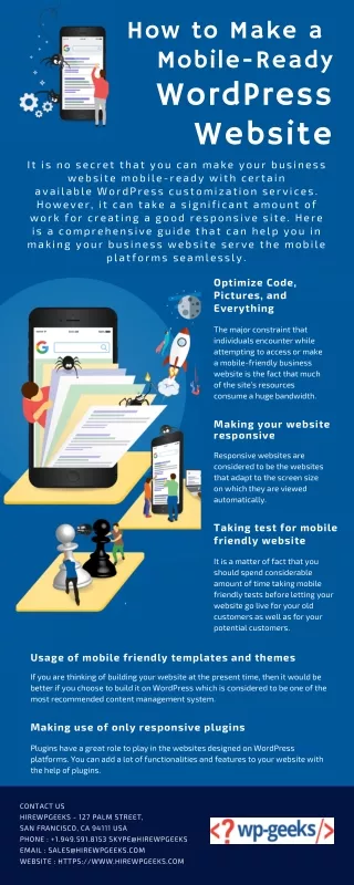
Ten steps to make your website mobile friendly: #1: Start by making your website responsive: 1. Search engine providers such as Google note this as their prefered format for mobile website The point is to make sure that all users (no matter the device) get identical information from your website. The amount of skill and time it takes to create a responsive website is high, so make sure to either hire or consult a professional developer. Another option here is to search for a website builder that has mobile friendly templates incorporated in its offer. Note that this is the very first step you need to take to make your website mobile friendly. 2. 3.
#2 Enable people to easily find the information they search for: When browsing the web using mobile phones, most people tend to be in a hurry. Whether they are commuting, looking to pass the time while waiting in line or in search for specific information, they need answers and they need them as quickly as possible. And it is important for your website to be able to provide them with those answers with a few simple clicks.
#3 Avoid using flash Several years ago, Flash fell out of favor in the eyes of search engine algorithms. Not only can it significantly slow down website speed, but there are devices where it fails to perform altogether. Another crucial fact to consider here is that neither Android or iOS devices support Flash.
#4 Incorporate a viewport meta tag This is the simplest way to check just how your website will look on mobile phones and other devices. If the page in question opens up as the same width on the screen of your phone as it does on your desktop, then something is not right. What the viewport meta tag does is communicate to browsers to fit the width of your page to the scree of the device in question.
#5 Make sure to turn off auto correct option for forms one of the better ways to help users save time and energy (especially mobile phone users) is turning off the autocorrect form. A simple modification on your end, but one that means a lot to the overall user experience of for your website. Rather than having people struggle with their phone trying to push autosuggestion on to them, they will be able to type in the information as they see fit. As a result, people are less likely to give up on filling out the form, or making any mistakes while doing so. To make this modification
#6 Adjust the size of buttons to mobile devices Small buttons are frustrating and nobody likes having to deal with them. Having a mouse is all nice and great, but what happens when you don’t have one nearby? So, rather than annoying your mobile device users endlessly, why not take this potential problem out of the equation completely. Start by testing all the buttons that you have on your website for mobile phone users. And take the time to test any new buttons that you add on your inner pages.
#7 Use larger text fonts: Reading on smaller screens is difficult enough for most people, but having to do so with a tiny font is close to impossible. When it comes to the choice of fonts, it’s best to stick to standards fonts. Introducing any special or unique fonts can only slow down page loading speed and draw attention from the message you wish to convey.
#8 Compress CSS and your images You always want to keep your focus on the loading speed of your website. And this is particularly important when it comes to mobile phone users, where patience is in high demands and short supply. The best way to ensure the optimal speed for the mobile version of your website is to compress anything that normally takes up a lot of space.
#9 Make switching to desktop versions easy to do: One of the ways to answer the needs of customers is to offer them as much flexibility as possible. So, giving mobile phone users the option to switch to the desktop version of your website is always a good step to take. Certain users have different preferences and this one of them. You want your visitors to be able to interact with your website in a way that makes the most sense for them.
#10 Testing is must when aim is to make website mobile friendly Testing the mobile version of your website is not a choice – it is a necessity. This is a vital part of the conversion process – one that you need to do regularly. So, make sure to take the time out of your day every now and then to go through your website functionality by using your mobile phone.
Conclusion: Ever since the introduction of smartphones and Internet access from mobile devices, we started an avalanche. And this avalanche has been growing for the last decade, each year bigger and bigger. Ultimately, 2016 brought us to a point where mobile internet usage surpassed that of desktop usage. And as a direct result, website owners began adapting to the newly found needs of potential clients. All you need to do is take the time to hire an in-house or 3rd party web development team and convert your current website into one that is mobile responsive and friendly. Simple as it might sound, this conversion is a process and once you would be wise to plan out. It’s always best to take the slower, detailed approach than rushing things unnecessarily.