Download
1 / 18
180 likes | 204 Vues
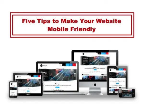
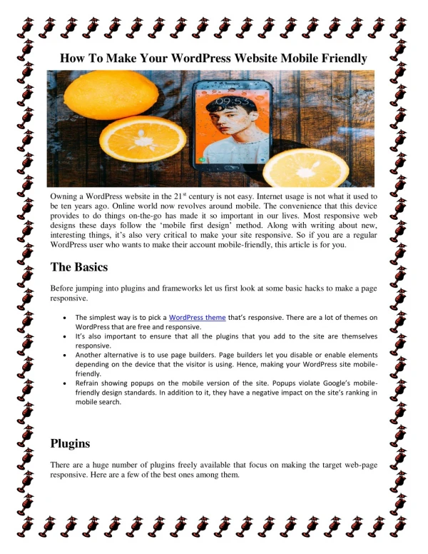
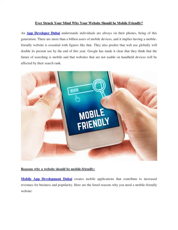
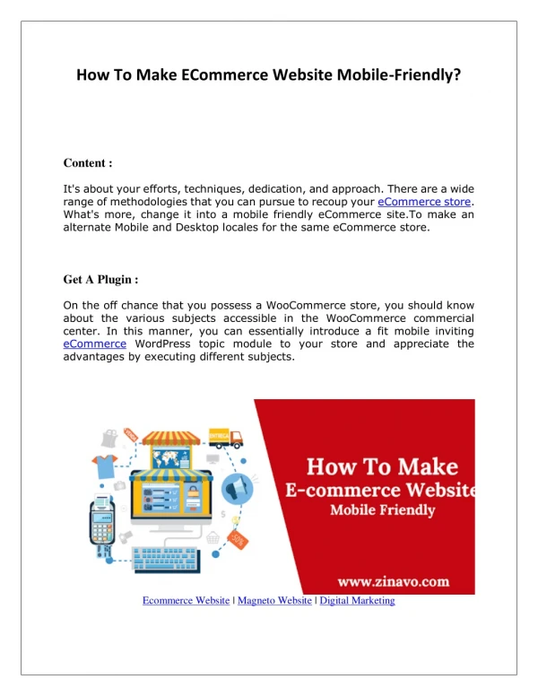
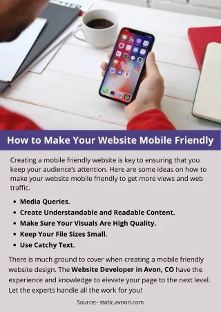
Google now ranks websites on how mobile friendly they are. A mobile-friendly website is one which optimises its display for devices such as smartphones and tablets.

E N D
10 Ways To Make Your Website Mobile Friendly1. Set Form Input Attributes • If your website uses input fields to ask for the user’s name or address, then turn off autocorrect and turn on auto capitalize. • What's your name:<input type=text size=20 autocorrect=off autocapitalize=words> • What's your email: <input type=email size=20>
2. Set a Mobile Friendly Preferred Width • Load your website in a desktop browser and resize the window to the narrowest width, while keeping your website still readable. This is your minimum viewing size. Now, get the size of that window and set it as your website’s preferred viewport width by adding this meta tag to your page’s head. • <meta name=viewport content='width=700'> • The next time your website is viewed on a mobile device, it will automatically show your website at this size. so the user doesn’t need to zoom out or zoom in on their first visit.
3. Set Image Widths to 100% • Give your images a maximum width of 100% so that they are automatically resized if they get too big for the mobile device. • img { max-width: 100% }
If your images are set as background images and not asimg tags, simply set the background-size CSS property to contain. This will cause the background image to resize when the screen is too small. • .header { background: url(header.png) 50% no-repeat; background-size: contain }
4. Set Input Widths to 100% • After giving your images a max-width, Perform a similar trick on the input fields. Simply add this to your website’s CSS stylesheet. • input, textarea { max-width:100% }
5. Use Care When Disabling Submit Buttons • Does your website disable form submit buttons after the first click to prevent multiple submissions? If so, don’t do it (unless absolutely necessary)! • Unlike desktop computers, mobile devices experience frequent network disruptions. • If you disable the button, the user cannot click again to re-submit. I’m not only talking about network disruptions due to poor signals or tower switching. If a user receives a phone call while submitting the form, the mobile browser is closed to show the caller screen, and the browser may not be able to recover from that interruption when it re-opens. • If you must disable the submit button, disable it for a few seconds only.
6. Use word-wrap with Long Strings • Sometimes it is necessary to display long strings, such as reference codes, bank account numbers, or even URLs. If your website is too narrow to display the whole number on a mobile device, it may extend off the edge of the screen.
To remedy this, simply wrap any long strings with a word-wrap style. • Now the text will break to the next line when it reaches the edge, allowing the user to see the whole text without needing to scroll around. • Your passcode is: <span style='word-wrap:break-word'>435143a1b5fc8bb70a3aa9b10f6673a8</span>
7. Use Extra Spaces Cautiously • Displaying blank spaces in between the five letter groups, simply wrap the five letter groups in an element with some padding in between. • <style> .split m { padding: 0em 0.5em } </style> • Your passcode is: <span class='split'><m>43514</m><m>3a1b5</m><m>fc8bb</m></span>
8. Take Advantage of Media Queries • When all else fails, you don’t want to have to adjust your website and make things smaller so that they look better on a mobile device, only to have them look too small on your desktop computer. That’s where media queries come in. • You can create custom style rules that only come into effect when viewed on a mobile device (or viewed in a small browser window) and not come into effect on your desktop browser. Simple add targeted styles inside a media query, as shown below.
<style> /* regular css */ .tabs { padding: 10px 2em } @media screen and (max-width: 500px) { /* applies only if the screen is narrower than 500px */ .tabs { padding: 3px 1em } } </style>
9. Avoid fixed Positioning • Website has a fixed header or sidebar with CSS position property set to fixed, Be aware that when a user zooms in website, Header will also zoom in and potentially obscure the whole screen. • Easiest solution is to disable the fixed position when website is viewed on a mobile device. You can do this with the media query method from the previous tip.
<style> /* regular css */ #header { position: fixed } @media screen and (max-width: 500px) { /* applies only if the screen is narrower than 500px */ #header { position: static } } </style>
10. Use Standard Fonts • Using custom fonts gives your website a professionally designed look. • If you are using the Google Font Loader to load your fonts, you can choose to display the text in a default font first, and then re-render the page in the new font when the font has downloaded.
<script src='//ajax.googleapis.com/ajax/libs/webfont/1.4.7/webfont.js'></script> <script> WebFont.load({ google: { families: ['Open Sans'] } }); </script> <style type='text/css'> .header { font-family: Arial } .wf-opensans-n4-active .header { font-family: 'Open Sans' } </style> • Notice the .wf-opensans-n4-active class selector that is dynamically added to the website by the Font Loader after the font has finished loading.