Download

1 / 9
90 likes | 117 Vues
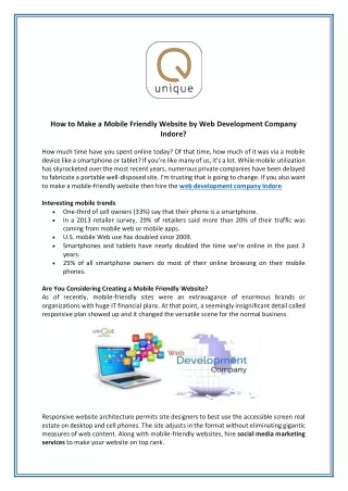
The digital world of business has become a harsh place to reach the top of the food chain. Even harder is the challenge to remain on the top once you reach it. <br> <br>when you take into consideration that more than 80 percent of online users have mobile devices and that more than half of traffic online comes from those mobile users, you get a clear image of how vital it is to make a website mobile friendly.

E N D
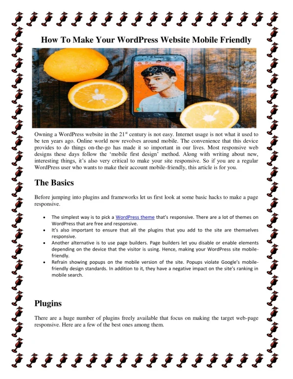
Topic on - How To Make A Website Mobile Friendly
Introduction The digital world of business has become a harsh place to reach the top of the food chain. Even harder is the challenge to remain on the top once you reach it. when you take into consideration that more than 80 percent of online users have mobile devices and that more than half of traffic online comes from those mobile users, you get a clear image of how vital it is to make a website mobile friendly.
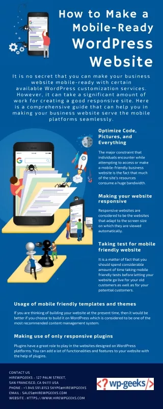
Steps of Website Mobile Friendly 1. Start by making your website responsive Search engine providers such as Google note this as their preferred format for mobile websites. The point is to make sure that all users (no matter the device) get identical information from your website. 2. Enable people to easily find the information they search for Whether they are commuting, looking to pass the time while waiting in line or in search for specific information, they need answers and they need them as quickly as possible.
3. Avoid using Flash Several years ago, Flash fell out of favor in the eyes of search engine algorithms. Not only can it significantly slow down website speed, but there are devices where it fails to perform altogether. Another crucial fact to consider here is that neither Android or iOS devices support Flash. 4. Incorporate a viewport meta tag This is the simplest way to check just how your website will look on mobile phones and other devices. If the page in question opens up as the same width on the screen of your phone as it does on your desktop, then something is not right.
5. Make sure to turn off the autocorrect option for forms. Forms are tricky for all users. And you have marketers still struggling with the best way to design the forms on websites for users to fill out. A simple modification on your end, but one that means a lot to the overall user experience of for your website. 6. Adjust the size of the buttons to mobile devices. Small buttons can be frustrating and nobody likes having to deal with them. Having a mouse is all nice and great, but what happens when you don’t have one nearby
7. Use larger font sizes. Reading on smaller screens is difficult enough for most people, but having to do so with a tiny font is close to impossible. So, why not make things easier for everyone and use a font size of at least 14px on webpages. 8. Compress CSS and your images. You always want to keep your focus on the loading speed of your website. The best way to ensure the optimal speed for the mobile version of your website is to compress anything that normally takes up a lot of space.
9. Make switching to desktop version easy to do. One of the ways to answer the needs of customers is to offer them as much flexibility as possible. So, giving mobile phone users the option to switch to the desktop version of your website is always a good step to take. 10. Testing is a must when the aim is to make a website mobile friendly. Testing the mobile version of your website is not a choice – it is a necessity. This is a vital part of the conversion process – one that you need to do regularly. You can also employ your staff to do the same – it never hurts to have a fresh set of eyes.
Conclusion Having a mobile-friendly website will enable you to tap into a whole new market of users. By providing a simple to use and easy to navigate interface, you are making your website mobile friendly and boosting the traffic to your Website. Regards :- Technology Moon