Download
1 / 4
40 likes | 62 Vues
Executive Summary This How-To Guide has been designed to provide practical advice to help you learn about the importance of building a mobile friendly website to make your website & company more accessible to customers & prospects. Read this brief 2-page guide to learn: The Importance of a Mobile Friendly Website The Key Characteristics of a Mobile Friendly Website Mobile Friendly Website Benefits Action Plan for Buidling a Mobile Friendly Website Take our Mobile Marketing Readiness Assessment to Assess Your Prepardedness Read this report to understand what mobile marketing is and how it can benefit your website and business model. Use our Mobile Marketing Readiness Assessment, our Mobile Marketing Planning Checklist, and our Mobile Marketing Competitive Tracking Tool to help you begin building your mobile friendly website and implementing a mobile marketing initiative. Demand Metric's How-To Guides are designed to provide practical, on-the-job training and education and provide context for using our premium tools & templates. If there is a topic that you would like to see covered, please contact us at info@demandmetric.com (link sends e-mail) to make a content request.

E N D
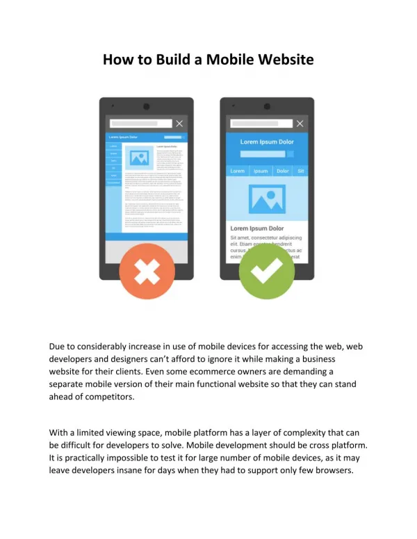
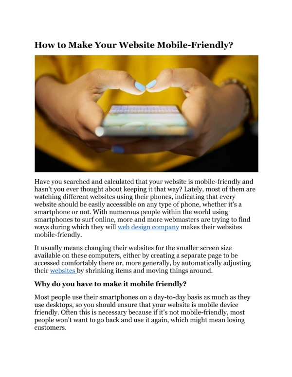
Building a Mobile Friendly Website Executive Summary A mobile friendly website will make your business more accessible to customers and prospects. This guide will outline why you need a mobile friendly website and how to implement one for your business. Read this brief 5-page guide and follow the action plan to get started. Why is this Important? Mobile friendly websites, also known as responsive websites, represent a new movement in web design and refers to the ease in which a user is able to access a website using a portable device such as a smart phone or tablet. Examples of optimization for portable devices include designs that are developed to ensure minimal scrolling, quick to load graphics, and clear navigation. The idea is simple: Mobile friendly designs ensure that your company’s website can be viewed as easily as possible whether a customer is accessing the site via a laptop, tablet, or smart phone. According to a recent Google survey, 72% of mobile users said web accessibility on a mobile phone was important to them. However, only 26% of small businesses currently have a mobile friendly website. As more people turn to portable devices in their daily lives, the importance of hosting a website that can be accessed on one of these devices increases dramatically. What is a Mobile Friendly Website? Mobile friendly websites refer to the ease in which a user is able to access a website using a portable device such as a smartphone or tablet. These optimized sites use a minimalist design in order to guide the customer to the appropriate information without distracting them with features that may not be optimal for a smaller screen, and that can eat up data and slow performance. © 2013 Demand Metric Research Corporation. All Rights Reserved.
An example of how a website may be viewed on various Internet devices: In today’s market, 24/7 internet accessibility is more important than ever before, and this access regularly occurs through mobile devices. Potential customers researching your business may not give you a second chance if their first impression of your mobile site does not meet expectations. In fact, 46% of consumers surveyed in a recent Gomez survey suggested that they would be unlikely to return to a mobile site if it did not work properly during their last visit. Your business only has a few seconds to grab the attention of a prospect, and if it is loading slowly because of large graphics, too many tables, and/or videos that will not play, it is likely a prospect will move on. Mobile Friendly Website Benefits Expanded access to customers for your business - When your company creates a mobile friendly website, it can reach more people than ever before because there are users who prefer to access the Internet from mobile devices. Increased brand recognition and customer appreciation - More than just increasing your customer base and profit margin, you also increase the appreciation consumers have for your business. © 2013 Demand Metric Research Corporation. All Rights Reserved
Matching customer expectations - In todays’ market, consumers expect results, and they expect them fast. This is why you are not only potentially losing new customers by not having a mobile website, but you are also risking losing current customers who are unable to access your web content on the go. Being accessible to your customers should be your #1 priority as a business. Action Plan Now that you understand what a mobile friendly website is and why it is important to your business, follow these simple steps below to get started in creating a new and mobile friendly website for your business. We also recommend you take our Mobile Marketing Readiness Assessment to assess your preparedness for a mobile marketing initiative. 1. Display the most important information at the top. The main page of your mobile site should include your business name, contact information, address, and a description of your business. Remove “Contact Us” buttons that bring visitors to other page or to an information request form. 2. Remove any Flash-based videos. Many mobile devices do not support Flash, and because of this, you should remove Flash from your mobile website and your main desktop website. Flash videos require large amounts of bandwidth and eat into your customers’ data plans when accessed from mobile devices. Your customers will not want to visit your website on their mobile phones if they know it is going to cost them money. Flash videos, because of their large file size, slow the downloading process which can potentially discourage your customers from using your site. 3. Make information easy to read on a small screen. No person enjoys squinting at a desktop or mobile device to read smaller text. Remove any small fonts or fancy lettering and replace these with bold, clear, and large fonts that are easy to read. 4. Remove excess information. Information about contests, extra videos, and staff biographies can be kept for desktop websites. The purpose of your mobile site is to provide the basic information that your customers will be looking for. This information should be made quick and easy to reach. © 2013 Demand Metric Research Corporation. All Rights Reserved
5. Include mobile friendly buttons. Provide customers with a “click to call” button so they do not have to copy down your company’s telephone number and can call directly from your website. Include links to social media profiles on your mobile site so that customers can easily navigate from your business page to your social media pages with the click of a button. Include an option to view the non-mobile site. Sometimes your customers are just browsing and have the time to spend navigating your site. Make sure you provide them with the ability to view everything your full desktop page has to offer if they so desire. 6. Limit the use of tables and scrolling. Remove extra tables to eliminate unnecessary scrolling. Remember to keep things simple. 7. Increase your speed. Limit the use of media on your mobile friendly site. Large files containing pictures and videos will slow the loading time for visitors. Make sure your loading time is down to 5 seconds or less. Anything more than that and you risk losing customers. Now that you have an understanding of mobile friendly website, we recommend you review our Mobile Marketing Planning Checklistto ensure you have the right people, processes, and technology to implement a solid mobile marketing program. If you are interested in monitoring your competitor’s mobile marketing initiatives, use our Mobile Marketing Competitive Tracking Tool to keep track of how your competitors are using mobile in their marketing initiatives. Remember that the reason for creating a mobile friendly website is to ensure that your customers and prospects are able to access your company’s information quickly and easily while on the go. It is important that your mobile friendly website is clear and concise, while maintaining the branding that your business has worked so hard to achieve recognition for. Bottom Line An efficient mobile website makes your business more accessible to customers and prospects. If you do not have a mobile friendly website, you risk not acquiring new customers and even losing the ones you already have. As more people continue to turn to portable devices such as tablets and smartphones, the demand for mobile friendly websites will continue to increase. Make sure your business is at the forefront of this mobile trend by ensuring your company’s website offers a clear and concise mobile friendly site. © 2013 Demand Metric Research Corporation. All Rights Reserved