Download
1 / 6
60 likes | 85 Vues
Optimizing a website for mobile devices can positively impact your siteu2019s UX. Follow these 10 smart tips to optimize your site for a smartphone! https://medium.com/@rajuc/how-to-optimize-a-website-for-mobile-devices-a-detailed-guide-c43c2e63e9d0

E N D
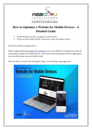
How to Optimize a Website for Mobile Devices - A Detailed Guide “Mobile-friendly sites show up higher in search results.” “If your site isn’t mobile-friendly, visitors are 5 times more likely to leave.” We don’t say these, Google says so! With Google prioritizing mobile-first indexing, you cannot afford to overlook the matter of optimizing a website for mobile devices. And it need not be daunting. With the right guide, you can easily make your site mobile-ready. Not sure where to start? We will explore today. Give the blog a thorough read.
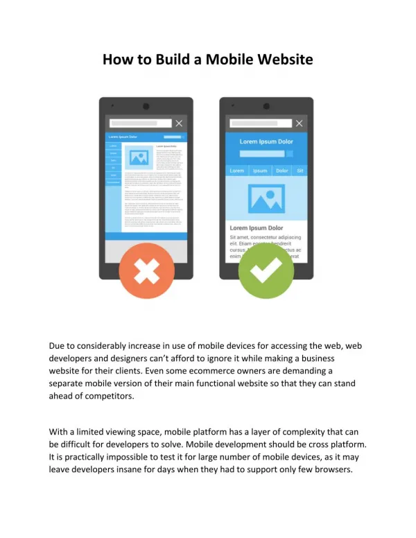
A Quick Guide to Optimize a Website for Mobile Devices 1.Check Your Site’s Mobile-Friendliness using Google’s Mobile-Friendly Test Tool Before proceeding to optimize your website, make a smart move to check your site’s mobile friendliness. It will help you to identify specific areas of your site where you need to work on. You can manually check the site’s performance by accessing it with different devices. Pay attention to the looks and feels of using the site by opening it on a smartphone and tablet. It will give you an insight into the loading time, the responsiveness of the site design on a small screen, whether the content is easily readable, etc. The next step is to dig a little deeper and use a testing tool. Google has a dedicated Mobile Friendly Test tool that allows you to check your site’s mobile-friendliness absolutely for free. Enter your URL and select Run Test. If your website is mobile-friendly, a message will pop up to indicate that. You can also find a screenshot of how your site appears on a smartphone. If your website is not mobile-friendly, the test result will show the issues you need to fix. Some of the issues can be “clickable elements too close together”, “viewport not set”, “text too small to read”, “page loading issues”. Once you get the insights, go on to fix the elements. 2.Select a Reliable Web Host Choosing the right web host for your site is one of the most significant decisions to make. If you pick a host that doesn’t offer adequate resources or speed, you cannot stop your site from performing poorly no matter how much efforts you put. Your web host determines how well the site will perform. Choose a plan that ensures a consistently high performance along with minimal downtime. This will guarantee that the web traffic can readily access your website without any loading issues. You can go with a VPS hosting plan. It is affordable and also offers brilliant performance at all times. For an enterprise-scale website or a high traffic-driven site, you can opt for a managed dedicated server. Here, you can use a server that’s specifically dedicated to your site. This enables you to customize the server as per your requirement. You can also expect increased speed and security - two of the key elements for a mobile-friendly site. 3.Pick a Responsive Theme Whether you are developing a new site or revamping an old one, make sure to use a responsive theme. If you have a WordPress-based website, you can easily execute this.
Setting up a theme on WordPress is simple - head to WordPress dashboard > click on “themes” under the section “appearance” > search with the term “responsive” > then click on “install themes”. Once you hit search with the term “responsive”, WordPress will bring up all the responsive themes available in the WP database. And don’t worry about the options. You can get over hundreds of responsive themes to pick from. Install one according to your website subject and you are good to go. Website development company professionals recommend double checking the step. After installing the theme, open your site on different devices to check if it looks good on cross devices. 4.Use Media Queries Media queries play a crucial role in optimizing a website for mobile devices. Here’s a quick question - have you noticed that some web pages get resized and reshaped while loading on a smartphone? Some sections get thinner or wider and some elements (such as sidebars or navigation bars) move to different places. These pages actually use media queries to make the site fully responsive. While using media queries, you can specify the maximum and minimum width. For instance, if you put the max width 1020px, all the CSS code inside the media query will adjust to the width. The code put inside is given priority over other codes for a specific element. You can also adjust the font size in the paragraph tags. Now, when do you need to use a media query? Open your website on a smartphone. If you find that some parts of the page are not readable, it’s time to create a media query. Change the specifications to make the content elements smaller or larger to make the content mobile-friendly. Also, you can apply different media queries to a page. So make sure that each of the elements has a specific maximum and minimum width to get the optimum display. 5.Optimize Your Site’s Loading Speed Website speed is a significant concern in a mobile-first digital realm. Make sure to keep your site’s loading time to a minimum level. The first step is to know your site’s performance. We have already discussed it in the first pointer. Google’s Mobile Speed Test tool will provide you with a deep insight into the site loading speed. The tool will scan your site and inform how
quickly it loads on a mobile device. It will also outline how your site is performing in comparison to the competitors in your industry. Here are a few key steps to optimize your site’s loading speed on mobile devices: Optimize the images - We prefer to use the word “optimize” instead of “compress”. Compression may affect the quality of the images. When you optimize the image, you compress the size without affecting the graphic pixels. Minify the codes - Optimize the site’s JavaScript, CSS, and HTML to make the site load more efficiently without lagging. Implement browser caching - Enable the site to cache the users’ browser data so that they need not load the entire page every time. The essential elements will be automatically loaded even in a poor network zone. 6.Enable AMP AMP or Accelerated Mobile Page is defined by Neil Patel in the following terms: “Accelerated Mobile Pages is an open-source initiative project designed to optimize faster mobile pages”. It involves stripping your content down, removing irrelevant media files or layouts. It highly improves the mobile users’ experience. The AMP plugin renders the mobile pages quickly and efficiently by eliminating irrelevant the HTML code tag manager aspects. This results in fast loading speed which is a crucial issue since a 1-second delay in loading time can lead to a drop by 9.40% in page views and 3.50% in conversion rate (source - embrk.com). 7.Redesign the Site Pop-Ups The professionals of web development services hold distinct views about pop-ups. Some professionals recommend complete elimination of the pop-ups so as not to frustrate the web traffic. However, some experts suggest using pop-ups strategically. Eye-catchy pop-ups can significantly increase conversions or convey crucial information to the users. A full-screen pop-up can lead the users to bounce so you need to optimize the pop- ups for mobile devices. Before starting, take a look at Google’s guideline on pop-ups. Make sure that the pop-ups are non-intrusive and cover only a fraction of the screen. Allow the users to easily dismiss the pop-up if they are not interested. However, pop-ups requiring necessary information such as age verification pop-ups, login box, cookie notices, etc. need not abide by these terms.
8.Include Search Functionality Many of you may think “my website has a menu bar, why do I need to include a search bar”! Well, we will explain why. Your website may have a menu with 20 distinct options. It’s not possible for a user to visit all the pages to find something out. A mobile device further limits the scope due to its small screen size and space to touch the menu options. If the users can search for what they are looking for, they will enjoy greater convenience and comfort. Remember, too many options can confuse the visitors and make them bounce. Search functionality is a must-have for an eCommerce website development. Implementing a search bar simplifies your site navigation and encourages the users to browse your website without breaking a sweat. 9.Keep Forms Short The form is a crucial feature in a website. You must want to know a lot about your visitors to maximize your customized marketing efforts. However, asking for a lot of information will only irritate your visitors. A lengthy form that covers the entire site content will lead the visitors to bounce. Keep the form short and ask for only the essential questions. Remember, many people will browse your site from mobile devices. So, provide adequate space for them to write. Evaluate the form manually to ensure the necessity of each line. If you are asking your users to subscribe to your digital newsletter, you sure don’t need their home address. Forms designed to drive conversions can simply feature the billing and shipping info. Always bear in mind that a long and complicated checkout process will negatively impact your conversions. 10.Display the CTAs Properly CTA is yet another conversion-oriented element on your site. Feature an eye-catchy call-to- action button to ensure an effective mobile web design. Since the website is open in a much smaller screen than a desktop, you shouldn’t overwhelm the users by squeezing too many CTAs on the screen. Arrange the CTAs in the proper distance and enlarge their sizes. These should be larger than the rest of the content size. Don’t experiment too much with the typeface. Keep it regular so as to improve its readability.
Make sure that the CTAs are goal-oriented and easy-to-understand. If you are trying to get the users to download your software, a CTA featuring “Download” is more intuitive. Also, maintain enough white space around the CTA button to enhance visibility. If your users cannot find the CTA button, it will directly impact your conversions! So, stay extra cautious. Conclusion As you can see, optimizing a website for mobile devices involves optimizing each element of the site for a small screen. We hope you have found our tips relevant and useful. Implement these to bring a change in the look and feel of your site! Resource: https://medium.com/@rajuc/how-to-optimize-a-website-for-mobile-devices-a-detailed- guide-c43c2e63e9d0 ……………………………………………………………………………………………………… WebGuru Infosystems Y8, Block-EP, Sector V, Salt Lake Kolkata-700091, India Website: https://www.webguru-india.com/ Email: enquiry@webguru-india.com Phone: +91-8420197208 Follow us on:


