Expert Guidelines to Make Website Mobile Friendly
20 likes | 47 Vues
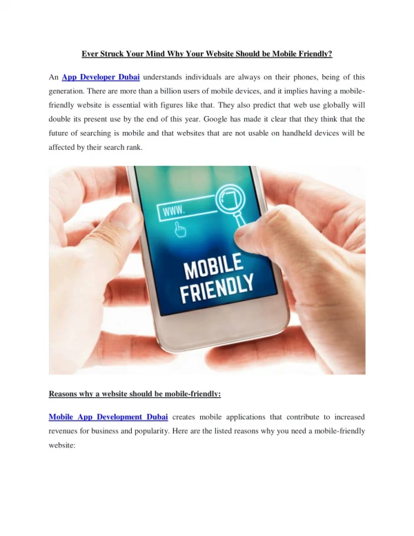
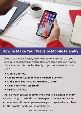
In the fast-growing mobile technology, mobile internet usage has beaten the computer usage. It must not have been wonderful to anyone paying more attention. Mobile device usage has been on the rise since Apple released the first smartphone and mobile devices.

Expert Guidelines to Make Website Mobile Friendly
E N D
Presentation Transcript
Expert Guidelines to Make Website Mobile Friendly In the fast-growing mobile technology, mobile internet usage has beaten the computer usage. It must not have been wonderful to anyone paying more attention. Mobile device usage has been on the rise since Apple released the first Smartphone and mobile devices. It has become an important part of today life. Mobile is an essential need of the hour. For website owners, how folks interact with the web is not surprising, but it increases the perseverance to make your website mobile friendly. If your mobile visitors don’t have a good experience presently, while they are trying to land on your website. To create a website mobile friendly, web design company helps you a lot to design the website in professional ways. Experienced web designers are very experts in creating a responsive and professional website. Create your website responsive- A responsive website involves all the similar content and details on any device. It is the best option for creating your website mobile friendly because you are not regulating the information. Responsive design is extremely better for search engine optimization. Do Not Use Flash- It can slow down the loading time of a page and there are many browsers and devices where it does not work at all. Encompass the Viewport Meta Tag-
The viewport Meta tag is a simple way to control how your site display on the mobile. If your page opens up as the similar width on the small screen of your mobile phone as it does on your desktop. The viewport Meta tag informs browsers to match the width of your website’s page to the display of the device type from which, the visitor is coming from. Everyday Perform Mobile Testing- The important thing you can do it to check your website’s mobile experience is better when one is daily testing our you on your mobile device. You should take out your site on your mobile phone and tablet and spend some more time browsing to see if anything is very hard to see or difficult to do. If you have found any complex questions, you should choose web development services to develop the site in the professional ways. Blog Source: - https://pnjsharptechtips.blogspot.com/2019/01/expert-guidelines-to-make- website.html