Download
1 / 55
570 likes | 1.02k Vues
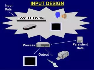
GUI Controls for Input Design. GUI Controls for Input Design. Introduction Most new applications being developed today include a GUI. This approach is influenced by a new trend in programming, called repository-driven programming. GUI Components (or Controls).

E N D
GUI Controls for Input Design • Introduction • Most new applications being developed today include a GUI. • This approach is influenced by a new trend in programming, called repository-driven programming.
GUI Components (or Controls) • Common GUI controls (for both Windows and Web interfaces) • Text boxes • Radio buttons • Check boxes • List boxes • Drop down lists • Combination boxes • Spin boxes • Buttons • Hyperlinks • Advanced controls (mostly for Windows interfaces) • Drop down calendars • Slider edit controls • Masked edit controls • Ellipsis controls • Alternate numerical spinners • Check list boxes • Check tree boxes
GUI Controls • Text Box • Buttons • Radio Button • Check Box • List Box • Combo Box • Drop-Down List • Spin (Spinner) Box
Text Box • A text box consists of a rectangular shaped box that is usually accompanied by a caption. • A text box requires the user to type the data inside the box. • A text box can allow for single or multiple lines of data characters to entered. • When a text box contains multiple lines of data, scrolling features are also normally included.
Text Entry/Read-Only Controls • Text boxes • Editable/read-only (fields vs. labels) • single line/multiple lines • fixed size/resizable • fixed length/variable lengths • visual box/non-visual box • scrollable /non-scrollable • Properties • background/foreground colors • sizes/fonts/styles of text • alignments
Text Box Design • Provide descriptive caption • Consider the cursor movement from one field to another. • Provide large enough boxes for fixed-length data • Select reasonable fonts/sizes/colors • Design highlight to attract attention
Text Box • When to Use Text Boxes For Input: • A text box is most appropriately used in those situations where the input data values are unlimited in scope and the analyst is unable to provide the user with a meaningful list of values from which they can select. • Suggested Guidelines for Using Text Boxes: • A text box should be accompanied by a descriptive caption. • The size of the text box should be large enough for all characters of fixed-length input data to be entered and viewed by the user.
Example text box and label in MS Windows
Example text box labels providing format cues
Buttons • Initiates an action • to activate a command (an alternate to menu choice or command line entry). • to display another window or menu selection • Always visible • provides convenient access to frequently-used commands • standard shapes and screen location for similar commands.
Buttons • Types • Command buttons -- text as labels • Bar buttons (menu buttons) -- graphics and/or text as labels • Radio buttons Next
Example push buttons with text labels, graphic labels, or both
Buttons -- labels • Use standard button labels when available • Provide meaningful action description • Use regular system font • unless for some special purposes • Center the label text • Provide consistency across all screens
Buttons --shape and graphics • Use rectangular shape whatever possible • Maintain consistent button heights and widths • Design graphics/icons that have natural mapping to the actions • Enhanced graphics with text description
Radio Button • A Radio button consists of a small circle and an associated textual description that corresponds to the value choice. • The circle is located to the left of the textual description of the value choice. • Radio buttons normally appear in groups - a radio button per value choice. • When a user selects the appropriate choice from the value set, the circle corresponding to that choice is partially filled to indicated that it has been selected. • When a choice is selected, any default or previously selected choice’s circle is deselected.
Radio Button • When to Use Radio Buttons For Input: • When a user is expected to input data that has a limited predefined set of mutually exclusive values. • Suggested Guidelines for Using Radio Buttons: • Radio buttons should present the alternatives vertically aligned and left-justified to aid the user in browsing.
Radio Button • Suggested Guidelines for Using Radio Buttons: (continued) • The sequencing of the choices should also be given consideration. • It is not recommended that radio button(s) be used to select the value for an input data whose value is simply a Yes/No (or On/off state).
Which one is better? Plan Choice: Limited Basic Superior Premium Plan Choice Plan Choice: Limited Limited Basic Basic Superior Superior Premium Premium
Check Box • A check box also consists of two parts. • A square box followed by a textual description of the input field for which the user is to provide the Yes/No value. • Check boxes provide the user the flexibility of selecting the value via the keyboard or mouse. • An input data field whose value is “Yes” is represented by square that is filled with an “x”. • The absence of an “x” means the input field’s value is “No”. • The user simply toggles the input fields value from one value/state to the other as desired.
Check Box • When to Use Check boxes For Input: • When a user needs to input a data field whose value set consists of a simple “Yes” or “No” value. • Suggested Guidelines for Using Check boxes : • Make sure that the textual description is meaningful to the user. • Arrange the group of check box controls where they are aligned vertically and left-justified. • If necessary, align horizontally and be sure to leave adequate space to visually separate the controls off from one another. • Appropriately sequence the input fields according to their textual description.
List Box • A list box is a control that requires the user select a data item’s value from a list of possible choices. • The list box is rectangular shaped and contains one or more rows of possible data values. • The values may appear as either a textual description or graphical representation. • List boxes having a large number of possible values may consist of scroll bars to navigate through the row of choices. • A list box’s row may contain more than one column.
List Box • When to Use List Boxes For Input: • A list box’s scrolling capabilities make it appropriate for use in those cases where there is limited screen space available and the input data item has a large number of predefined, mutually exclusive set of values from which to choose. • Suggested Guidelines for Using List Boxes: • A list box should be accompanied by a descriptive caption.
List Box • Suggested Guidelines for Using List Boxes: (continued) • It is recommended that a list box contain a highlighted default value. • The width of the list box should be large enough for most characters of fixed-length input data to be entered and viewed by the user. • The length of the box should allow for at least 3 choices and be limited in size to containing roughly 7 choices. • Scrolling features should be used to suggest additional choices are available to the user.
List Box • Suggested Guidelines for Using List Boxes: (continued) • If graphical representations are used for value choices, make sure they are meaningful and truly representative of the choice. • If textual descriptions are used, use mixed-case letters and ensure that the descriptions are meaningful. • The list of choices should be left-justified to aid in browsing.
Example list and text box used in an incremental search in Motif
Drop-Down List • A drop-down list is another control that requires the user to select a data item’s value from a list of possible choices. • A drop-down list control consists of a rectangular shaped selection field with a small button connected to its side. • The small button contains the image of a downward pointing arrow and bar. • When the user selects a value from the list of choices, the selected value is displayed in the selection field and the list of choices once again becomes hidden from the user.
Drop-Down List • When to Use Drop-Down Lists For Input: • A drop-down list should be used in those cases where the data item has a large number of predefined values and screen space availability prohibits the use of a list box to provide the user with a list box. • Once disadvantage of a drop-down list is that it requires extra steps by the user, in comparison to the previously mentioned controls. • Suggested Guidelines for Drop-Down Lists: • The caption for a drop-down list is generally either left-aligned immediately above of the selection field portion of the control or located to the left of the control.
Example drop-down list box in Motif
Combination (Combo) Box • A “combo box” combines the capabilities of a text box and list box. • A combo box allows the entering of a data item’s value (as with a text box) or by selecting its value from list (as with a list box). • The associated small button is not directly connected to the rectangular entry field. • Once the small button is selected, a hidden list is revealed. • The revealed list appears slightly indented beneath the rectangular entry field. • When the user selects a value from the list of choices, the selected value is displayed in the entry field and the list of choices once again becomes hidden from the user.
Combination (Combo) Box • When to Use Combo Boxes For Input: • A combo box is most appropriately used in those cases where limited screen space is available and it is desirable to provide the user with the option of selecting a value from a list or typing a value that may or may not appear as an option in the list. • Suggested Guidelines for Combo Boxes: • The same guidelines for using drop-down lists directly apply to combo boxes.
Example drop-down combo box in MS Windows
List Box or Combo Box? • Combo box • unlimited number of choices • highlight the selection • conserves screen space • Extra step to display all the choices • List box • unlimited number of choices • possible multiple choices • consumes screen space • can be set to different size • easy to see the choices