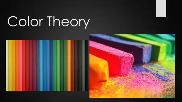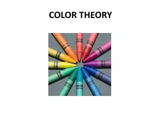
Color Theory
Color Theory . Digital Media. a property of light a property of objects Happens in the observer. Light | Physics Object | Chemistry Observer | Biology. What is Color?. Photons and Waves .

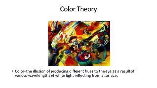
Color Theory
E N D
Presentation Transcript
Color Theory Digital Media
a property of light • a property of objects • Happens in the observer • Light | Physics • Object | Chemistry • Observer | Biology What is Color?
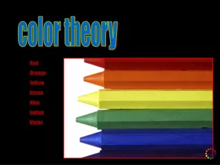
Photons and Waves • Isaac Newton discovered in 1672 that light could be split into many colors by a prism, and used this experimental concept to analyze light. The colors produced by light passing through a prism are arranged in a precise array or spectrum from red through orange, yellow, green, blue,and into indigo (violet).
Prism • The colors we see are light waves absorbed or reflected by everything around us. Rainbows arewhite lightbroken apart bymoisture in the air. • The colors of the visible light spectrum are red, orange, yellow, green, blue, and violet.
Electromagnetic Spectrum Visible Light
Waves of light • The order of colors is constant, and each color has a unique signature identifying its location in the spectrum. The signature of color is the wavelength of light.
The Eye: How it all works. • This is your eye. It's a ball with a hole in front. The hole is called your pupil. Light comes through the pupil and splashes inside your eye on the retina. Optic nerves carry information about the light to your brain.
Seeing Color and Black and White • Your retina is filled with two kinds of special cells, rods and cones. Rods let you see black and white only. Cones let you see color.
Rods and Cones • This is a sketch of a retina. See the big dots? Those are cones. The cones are dense at the center of your retina but not at the edges. Cones work best when there's lots of light, like during the day. • This is another sketch of a retina. See the little dots? Those are the rods. Rods are dense at the edge but there aren't many of them in the center. Rods work best when light is dim, like in the late evening. Then you don't see much color.
How Do Animals See Color? • Some animals see differently than we do. Some animals, like bees, have cones for colors we can't see. Other animals may be missing cones for colors we can see. For example, look at how the monkey and the owl see colors.
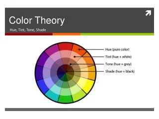
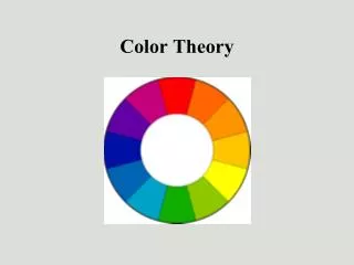
Hue is the basic name of a color or the pure form of color – there are six basic hues: red, orange,yellow, green, blue, and violet. • Saturation refers to the relative brightness or dullness of the color – a color is at full intensity only when pure and unmixed. • Value is the lightness or darkness of a hue. Three Properties of Color
Primary Colors • Red, yellow, and blue • In traditional color theory, these are the three pigment colors that can not be mixed or formed by any combination of other colors • All other colors are derived from these three hues
Secondary Colors • These are the three colors formed by mixing two primary colors together - green, orange, and violet • Blue + yellow = green • Red + yellow = orange • Red + blue = violet
Tertiary Colors • These are the six colors formed by mixing a primary color with a secondary color - yellow-orange, red-orange, red-violet, blue-violet, blue-green, and yellow-green
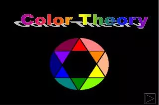
Color schemes are ways to use groups of colors together so a desired affect is achieved by an artist Basic Color Schemes
This uses a single pure hue with a number of tints and shades to provide variety • Pros: Extremely unified and harmonious - effective for establishing an overall mood • Cons: Can be dull because of the lack of variation and therefore can lose the interest of the viewer Monochromatic Scheme
Analogous colors are any three colors which are side by side on a 12 part color wheel, such as yellow-green, yellow, and yellow-orange • Usually one of the three colors predominates • Pros: Great selection of possible combinations makes this scheme versatile - the similarity of colors makes the schemes harmonious with great results because it is used in nature and is usually soothing and restful. • Cons: The use of more than three colors can dilute the overall effect of this scheme Analogous Colors
Complementary colors are any two colors which are directly opposite each other on the color wheel, such as red and green and red-purple and yellow-green. • In the illustration below, there are several variations of yellow-green in the leaves and several variations of red-purple in the orchid. • These opposing colors create maximum contrast and maximum stability – they heighten and accent one another. • Pros: Extremely eye-catching and vibrant, sometimes more so than the triadic scheme. • Cons: The limited number of colors in complementary schemes means the colors are easily digested and then discarded by the viewer. Complementary Colors
The points on the triangle indicate the colors you should choose • This scheme is very appealing and well balanced • Most effective color scheme consists of the three primary colors - the extreme contrast has immense visual impact. • Pros: Extremely stable, each color perfectly balances with the other - the bold nature makes for a vibrant color scheme and is useful for presenting information in bold decisive patterns • Cons: The vibrancy may be too garish and detract from the message Triadic
Split Complimentary colors are similar to complimentary but instead of just two colors directly opposite on the color wheel, two of the three colors are adjacent to one of the colors that is opposite • Pros: This scheme has more variety than a simple complementary color scheme • Cons: It is less vibrant and eye-catching - it is difficult to harmonize the colors Split Complementary