Color Theory in Art: A Comprehensive Guide
140 likes | 236 Vues
Learn about how colors are created from natural pigments, the concepts of saturation, brightness, and value, primary vs. secondary colors, complementary and analogous colors, warm vs. cool colors, titian color qualities, shading with colors, and more to enhance your artistic skills.

Color Theory in Art: A Comprehensive Guide
E N D
Presentation Transcript
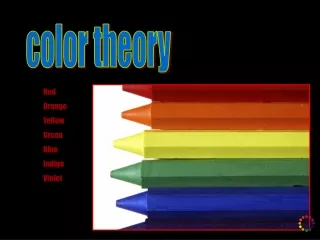
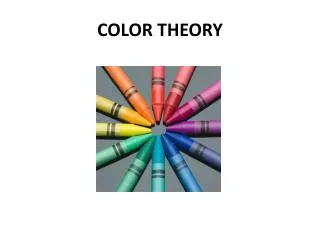
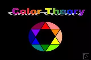
color theory Red Orange Yellow Green Blue Indigo Violet
Colors are created from natural pigments found in minerals. Minerals are ground into fine powders then combined with a “binder” to create artistic materials such as paints or oil pastels.
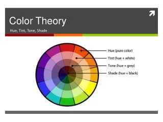
saturation, brightness, & value Saturation refers to the amount of pigment being used in a color. A color that is desaturated is closer to a neutral. When a color is at its fullest saturation, it appears vibrant. Brightness refers to how much white is in a color, the more white, the brighter. Value refers to the amount of black in a color. The more black, the darker the value. michelangelo
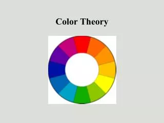
primary vs. secondary Red Yellow Blue These colors are the basis for all other colors and cannot be created through mixing. RED + YELLOW = Orange RED + BLUE = Purple BLUE + YELLOW = Green Green, Purple, & Orange are considered secondary colors and are created by mixing two primaries together.
complementary colors Complementary colors are colors that are opposite eachother on the color wheel. EX: Red & Green Blue & Orange Purple & Yellow Placing complementary colors next to eachother highlights an area bringing attention to the contrast created by the opposites. While these colors often create a vibrant look, they do not always look good next to eachother. http://www.freefoto.com/images/90/03/90_03_1---Christmas-Decorations_web.jpg
Are colors that are directly next to eachother on the color wheel. These create almost no contrast between them but rather work well together. For example: Blue & Green Red & Orange Purple & Red analogous colors http://en.wikipedia.org/wiki/Image:Colouring_pencils.jpg
warm vs. cool colors Warm colors are colors such as red, orange and yellow. They are called such because they make one think of such things as fire and warmth. Cool colors are colors like blue, purple, and green. These are called cool as they make one think of such things as water, grass, and other such cool objects. Neutral colors are colors such as greys and browns which do not contrast with other colors and are considered dull. titian
color qualities Notice how a color appears to stand out or fade away based on the proximity to other colors.
Shading with colors When you attempt to shade something and are using colors, rather than mixing black / adding black to the color, you change the color. For example, when you look at a tree, the leaves hit by the sunlight appear to be white or yellow. The leaves in shadow, can appear anywhere from dark green to blue, to purple. Look at how the following image changes with shadows based on the color schemes used.
Here one sees shadows of deep browns, grays, blues, and reds while the highlights are tans and whites.
The shadows here are deep blues, purples, and a little black while the highlight is white, yellow, and a pale green.
Finally with this color scheme, shadows come in brown, red, and purple while highlights are yellow and orange.
Summary Remember these things as you begin to experiment with coloring your renderings and struggle with color placement. Be sure in your practice ones to experiment with color mixing so you can see what might work together and what fails. Shadows in landscape are often depicted in purples and browns and highlights in yellows and tans. Think of this while you begin to fill in your colors. And if all else fails, consult reference images for help.
