Mastering Design Principles: Repetition, Contrast, and Alignment
20 likes | 160 Vues
This guide explores essential design principles, including repetition, contrast, and alignment, to enhance your visual communication. Repetition creates unity and coherence by maintaining consistent elements like fonts, colors, and layout throughout your design. Contrast emphasizes key elements and adds visual interest. Proper alignment ensures clarity and relationships between items, enhancing the overall structure. Keywords include essential concepts such as font families and proximity for effective grouping. Whether designing brochures or digital content, applying these principles can elevate your work.

Mastering Design Principles: Repetition, Contrast, and Alignment
E N D
Presentation Transcript
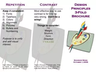
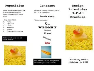
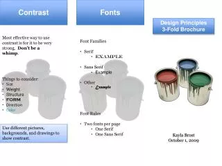
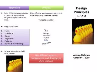
Repetition • Robin William’s design principle is: repeat an aspect of the design throughout the entire piece. • Keep it consistent • Fonts • Type face • Colors • Alignment • Pictures • Bullets and Numbering • Purpose is to unify and add visual interest Repetition Design Principles 3-Fold Brochure Contrast Most effective way to use contrast is for it to be very strong. Don’t be a wimp. Things to consider: Size Weight Structure FORMColor Contrast Fonts Type face Colors Alignment Pictures Bullets & Numbering Direction Andrea Dahmen October 1, 2009 Use different pictures, backgrounds, and drawings to show contrast.
Alignment • Flush LeftFlush Right • Within alignment • the four important • elements are: • visual • connections • unity • try not to over use • center • justify Alignment Proximity Fonts • Proximity is about: • Grouping related items together • Showing a relationship between items • Unrelated items need to be separated • Font Families • Serif • Example • Sans Serif • Example • Other • Example For Instance: My Flowers Marigold Pansy Rue Woodbine Carnation Primrose My Flowers Marigold Pansy Rue Woodbine Carnation Font Rules are: • Two fonts per page • One serif • One sans serif