
SlideServe
Menu
Préférences
© SlideServe · v2026

Responsive Website Design Best Practices

clickmatix avatar
8 diapositives · 1.3K Views · Jun 30, 2015

Learn the essential responsive web design best practices that will take your website to the next level.
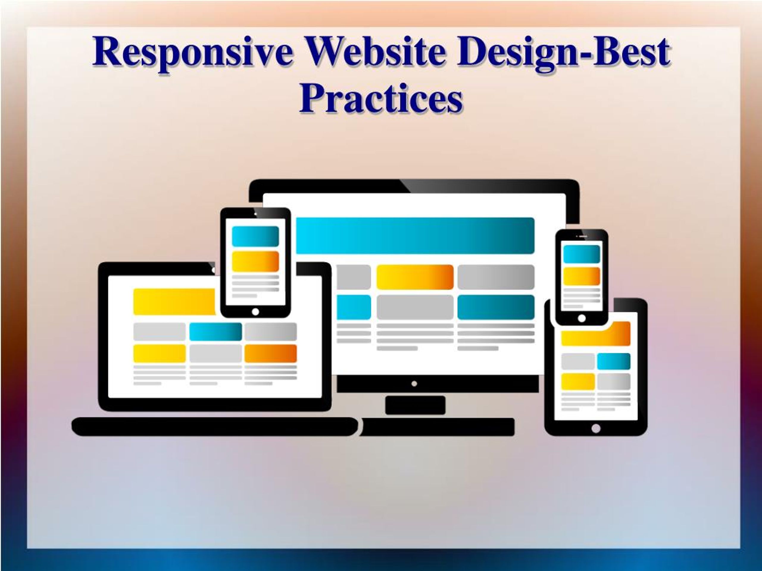
Responsive Website Design Best Practices - slide 1
01 / 8Responsive Website Design Best Practices
1 / 17

Télécharger la présentation

Responsive Website Design Best Practices
Une image / un lien ci-dessous est fourni (tel quel) pour télécharger la présentation

Politique de téléchargement : le contenu du site vous est fourni TEL QUEL pour votre information et votre usage personnel ; il ne peut être vendu, concédé sous licence ni partagé sur d’autres sites sans l’accord de son auteur.Le contenu vous est fourni TEL QUEL, pour votre information et votre usage personnel uniquement. Téléchargez la présentation en cliquant sur ce lien. Lors du téléchargement, si vous ne parvenez pas à télécharger une présentation, l’éditeur a peut-être supprimé le fichier de son serveur.Pendant le téléchargement, si vous ne parvenez pas à obtenir une présentation, le fichier a peut-être été supprimé par l’éditeur.

F I N

Plus de contenu associé

Transcription de la présentation
  1. Responsive Website Design-Best Practices

  2. Responsive Website Design Responsive web design (RWD) is an approach to web design aimed at crafting sites to provide an optimal viewing and interaction experience—easy reading and navigation with a minimum of resizing, panning, and scrolling—across a wide range of devices (from desktop computer monitors to mobile phones).

  3. Key Factors: Creating for numerous systems - It's not adequate to develop just for desktop and also laptop individuals. You need to likewise see to it that your web site - and also every necessary facet of it - will translate effectively no matter the tool and web browser a person is making use of to access your web site. Flexible or instantly resized images - It is necessary that you make critical use of images as they are one of the most challenging components to readjust and also incorporate with mobile formats. When you do make use of a photo, you ought to likewise ensure that it is programmed to resize as well as match the requirements or limitations of a mobile format.

  4. Reasons: Why we going to responsive design? 1. Regular desktops and laptops without touch sensitive displays. 2. Touch sensitive devices like tablets, laptops and desktops. 3. Touch sensitive devices like iPhones, PDAs, etc., that have very small display.

  5. To Be Successful If you wish to achieve success with your online business, you ought to decide on receptive website design for your company. As a company owner, you should recognize just how essential it is to make your web sites appropriate with the mobile browsers and also with the other hand-held devices. When you do recognize the relevance of having a receptive internet site made for your company, you need to take note of particular ideal methods to enjoy all the perks of having a responsive web site. When you hire a responsive website designer for receptive site design needs, you need to check whether your provider adheres to the sector's finest techniques while designing receptive sites.

  6. Advantages: 1. A Positive First Impression 2. Compatibility With the Latest Mobile Technologies 3. Beautiful High-DPI Retina Optimized Images 4. A Reliable Website 5. Better Designs 6. A Faster Website 7. More Likely to Show on Google 8. It Will Save You Time 9. It Will Make You Money 10. It’s More Affordable Than You Think

  7. PPT Created By:

  8. Thank You.....