Download
1 / 3
30 likes | 44 Vues
CliquedMedia is the best Responsive Web Design agency in Dublin, We offering custom design, development and eCommerce solutions since 2006. Find out more...

E N D
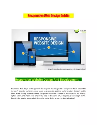
Responsive Web Design Dublin Responsive Website Design And Development Responsive Web design is the approach that suggests that design and development should respond to the user's behavior and environment based on screen size, platform and orientation. Google's Mobile Index makes having a mobile-friendly design non-negotiable. A website that responds for desktop, laptop, tablet, and mobile with one HTML code on the same URL is responsive web design (RWD). Basically, the website layout adjusts depending on the device screen size it's displayed on!
Because mobile internet usage is increasing, it's important businesses adapt. The majority of users coming to your site are likely to be using a mobile device. We are plugged into our mobile devices. Internet surfing, checking emails, online shopping, and social media is being taken over by mobile. Now you can have one website that's visually appealing and ready for all devices! Responsive design is an approach to building sites to provide an optimal viewing and interaction experience. It focuses on easy navigation of site with a minimum of scrolling, panning and resizing across all devices. Mobile First is a methodology for creating responsive CSS code where the styles for mobile devices are written first, without media queries, and for each screen size step up, a new media query is added extending, modifying and overriding the existing styles of the previous (smaller) step! Responsive Web Design is the present and future of the internet today. With smartphones numbers now more than desktop and PC's web developers must use sleek mobile website designs in today's age. Although today's generation works directly with responsive templates and frameworks from the beginning, still you must understand the whole concept to solve any imperfections smoothly!
https://cliquedmedia.com/responsive-web-design-ireland/ 01 554 7227 hello@cliqued.media https://www.facebook.com/cliquedmedia https://twitter.com/CliquedMedia https://www.voutube.com/channel/UC0I6Y8CNz3l08QlZXbrsTba 6-9 Trinity Street Dublin, Ireland