Display (Output) Design
Display (Output) Design. Cognitive functions Present task data Communicate task organization Grouping and ordering Draw attention Aid discrimination/searching Indicate status. Display (Output) Design. Guidelines Overall layout and organization Displaying text and numbers Visual coding

Display (Output) Design
E N D
Presentation Transcript
Display (Output) Design • Cognitive functions • Present task data • Communicate task organization • Grouping and ordering • Draw attention • Aid discrimination/searching • Indicate status
Display (Output) Design • Guidelines • Overall layout and organization • Displaying text and numbers • Visual coding • Use of color • Icon design
Overall Layout and Organization 1. Structure!! • Organize to reveal object and/or task structure • Grouping • Labeling • Spatial Alignment/justification • Borders & Separators (including white space) • Visual effects: highlighting, color, fonts
Structuring example Poor: TAYLOR, SUSAN 034787331 WILLIAM TAYLOR THOMAS 102974 ANN 082177 ALEXANDRA 090872 • To improve appearance • Add labels • Labels use distinctive font and style • Format birth dates with -’s • Align names and birth dates in columns with column headings • Separate display into parts with borders
Structuring example (cont.) Poor: TAYLOR, SUSAN 034787331 WILLIAM TAYLOR THOMAS 102974 ANN 082177 ALEXANDRA 090872 Name: Susan Taylor Social Security No. 034-78-7331 Spouse: William Taylor Children: Names Birth Dates Alexandra 09-08-92 Thomas 10-29-94 Ann 08-21-97
Overall Layout and Organization (cont.) • 2. Consistency of data display • use of documented standards for terminology • formats, colors, visual idioms, etc. • 3. Efficient information assimilation by the user • spatial organization, use of white space • 4. Compatibility of data display with data entry • 5. Flexibility for user control of data display (ex: VB)
Some Experimental Results Screen redesign can greatly improve efficiency and accuracy (31-50% reduction of time and errors for inexperienced users) Dense displays can be effective if well-designed (high cost of moving to new pages and re-orienting) Consistent location of menu’s, buttons, titles, instructions, entry areas, etc. improves efficiency up to 50% Too sparse: frustrates users! Extraneous information lowers performance
Text in UI Design • Text is everywhere: • command names • status and error messages • labels for buttons and icons • fill-in fields • prompts and instructions • names of files and windows • on-line help Some text usability problems due to project and/ororganizational processes for interface design/development
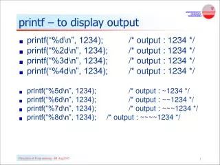
Displaying Text and Numbers – Basic Guidelines • Provide labels for all data fields • Text: • Limit lines to 50-55 characters or use 2 columns, 30-35 characters • Avoid right-justifying if this causes unequal spacing • Distinguish labels and fields • Avoid all uppercase letters • Numbers: • Right justify or decimal-align numbers • Suppress leading 0’s • Use separators (such as commas) for long numbers
Text in UI Design (cont.) List of Textual “Bloopers” Inconsistent terminology Unclear terminology Speaking geek Careless writing Clueless error messages Misuse/nonuse of … in command menus Arrangement and formatting of labels Tool tips that add no information Inconsistent window titles
Tullis’ screen design metrics(text oriented) 1. Overall density (% filled characters) 2. Local density (filled characters in 5 degree visual angle) 3. Grouping (number of groups; average visual angle) 4. Layout complexity (measure of different shapes/blocks) Angle of visual concentration 5 degrees (about 15 characters times 7 rows) suggests size of text blocks. Effective display has a moderate number of groups (6-15), neatly aligned, surrounded by white space, with parallel structure. Best if: overall density < 40%, local density <62%
Visual Coding/Attention Getting • Shape • Marking • (borders, bullet, • icon, etc.) • Size • Choice of fonts • Grouping/proximity Color Inverse video Blinking Color blinking Audio Animation
Specific screen design guidelines Each display should have a title or header Include all necessary information Include only necessary information Consider task sequence, but also:Group items logically Use white space and visual cues for easy scanning Design standard formats and terminology, and follow consistently Place prompts where the eye will be when they are needed
High-level issues in screen design Density (v. navigation overhead) Statics v. Dynamics (selected state, moving image) How much customization?
Color • Color can • Draw attention • Communicate organization • Indicate status • Reveal relationships • Add accents to an uninteresting display • Facilitate subtle discriminations in complex displays • Evoke emotional reactions • Human vision: rods (peripheral) and cones (fovea, or center) • Blue and yellow more visible further out than red/green
Color Guidelines • Use color conservatively • Limit the number and amount of colors (4/7 rule) • Recognize the power of color to speed or slow tasks • Color coding should appear automatically to support the task • Color coding should be under user control • Be consistent in color coding • Be alert to common expectations about color codes • Use color changes to indicate status changes • Use color in graphic displays for greater information density
More Color Guidelines • Avoid confusing color pairs such as red/green, red/blue, yellow/purple, magenta/green • Heavy use of saturated colors can cause afterimages, shadows or depth effects • Brown and green are poor choices for background colors • Orange/red and orange/yellow are easy to confuse • Warm colors appear larger than cool colors • Color in combination with black or white is often better than 2 colors • Use light, saturated colors to emphasize, darker desaturated colors to de-emphasize • Black on white more readable than white on black
Icon Design An icon is an image, picture, or symbol representing a concept Icons are small, usually 64X64 pixels (actual size depends on screen resolution) Icons take advantage of powerful human visual pattern perception Claims for superiority of icons not universally accepted Icons for objects are more intuitive than icons for actions Too many different icons can be distracting and confusing Icons that are too complex can be distracting and confusing Icon design should be considered in context of overall screen appearance and complexity Growing use of Tool Bars (employing even smaller icons)
Icon Design (cont.) • Additional Guidelines • Represent the object or action in a familiar manner • Make icons stand out from the background • Ensure a selected icon is visible from unselected icons • Design the movement animation • Icons combined with text labels are most effective