Download
1 / 47
470 likes | 580 Vues
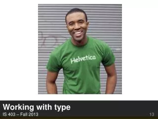
Working with t ype IS 403 – Fall 2013 13. A4. Due Tuesday http:// userpages.umbc.edu /~skane/classes/is403/a4.html. Today. Bethany: summary on web type Talking about type Using type.

E N D
A4 Due Tuesday http://userpages.umbc.edu/~skane/classes/is403/a4.html
Today Bethany: summary on web type Talking about type Using type
Understanding type • What we need to know: • How to talk about type • How to choose typefaces (and pair them) • What not to wear choose • Why it matters • Type communicates who we are (professionalism, attitude, style) • Bad type can impair reading (it is said that you only notice type when it is bad)
Typography on the streets! What changed? Why? http://www.nypost.com/p/news/local/bronxmillion_kuj8X4Z2VolVhXnCymfkvM New York updated their street signs.
Why? Is this Charles street? Perry street? Smith street? PERRY
Why? Is this Charles street? Perry street? Smith street? How about this? PERRY Perry
Why? Is this Charles street? Perry street? Smith street? How about this? PERRY Perry
Typography on the streets! New York is updating their street signs. Costing 27 Million Dollars! http://www.nypost.com/p/news/local/bronxmillion_kuj8X4Z2VolVhXnCymfkvM “Studies have shown that it is harder to read all-caps signs, and those extra milliseconds spent staring away from the road have been shown to increase the likelihood of accidents, particularly among older drivers.” “new regulations also require a change in font from the standard highway typeface to Clearview, which was specially developed for this purpose. “
Font-Type Definitions http://www.wiu.edu/art/courses/handouts/type.htm • Typeface: The distinctive, design of an alphabet (and accompanying numbers and punctuation). All point sizes of that typeface. • Font: All the letters, numbers and punctuation of a single size of a single typeface (27-point Helvetica) • 1 Inch = 72 points = 6 picas (1 pica=12 points)
Basic Type Anatomy http://www.wiu.edu/art/courses/handouts/type.htm
http://jpedroribeiro.com/2009/10/know-your-type-part-1-anatomy/http://jpedroribeiro.com/2009/10/know-your-type-part-1-anatomy/
Two broad categories of fonts Serif Sans-serif
Further type categories http://www.wiu.edu/art/courses/handouts/type.htm Williams has several good chapters on this
Designed for print or screen? • Traditionally, on screen resolution was much lower than print resolution • Some fonts designed specifically for on-screen readability • Georgia • Verdana • Tahoma
Variations within a type family Helvetica Helvetica Bold Helvetica Bold Oblique Helvetica Light Helvetica Light Oblique Helvetica Neue
Other attributes of type Weight (heavy, light) X-height Ascender/descender height
Letterspacing http://www.wiu.edu/art/courses/handouts/type.htm
http://hartfordprints.blogspot.com/2012/11/112712-language-of-typography.htmlhttp://hartfordprints.blogspot.com/2012/11/112712-language-of-typography.html
Things to consider? Combining typefaces Testing type Readability
Combining typefaces Williams: 3 relationships between typefaces Concordant Conflicting Contrasting
Combining typefaces http://www.smashingmagazine.com/ 2010/11/04/best-practices-of- combining-typefaces/
Combine a Sans Serif with a Serif By far the most popular principle for creating typeface combinations is to pair a sans serif header typeface with a serif body typeface. This is a classic combination, and it’s almost impossible to get wrong.
Avoid Similar Classifications Typefaces of the same classification, but from different typeface families, can easily create discord when combined. Their distinct personalities don’t play well off of each other and create a kind of typographic mud if careful attention is not paid.
Assign Distinct Roles One very easy way to combine multiple fonts from several typefaces is to design a role-based scheme for each font or typeface, and stick to it.
Contrast font weights / sizes A sure-fire way to muddy your typographic hierarchy is to fail to distinguish elements in the hierarchy from one another. In addition to variations in size, make sure you are creating clear differences in font weights to help guide the reader’s eye around your design.
Keep it simple–2 typefaces In all the effort to sort through large typeface libraries looking for “just the right combination”, it’s often easy to overlook the sometimes obvious and much easier choice: stick to two typefaces using a classic sans serif and serif combination.
Testing type • Easy to do with CSS • A/B testing • Generate dummy text • Loremipsum
Loremipsum? test test test test test test test test test test test test test test test test test test test test test test test test test test test test test test test test test test test test test test test test test test test test test test test test test test test test test test test test test test test test test test test test test test test test test test
Loremipsum(http://lipsum.com) Loremipsum dolor sit amet, consecteturadipiscingelit. Maecenas necliberosapien. Proin ac arcuporttitor, temporjusto non, eleifend dui. Etiamconsectetur ligula quissapienlobortis, non accumsan nisi aliquam. Vivamussedleopellentesque, tempormetus et, facilisisrisus. Curabituregestasimperdietorci, in consectetur nisi tincidunt ac. Integer iaculis magna egetmaurispharetrascelerisque. Nuncfringilla vitae nisl a ullamcorper. Phasellus at ultricies mi.
Readability • What makes a font easy to read? • Specific color combinations • Specific fonts • Spacing (line spacing, whitespace) • Chunking into paragraphs
Readability matters • Font weight • Font size • Contrast with background • Serif vs. sans-serif – the jury is still out • Fonts designed for screen or page • Other attributes • Tracking, leading, whitespace
Readability Follow the pros
Typography tools • WhatFontfor Chrome • https://chrome.google.com/webstore/detail/whatfont/jabopobgcpjmedljpbcaablpmlmfcogm • What the Font • http://www.myfonts.com/WhatTheFont/
Fonts as a business http://chapters.aiga.org/resources/content/3/5/9/6/documents/aiga_2fonts_07.pdf Fonts are creative, intellectual property. You do not own a font. You license it for limited uses. You cannot share a font with someone who does not have his or her own license to use it. You can embed a font in a file to have it viewed or printed by others.
Type activity What does your font say about you? Let’s look at some web sites for shoes