Download
1 / 4
40 likes | 59 Vues
A 'Call to Action' is a must if you do intend to make a sale. But, do your texts, emails or messages have the right Call to Action in place for the reader to respond favorably? Check out here in this blog<br><br>

E N D
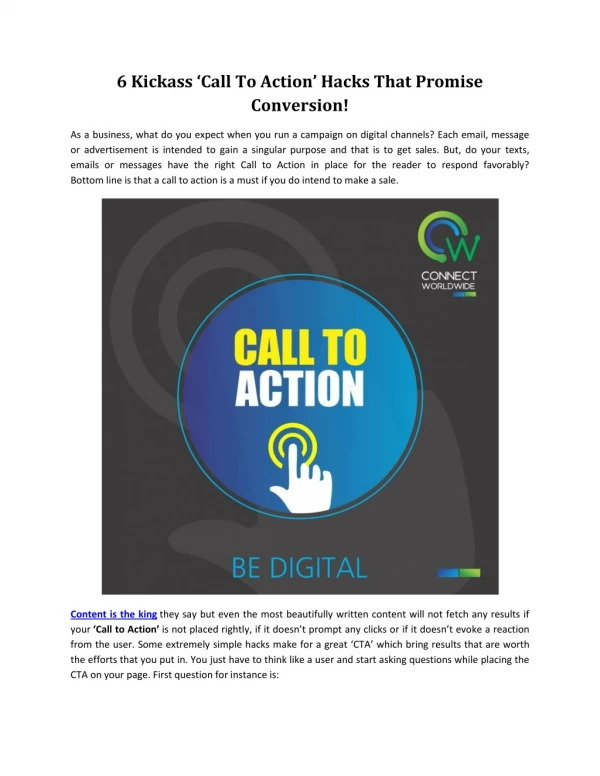
6 Kickass ‘Call To Action’ Hacks That Promise Conversion! As a business, what do you expect when you run a campaign on digital channels? Each email, message or advertisement is intended to gain a singular purpose and that is to get sales. But, do your texts, emails or messages have the right Call to Action in place for the reader to respond favorably? Bottom line is that a call to action is a must if you do intend to make a sale. Content is the king they say but even the most beautifully written content will not fetch any results if your ‘Call to Action’ is not placed rightly, if it doesn’t promptany clicks or if it doesn’t evoke a reaction from the user. Some extremely simple hacks make for a great ‘CTA’ which bring results that are worth the efforts that you put in. You just have to think like a user and start asking questions while placing the CTA on your page. First question for instance is:
1. Where to place the CTA? The positioning of your CTA matters big time. It should be easily identifiable. Neither should it be further down the page, nor should it be in your face blinking like a broken tube-light. Considering the layout of your website, you should decide where it will be more suitable to position the CTA. In case, it is a picture that you have your focus on, best would be to place the CTA either on the picture itself or right next to the picture, so that the user doesn’t wanders off and get a clear idea of where to click to communicate further. 2. Did you invest your attention into the right thing? When you run a marketing campaign, be it social media marketing or email marketing, the traffic lands on a particular page which is also known as the landing page. It is mandatory that your CTA is placed meticulously at a spot where it prompts action. It is likely that you would want to include other links too on your page but make sure that your CTA is bolder, clearer and straight, so that your campaign doesn’t get lost amidst all the gimmicks that you use to attract users.
3. Is your message clear or obscure? If you want your user to engage with you, you must think like the user yourself and craft a message that gives a clear idea of your intent and what they’d be getting in return if they do engage with you. It is a give and take world; you must give some to get some. Ensuring that your message isn’t obscure, misleading or confusing is your foremost responsibility. 4. Does your language evoke action? You want your user to respond to you right away and to keep him from procrastinating; you have got to use words that evoke the reader to act immediately. Your Call to Action is effectual if only it pokes the reader to take the action you expect and to take an action instantly. Factors like the placement of your CTA and its language play a huge role in getting you the results you aspire. 5. Is your creative copy exciting enough? Pick the boldest points of the offer you are giving and craft a copy around those points. Make sure that your creative copy is upto 5 words or less to get the best engagement from your users. For example, you
are giving free downloads or a discount of up to 70%, ensure that these offers are getting communicated clearly and place your CTA right next to these offers. 6. Does your CTA stands out? The color, size and the font are the determining factors for your CTA to bring the right results. The color of the CTA should be contrasting to the color of content you have on your page and same is the case with its size and font so that it stands out from the rest of the stuff on your page and is easily recognizable. The steps mentioned above are simple and doable. A bit of mindfulness can help make your CTA look more appealing and something that prompts an immediate action.