Youth Beats: A Fresh Music Experience
80 likes | 174 Vues
Discover the latest music trends with a modern and minimalistic design targeting young people. Featuring black-themed bands with a consistent color palette of yellow, green, white, black, and red. Stand out with giveaways and graphic elements in a youthful style.

Youth Beats: A Fresh Music Experience
E N D
Presentation Transcript
Different music press By Carys
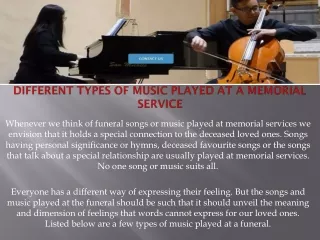
Rock Sound magazine • Editor: Ben Patashnick • Monthly • Publisher: Freeway Press Inc.
The font is san serif, modern and minimalistic. Perhaps because they’re targeting young people, as their audience. The header is behind the image, showing that you should know the title, and it’s less important than the band on the cover. They’re wearing black, and some of the text matches this, relating the two. There’s a consistent colour theme throughout; yellow, green, white, black and a bit of red. There’s giveaways There’s graphics to look like stickers to stand out. This text overlaps the photo, drawing attention, swamping the picture and standing out. There’s information around to get people interested in the bands that are in the content. The shot is taken so you can see their whole body/knee-up.
Q magazine • Editor: Andrew Harrison • Monthly • Publisher: Bauer Media Group
The header title is simple and consistent. It’s behind the main photo, showing you should already know it. This is in a circle, which contrasts to the rest of the text, because, apart form the logo, there is no block red. The colour code is simple and consistent. The code is gold, white, black and red. Normally, there is always only one shade of red, across all magazines, to make it significant and easily recognisable. Only once, when they did an issue on Coldplay, have I seen the colour significantly changed (they also changed it for an Alex Turner cover, on the front page). The main photo is just head and shoulders. This leaves less room for text, but it feels more sophisticated. They’re used graphics in this, which they don't usually do. However, with this issue, it makes it stand out more. They use san-serif fonts all over this page. This contrasts with the title, which is serif, which makes it stand out more. Also, because the title is serif, it looks, in my opinion, more professional and mature. Perhaps this shows that their target audience is different to Rocksound, and is for an elder audience.
NME magazine • Editor: Mike Williams • Weekly • Publisher: IPC Media (Time Inc.)
The text is the same colour as Florence’s top, relating the two. This type face is san serif and capital letters. It’s bold and clear. The shot is very close up. This is in your face, obvious and bold. This is grabs your attention. The white writing also contrasts to the red, dark red and black (shaded) hair she has. Again, this stands out significantly. This black text contrasts to her white top. This makes it obvious and clear. Therefore, if her fans are interested in reading about her, they can see, easily, that she’s featured in the magazine.
Conclusion • Because the magazines for younger audiences use san serif type faces. Therefore, if I make my magazine targeted to teenagers, for example, then I will have a san serif font. I think I will aim my magazine at teens, because I think it will be more convenient when it comes to audience research/questionaires. • Also, the person is almost always in front of the header. Apart from if the main picture is a close up – like the NME Florence & The Machine – this is too close to have the header behind. • In addition, the more mature the audience, the more minimalistic and simplistic the covers are. Also, the less mature the audience is, the more giveaways there are.