Designing an Accessible Web: Principles for Inclusive Digital Experiences
Accessibility is a critical design issue, emphasizing the need for web experiences that cater to everyone, including those with disabilities. This overview discusses assistive technologies and highlights principles for accessible design—such as clear purpose, solid structure, easy interaction, helpful wayfinding, clean presentation, and the use of plain language. By embracing these principles and focusing on universal usability, we can create digital environments that are inclusive and effective for diverse user needs, ensuring that everyone can participate fully in the digital world.
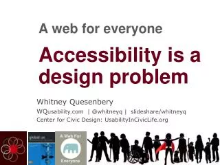

Designing an Accessible Web: Principles for Inclusive Digital Experiences
E N D
Presentation Transcript
Accessibility is a design problem A web for everyone
Disability: the outcome of the interaction between a person with an impairment and the environment and attitudinal barriers she/he may face - International Classification of Functioning (ICF)
I feel like technology is finally catching up with what I truly need. Glenda Watson Hyatt DoItMyselfBlog.com
People first • Clear purpose • Solid structure • Easy interaction • Helpful wayfinding • Clean presentation • Plain language • Accessible media • Universal usability Principles for accessible design
Carol Jacob 1 | People First Lea Emily Steven Maria Trevor Vishnu
2 | Clear purpose: well defined goals Design for mobile first because... Mobile forces you to focus (November 2009) http://www.lukew.com/ff/entry.asp?933
Build accessibility into your thinking...and your templates A big hat tip to @AccessibleJoe and all the folks working on making WordPress more accessible, and to Sylvia Eggers, author of the accessible child theme shown here.
Design for diversity in interaction stylesThink outside the mouse Images: Braille, foot pedal, magnifier, Talking Dial, Voiceover, joystick, audio, high contrast keyboard Glenda Watson Hyatt and her iPad
role = banner role = navigation Identify the areas of a page visually and in code role = form role = search role = main role = complementary role = contentinfo role = navigation
Even complex pages work with good signposting OpenIDEO.com
Even complex pages work with good signposting Challenge Phases Main Content Stats Share Activity feed Related themes User Comments OpenIDEO.com
Learn to recognize good contrast, so it becomes part of your design palette Large Text Body Text Large Text Body Text Large Text Body Text vs. Large Text Body Text Large Text Body Text Large Text Body Text
7 | Plain language: creates a conversation Clear summary States risk in text Invites action .. and visually
People read with different levels of literacy Intermediate – moderately challenging activities like consulting reference material Proficient – interpreting text, comparing viewpoints Below basic – only the most simple and concrete reading skills Basic – able to manage everyday tasks U.S. National Assessment of Adult Literacy http://nces.ed.gov/naal/kf_demographics.asp
Support different reading styles and perception http://www.careerinfonet.org/finaidadvisor/earnings.aspx?nodeid=21
Support different reading styles and perception Good title Clear summary Visual information Data in a table http://www.careerinfonet.org/finaidadvisor/earnings.aspx?nodeid=21
8 | Accessible media: supports all senses Shape Color Text
Meaningful alternatives for visual information What’s the right alternative text for this image?
The right alt text depends on context:Why are you putting this image on the screen? Fox Red fox A red fox, standing on a pile of rocks, looking back at the camera Red fox at Sachuest Point National Wildlife Refuge
When everyone has a place at the (design) tableWe can design a web for everyone Photo: mtstcil.org andITIF/CATEA
Have a new perspective Photo: AIGA Dessign for Democracy and blog.metmuseum.com
Whitney QuesenberyWQusabilityCenter for Civic Designwhitney@wqusability.com@whitneyq