Evaluating Multivariate Visualization Techniques for Climate Change Data Exploration
This research investigates the effectiveness of three multivariate visualization methods for analyzing climate change datasets. Through a user study, we aim to understand how well naïve observers can interpret maps showing spatially varying factors, recognize patterns, and identify relationships among variables. We compare approaches such as multi-layer texture synthesis, perceptually-based brush strokes, and side-by-side color representations. The study focuses on common analytical tasks to shed light on how different visualization techniques influence data comprehension and exploratory analysis.

Evaluating Multivariate Visualization Techniques for Climate Change Data Exploration
E N D
Presentation Transcript
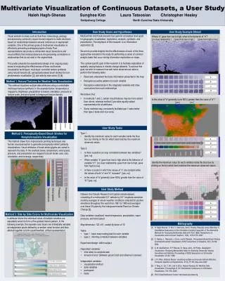
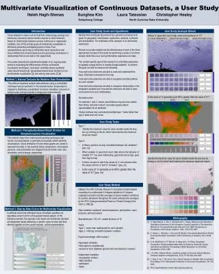
Multivariate Visualization of Continuous Datasets, a User Study Haleh Hagh-Shenas Sunghee Kim Laura Tateosian Christopher Healey Gettysburg College North Carolina State University Introduction User Study Goals and Hypotheses User Study Example Stimuli • MacEachran and Kraak [3] presents four general conceptual level goals for geographic visualization: exploration, analysis, synthesis, and presentation. The emphasis of this research is on information exploration. • We aim to provide insights into the effectiveness of each of the three approaches included in the study for performing a series of common analytic tasks that occur during information exploration on maps. • The context specific goal of this research is to facilitate exploration of spatially varying factors in climate change datasets. To achieve this goal, we wish to measure the following: • how well naïve observers are able to read and understand the basic information presented in the map • how well naïve observers are able to recognize possible patterns for each variable • how well naïve observers are able to recognize relationships in the integrated variables and how well the observers are able to draw conclusions from such relationships • We believe that: • In methods 1 and 2, certain visual features may be more salient than others, whereas method 3 provides equally salient representation for all attributes. • Some methods may consistently facilitate type 1 tasks better than type 2 tasks and vice versa. Visual analysis in areas such as fluid flow, meteorology, geology and astronomy commonly require domain experts to make decisions based on relationships between several continuous or segmented variables. One of the primary goals of multivariate visualization is effectively presenting overlapping layers of data. Poor representations can produce unintended visual interactions and visual artifacts that mislead observers into perceiving correlations or relationships that do not exist in the original data.This poster presents the experimental design of an ongoing study aimed at evaluating the effectiveness of three multivariate visualization techniques: multi-layer controlled texture synthesis using natural textures [5], perceptually-based brush strokes for non-photorealistic visualization [2], and side by side colors [1],[4] . Where “b” goes from low to high, what is the behavior of “d”? [ no clear relationship ] [ goes from low to high ] [ goes from high to low ] . a a Method 1: Natural Textures for Weather Data Visualization b b This method visualizes multiple data attributes using a controllable multi-layer texture synthesis. In the example below, temperature is mapped to brightness, precipitation to texture orientation, pressure to texture scale, and wind speed to foreground texture density. c c d d Is the value of “a” generally (over 80%) greater than the value of “b”? [ yes ] [ no ] User Study Tasks • Type 1 : • “Identify the maximum value for each variable inside the blue box, by clicking on the bin which best matches the maximum observed values” • Type 2: • Is there a positive (or any) correlation between two variables? [yes, no] • When variable “a” goes from low to high what is the behavior of variable “b”? [no clear relationship, goes from low to high, goes from high to low] • Is there a cluster in which the values of “c” are constant while the values of both “a” and “b” increase? [yes, no] • Is the value of “a” generally (over 80%) greater than the value of “b”? [yes, no] Method 2: Perceptually-Based Brush Strokes for Nonphotorealistic Visualization This method draws from Impressionist painting techniques and human visual perception to generate perceptually salient painterly visualizations. Visual attributes of brush-stroke glyphs are varied to represent the data. In the example below, temperature, wind speed, pressure, and precipitation are mapped to brush stroke color, size, orientation, and coverage, respectively. a b c d Identify the maximum value for each variable inside the blue box by clicking on the bin which best matches the maximum observed values. User Study Method • Dataset: the CRU (Climatic Research Unit) global climate dataset consisting of a multivariate 0.5 degree latitude by 0.5 degree longitude resolution monthly averages of eleven weather conditions for positive elevations throughout the world collected and averaged by the IPCC (Intergovernmental Panel on Climate Change) from 1961 to 1990 [5]. • Data variables visualized: mean temperature, precipitation, vapor pressure, and wind speed • Map dimension: 122 x 61, scaled by factor of 10 • Tasks: • type 1: basic map reading task for each variable • type 2: inferring correlation between variables • Experiment design: within subject • Dependent variables: • time taken to complete task • amount of error (between ground truth and observer’s answer) • Independent variables: • visualization method • data variables • participant • tasks Method 3: Side by Side Colors for Multivariate Visualization In attribute blocks the individual colors of multiple variables are separately woven to form a fine-grained texture pattern. In the following example, the separate color layers are individually sampled at independent pixels defined by a random noise function and then stitched together to form a patch worked, unified representation. Bibliography [1] H. Hagh-Shenas, S. Kim, V. Interrante and C. Healey. Weaving versus Blending: A Quantitative Assessment of the Information Carrying Capacities of Two Alternative Methods for Conveying Multivariate Data with Color, IEEE Transactions on Visualization and Computer Graphics, 13(6), 1270-1279, 2007. [2] C. Healey, L. Tateosian, J. Enns and M. Remple. Perceptually-Based Brush Strokes for Nonphotorealistic Visualization, ACM Transactions on Graphics, 23(1), 64-96, 2004. [3] A. M. MacEachren, F. P. Boscoe, D. Haug and L. W. Pickle. Geographic Visualization: Designing Manipulable Maps for Exploring Temporally Varying Georeferenced Statistics, Proceedings of IEEE Symposium on Information Visualization, 87-94, 1998. [4] J. R. Miller. Attribute Blocks: visualizing multiple continuously defined attributes, Computer Graphics and Applications, 27(3), 57–69, May-June 2007. [5] Y. Tang, H. Qu, Y. Wu and H. Zhou. Natural Textures for Weather Data Visualization, Proceedings of 10th International Conference on Information Visualisation, 741-750, 2006. [6] IPCC Data Distribution Center: http://www.ipcc-data.org temperature precipitation pressure wind speed