Enhancing User Experience: Insights from LPL Financial Navigation Menu Changes Study
This report summarizes a qualitative study conducted to gather feedback from Advisors regarding proposed changes to the top-tier navigation menu on LPL Financial's Resource Center home page. Through informal phone interviews, users provided insights on menu structure, icon usage, and the presence of Sponsors. Key findings highlight the need for consistent use of icons and descriptors, the positive reception of splitting menu items, and concerns over banner ads. This exploratory study outlines actionable suggestions to improve navigational clarity and functionality for end-users.

Enhancing User Experience: Insights from LPL Financial Navigation Menu Changes Study
E N D
Presentation Transcript
Resource Menu Changes - Report User Experience Study | Kevin Cornwall
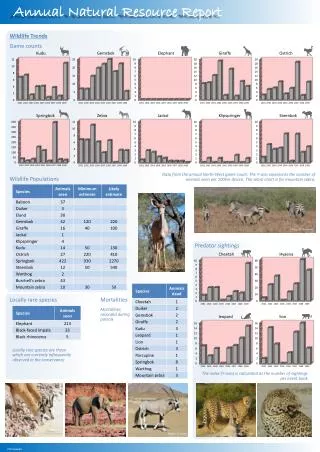
Executive Summary • Our Process • Method:Phone interviewswith survey type questions.Questions wereread to the participants while they referenced visuals sent via email. As this was meant to be an exploratory, qualitative study, participants were also told that they were free to interject comments. The style was friendly and informal. • Goal : The purpose of this study was to get feedback from Advisors about proposed changes* to the top-tier navigation menu on the left-hand of the home page of LPL Financial’s Resource Center, as well as to get a feel for how advisors view the presence of Sponsors in Resource Center. Additional questions were asked about the use of icons and descriptions in the menu, in general. • *Note: these were the proposed changes at the time of the study. The FSD has since been updated, 01/20/2101, adding additional changes to the menu layout. • High Level Findings • Splitting off existing menu items into separate, additional menu items is viewed as useful, navigationally and logically. • Icons should be used consistently – all or none – with no consensus as to which. However, many icons are not viewed as meaningfully related to their subject matter. • Descriptors should be used consistently – all or none. • Sponsor presence in Resource Center is acceptable, with the caveat that it doesn’t violate LPL’s principles of neutrality. • The distraction and space used by banner ads is viewed negatively. • Detailed List of Issues and Suggestions • See slides 3-6
Current Menu A – Consistency of Icon and Descriptor Use Home UX Concern Issue Internal . 1. 1 • Labeling • Consistency • First Tier navigation in Resource Center is available in a menu of links that runs along the left-hand side of the Resource Center pages. • On the Home page of Resource Center the menu items have associated icons and beneath them are “descriptors”, keywords representing information to be found behind the links. • However, internal pages in Resource Center do no show icons or descriptors. Although, the current Zone shows sub-zone links. 3 2
Splitting Off Current Menu Items into New Menu Items Current UX Concern Issue Proposed 2 1 2 3 4. • Ease of Navigation There is a proposal to split off a new Products and Sponsors from the current Research and Products. This will leave Research as the first item. There is a also proposal to split off a new Marketing and Events from Business Consulting. Splitting off both of these new links is viewed positively by advisors. 4 1 3
Proposed Menu B and C – Use of Icons on the Menu UX Concern Issue Proposal B Proposal C 1 2. • Labeling • Consistency • Proposal B shows menu items where some have associated icons, while some don’t. • Proposal C shows menu items without any icons. Advisors are divided on whether there should be icons associated with menu items, but they are agreed that menu items should all have icons or none of them should. 2 1
Proposed Menu B – Use of Descriptors on the Menu UX Concern Issue 1 Proposal B shows menu items where some have associated descriptors, while some don’t. Advisors are agreed that menu items with descriptors are useful and should be shown for all items • Recognition rather than recall • Labeling • Consistency 1
Current Menu A and Proposal B UX Domain Issue 1 • First Tier navigation in Resource Center is available in a menu of links, representing categories of information referred to internally as Zones. The menu runs along the left-hand side of the Resource Center pages. • On the Home page of Resource Center the menu items have associated icons and beneath them are “descriptors”, keywords representing information to be found behind the links. However, within other pages of Resource Center the menu does not show icons or descriptors, rather an icon is shown for the current section to the left of the menu area and “sub zone” links are presented as an indented list only below the menu item for the current section. 1. 2. 3 • Task Flow Support • Predictability • Visibility of system and interaction status • Labeling • Categorization and Grouping 3 2
UX Principles • Task Flow Support – The content and design elements should support the task the user needs to complete on each page. • Flexibility and Efficiency of Use – The system should account for a range of user skills and experience. • Recognition rather than recall – The user should not have to memorize or recall how to use the system. • User Control and Freedom – The user should be able to reverse an action. • Consistency and Standards – The user should not have to wonder whether different words, situations, or actions mean the same thing. • Ease of Navigation – The navigation bars should afford easy navigation. • Visual Feedback of System and Interaction Status – The system should keep the users informed about where they are and what is going on through appropriate feedback within reasonable time. • Categorization and Grouping – The content should be logically organized in easy to understand hierarchical order or grouped based on information relevance and user task. • Labeling – The labels should be understandable, short, and obvious. The labels should represent the purpose of the content. • Relevancy – The content should be relevant to the tasks and steps the user needs to complete. • Predictability – The system support recognition rather than recall. • Familiarity – There should be a match between the system and the real world, task flow, and natural user behavior. The system should speak the use’s language, with words, phrases and concepts familiar to the user, rather than system-oriented terms. Follow natural user behavior in terms of task flow, making information appear in a natural and logical order. • Error prevention and Ease of Recovery – Error messages should be expressed in plain language (no code), precisely indicate the problem and identify where that problem occurred, and both politely and constructively suggest a solution. • Help and Documentation – The system should be designed so well that documentation is not necessary. However, where necessary provide user assistance through hover tool-tips, alerts, and hints. • Aesthetics and Minamalist Desgin – The functions and information presented to the user should be content specific and relevant to the current task hence minimizing user’s cogntive load and increasing task completion efficency. Futhermore, the user should asethetically ”feel” the same experince throughout the application. This means that the eco-system of application is built on consistent user interface fraemwork, components, page types, placement of UI elements, brand messaging, and visual look & feel.