Analyzing Web Design: Balancing Aesthetics and Usability
This document evaluates various websites, highlighting issues related to excessive animations, poor text readability, and overwhelming color schemes. Examples include problems like all caps text, difficult navigation, and ineffective use of space. Conversely, well-designed sites demonstrate good practices, such as balanced graphics, clear color schemes, and easy navigation. Specific features of effective web design are showcased, alongside critiques of less successful sites. The Leap Motion technology is also mentioned as an innovative tool enhancing user interaction without physical contact.

Analyzing Web Design: Balancing Aesthetics and Usability
E N D
Presentation Transcript
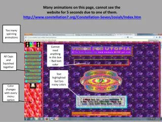
Many animations on this page, cannot see the website for 5 seconds due to one of them. http://www.constellation7.org/Constellation-Seven/Josiah/Index.htm Too many spinning animations Cannot read anything in this box – Bad text color All Caps and Squished together Text highlighted but too many colors Color changes with every menu option
Bad spacing between words, all caps, too many colors and animations, http://www.dokimos.org/ajff/ All Caps and hard to read Way too many colors Too many animations
Only really two colors Very Visible Menu Adequate spacing between words Unique font and size to identify name and style of restaurant Logo placed in center of page Graphics balanced on both sides Excellent color scheme, use of word highlighting with font and size. Graphics are balanced and centered optimally for attention of the reader. Wording is easy to navigate with spacing size and amount displayed. http://thecaferenaissance.com/
Unique font and size for important info All color schemes match the colors of the restaurant Visible menu, spacing Not too many colors in scheme Not too much info Very quick to learn to use All text is easy to see, navigate and draws attention to the most important things. All graphics are centered and balanced as well to maintain organization. The color schemes within the pictures match the color schemes of the site as well. http://www.cheddars.com/
Little Spacing between objects of menu Too many menu options
Spacing between object of menu (Categories) Sub Menus to break up quantity
http://www.t-mobile.com/ Easy was to sign in for member Not too much info Two colors Easy to find plan
Easy sing in and up Customer easy to see the plan and change it Check Look at phone
Find local store Good spacing between words Visible menu Color are matching Easy to see the menu All text is easy to see, and all the colors matching with the food .also, its easy to find the menu and all.Do customer can find stuff easy in this site
What is the Leap Motion? The leap motion is a computer hardware sensor device that supports hand and finger motions as input requiring no hand contact or touching. It is motion sensing technology for human–computer interaction.
What can it do? Browse the web, read articles, slice fruit, shoot bad guys, paint, draw, or play an instrument in real life. Not working on, but with, the computer. The Leap Motion Controller doesn’t replace other hardware, just enhances your experience.
Inside the leap motion What it is detecting
Leap Motion http://www.youtube.com/watch?v=_d6KuiuteIA