Elevating Data Visualization: Best Practices for Effective Graphs and Analyses
230 likes | 347 Vues
In the quest for clear communication of complex data, Gary McClelland and Julie Schiro present key insights on crafting effective visualizations. They explore the pitfalls of 3D charts, the significance of contrast, and the importance of engaging scatterplots. By focusing on clarity, they stress that if decision-makers can't interpret the graphs, the fault lies in the presentation, not the audience. This talk, inspired by historical figures like Florence Nightingale and John Snow, aims to empower statisticians to make impactful and accessible graphics for better data storytelling.

Elevating Data Visualization: Best Practices for Effective Graphs and Analyses
E N D
Presentation Transcript
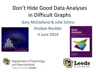
Don’t Hide Good Data Analyses in Difficult Graphs Gary McClelland & Julie Schiro Analyze Boulder 4 June 2014
Florence Nightingale “The Passionate Statistician” gary.mcclelland@colorado.edu & julie.schiro@colorado.edu
John Snow gary.mcclelland@colorado.edu & julie.schiro@colorado.edu
Charles Minard gary.mcclelland@colorado.edu & julie.schiro@colorado.edu
3D Column Chart gary.mcclelland@colorado.edu & julie.schiro@colorado.edu
“Height of Green Columns” gary.mcclelland@colorado.edu & julie.schiro@colorado.edu
Blue > Green gary.mcclelland@colorado.edu & julie.schiro@colorado.edu
Both Answers Correct? gary.mcclelland@colorado.edu & julie.schiro@colorado.edu
Green Columns = 5 gary.mcclelland@colorado.edu & julie.schiro@colorado.edu
Same data in 2D gary.mcclelland@colorado.edu & julie.schiro@colorado.edu
But even here… Low contrast where discrimination needed High contrast where not needed gary.mcclelland@colorado.edu & julie.schiro@colorado.edu
Scatterplots from R gary.mcclelland@colorado.edu & julie.schiro@colorado.edu
However DOTS gary.mcclelland@colorado.edu & julie.schiro@colorado.edu
What is the Relationship? gary.mcclelland@colorado.edu & julie.schiro@colorado.edu
Neither helpful nor hurtful Not at all worth it Very worth it gary.mcclelland@colorado.edu & julie.schiro@colorado.edu
Identical graphs, except the red cluster appears in the lower left or upper right gary.mcclelland@colorado.edu & julie.schiro@colorado.edu
Without red clusters - identical gary.mcclelland@colorado.edu & julie.schiro@colorado.edu
With “red” clusters gary.mcclelland@colorado.edu & julie.schiro@colorado.edu
Regression Line Helps gary.mcclelland@colorado.edu & julie.schiro@colorado.edu
Punchlines • “It’s not you, it’s me”: If the decision maker can’t understand your graph, don’t blame the decision maker. Make a better graph. • Unless there really is a 3rd dimension that you really need to display, avoid 3D graphs. • Enhance scatterplots and other graphics from stat programs to help the viewer focus on all of the data, not just some of it. gary.mcclelland@colorado.edu & julie.schiro@colorado.edu
May you make great graphs! Thank you! Gary & Julie gary.mcclelland@colorado.edu & julie.schiro@colorado.edu
Useful Links & Addresses • Gary.mcclelland@colorado.edu • Julie.schiro@colorado.edu • Gary’s ground-breaking but now aging online interactive statistics textbook using Java applets: http://www.seeingstatistics.com • Gary’s data analysis textbook: http://www.dataanalysisbook.com • Gary’s data visualization consulting firm: http://www.bolderstats.com • Java applets for teaching statistical concepts: http://www.seeingstatistics.com/gallery/ [the magic words are ‘model’ and ‘error’] • Steven Johnson’s TED talk about John Snow’s “ghost map”: http://www.ted.com/talks/steven_johnson_tours_the_ghost_map.html • Michael Friendly’s data visualization website, the “Milestones Project” describes and illustrates the ‘Golden Age of Data Graphics’: http://www.datavis.ca • Edward Tufte is usually considered the guru of modern data graphics. His website has LOTs of resources: http://www.edwardtufte.com/tufte/ • This presentation: http://www.bolderstats.com/graphsAB.pptx gary.mcclelland@colorado.edu & julie.schiro@colorado.edu