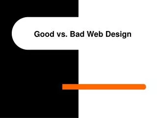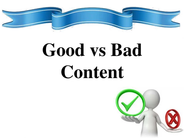
Good vs Bad
Creating Interactions. Good vs Bad. Some Advice. Keep it simple, clear, and concise A manageable amount of information is visible on screen Images are appropriate, and correct quality and clarity You are consistent with your use of formatting. Keep it Simple (good).

Good vs Bad
E N D
Presentation Transcript
Creating Interactions... Good vs Bad
Some Advice • Keep it simple, clear, and concise • A manageable amount of information is visible on screen • Images are appropriate, and correct quality and clarity • You are consistent with your use of formatting
Keep it Simple (good) • Content accurate and concise • Easy to read • Use additional media to emphasise the content A B C
Too Simple (bad) • To little information can seem dull or not important
Too Complex (bad) • If you put too much text on the page it can be hard to read. • Reading on the screen can be tiresome, so the major points should be immediately available. • Too many images cause confusion, and can be far too cluttered • Information can be broken down into smaller chunks over multiple pages to make it easier to understand. • Make sure the text can still be read on the screen A B C
All information is present (good) Scotland • Part of the United Kindom (UK) • Edinburgh is the Capital City • Is a largely rural country with a beautiful landscape of Mountains and Lochs
Information is missing (bad) Scotland • Enter text here... Add image here...
Breaking up Content • A process with multiple steps is easy to break-down into smaller chunks • Each step should describe a certain course of action • It is important to balance the content • Not too many steps (can be tedious) • Not too few (can be over-complex)
Formatting(good and bad) Spacing Make sure there is space between content Titles Each section of content should have a meaningful label CAPS LOCK YOU SHOULD BE CONSISTENT WITH YOUR CAPITAL LETTERS, do not type on ALL CAPS • Make sure text is readable on it’s background • Make sure text is readable on it’s background • Make sure text is readable on it’s background
Images • Images should be clear and easy to understand • Beware making small images larger • If image has labels, make sure they are still readable, otherwise replace with your own text
Summary • Feel free to experiment – but be consistent • Imagine you are looking at the content without any prior knowledge – is it clear? • Is all information present? • Content is broken up into manageable pieces.