
Component-Based Principle
E N D
Presentation Transcript
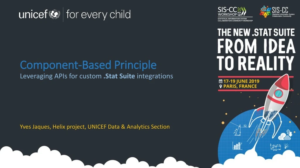
Component-Based Principle Leveraging APIs for custom .Stat Suite integrations Yves Jaques, Helix project, UNICEF Data & Analytics Section
What we do Data & Analytics Section @ UNICEF produces thousands of indicators per year on the state of children and women, at regional, national and sub-national level: • Immunization • Child protection • Nutrition • Early childhood education • Education • Water, Sanitation, and Hygiene • HIV/AIDS • Child, and Maternal health • Child poverty • Female Genital Mutilation/Cutting • Child Mortality • Child Migration
How we share our data • Websites • https://data.unicef.org • https://mics.unicef.org • https://childmortality.org • Print publications • State of the World’s Children • Global Nutrition Report • Levels and Trends in Child Mortality • Datasets • Microdata • Spreadsheets
(Some) challenges we faced • Every technical sector had their own set of processes. • Reference data was not standardized or easy to share. • Every set of indicators had their own structures. • Every structured output was different and used proprietary formats. • Difficult to compare data across sectors. • Producing cross-cutting publications was tedious. • Exporting to data visualization tools was ad-hoc.
Some guidelines we settled on • Work to harmonize processes • Standardize and centralize reference data • Normalize indicator structures • Adopt common outputs and non-proprietary formats • Make data comparable • Streamline preparation of publications • Native support for data visualization
So how to get there? • We had existing dissemination solutions to support, both digital and print. • Technical sectors had their existing processes that couldn’t just stop. • Although users didn’t like their current state, they didn’t have time to dedicate to getting us to a new state. • Our IT department is under-resourced, and over-burdened by cumbersome administrative and governance processes, making change a bit like moving through molasses.
Constraints and assumptions • Buy –vs- build. Don’t re-invent the wheel. Who else has business processes similar to ours? • Enter SIS-CC. • Work iteratively • We can’t replace everything all at once. • Test vertically • See how the pieces fit-together before rolling it all out • Put our users at the centre of it all • Theoretically this change is to help them work better
InDesign So how to implement? DataViz tools (Tableau, Infogram, ArcGIS) WordPress on Pagely Data Structures SDMX Services Data Lifecycle Manager UNICEF Azure cloud Indicator Data Solr Search Engine Data Visualizer Drupal for ROs and COs Our data .Stat Suite UNICEF tools and platforms
Test vertically • https://childmortality.org • A custom, inter-agency site with very exacting requirements from our partners. • A standard WordPress out-of-the-box would not do, we had to rethink it all. Headless WordPress on Pagely Data Structures SDMX Services UNICEF Azure cloud Indicator Data Data Lifecycle Manager Our data .Stat Suite UNICEF tools and platforms
Re-test vertically • https://data.unicef.org • The flagship site for UNICEF indicators, we required: • seamless integration of look-and-feel, and • federated search over both text content and our data. • But we also wanted to create a generic plugin that could be of use to anyone wanting to provide SDMX data visualisation in their WordPress site. SDMX Services WordPress on Pagely Data Structures Data Lifecycle Manager UNICEF Azure cloud Indicator Data Data Visualizer Our data .Stat Suite UNICEF tools and platforms
Challenges along the way • Deployability • .Stat Suite was not historically designed for the cloud. We had to deploy more than we wanted to. • Looks like this is addressed in current release, yay! • Logging • Challenging to diagnose DLM problems when • You don’t have an SMTP server set up and • You don’t have access to the machine on which it’s running in order to look at the logs. • Hope to see this addressed in future • Composability • Data visualizer was dependent on server-side sessions for some of its state. • We had to rip that out to make it truly independent. • Search • We had to abandon search system • Built our own indexer to feed our SaaS Algolia implementation.
Up and coming • Drupal plugin • Drupal is currently the CMS of choice for UNICEF, already deployed in 25+ regional and country offices. • Can we take the work we have done for WordPress, and extend it to another CMS? • We think so, and plan to release it by the end of this Summer.
Thanks! • You can find this presentation at: http://bit.ly/helixsis-cc