Download
1 / 9
90 likes | 224 Vues
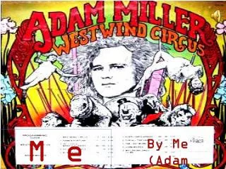
In this evaluation, I explore the development and adherence to forms and conventions in my magazine, "Pop Candy." Inspired by "Top of the Pops," I aimed for an eye-catching masthead and a clean cover featuring a primary image complemented by smaller visuals. My content mirrors what is expected in pop magazines with vibrant colors and engaging layouts, targeting young teen girls aged 11-14. I strive to redefine female representation, promoting positive images that inspire confidence and sisterhood, while also emphasizing the importance of relatable role models in today's society.

E N D
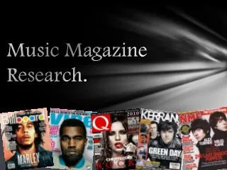
Music Magazine Evaluation By Fiyinfoluwa Ogedengbe
Forms And Conventions The way that my magazine uses, develops or challenges forms and conventions of a real music magazine! In my begin stages for the production of magazine I kept in mind the magazine I used as a case study (top of the pop magazine) I used this as my exemplar. I kept in mind that my masthead must be eye catching just like that of top of the pops. Front cover: With the cover I made sure that I kept the convention of having one main image on the cover. However I feel as though I developed my magazine by having other smaller images below and around the main image. I also tried to keep my images to a minimum. In addition just like TOTP magazine I put page numbers on the front cover as well. I done this 2 Contents page: I feel as through my contents page looks as just what would be expected in a real pop magazine with many incising images and bold eye catching colours used to incise the readers to turn to every page. Feature article: With my feature article I tried to break down on the conventions form expected of a double page spread such as maybe only having one main image. I tried to used a variety of images to boost my artists image.
Social Group Representation • How my magazine represents particular social groups! The reasons why I decided to aim my magazine at Young teen girl Readers is that I feel as though young girls need a more positive outlook on females. This is due to the fact that in society today the main image we see of women are as Sex Symbols. My magazine (Pop candy) is like an escape root from the negative publicity of females and encourages young teens growing up as females to see women in a positive Light. It helps unite a sisterhood in young teens. This meaning that as young girls they see themselves as young respectable women rather than women whom may feel as though they need to promote themselves sexually to get noticed. I think it is important for young girls to have respectable role model especially as in the century we are in many children all falling into girl gangs or at younger ages. Having a magazine such as this lets children see positive images.
Target Audience • Who would be the target audience for your magazine? • The target audience for my magazine would be young teen girls aged between 11-14. • However my magazine may have a border appeal depending on the my feature artists. They may spike and interest in readers of other ages. Audience Research Within my audience research I asked a variety of questions to people of various ages. This was done so that I could gain a better interpretation of what people think and whether my magazine displays conventions of a pop magazine. During my research It was clear to all the people that were asked that the target audience was young teens mainly girls. This shows that my magazine conforms to conventions of a typical pop Magazine. Using bright colours and eye bold fonts.I also learnt that my choice in naming my magazine ‘Pop Candy’ was a really good one as it appealed to its target demographic. With Candy (sweets) being an item of food that many young kids enjoy.
Distribution Of My Magazine • What kind of institution might distribute your magazine and why? I would expect many type of intuitions to distribute my magazine from the local corner shops,newagents to the biggest retail stores of all kinds e.g. Marks and Spencer's supermarkets such as Sainsbury's. The reason for this is that my magazine being a pop magazine can appeal to many people from various walks of life. All these institutions have people from various places in the world coming to there stores.
Target Audience Awareness How I attracted / addressed my audience! Well attracting my target audience wasn’t to tricky I made sure that the fonts used were friendly the same outlook was applied to my models (Artists) the fact that their smile is inviting to many audiences. Like I stated before the masthead for my magazine Is a real big selling point . Addressing my target audience with words such as Candy in the title made it more noticeable of what kind of audience I was trying to attract. This is because the word Candy is mainly associated with younger people.
What I Have Learnt About Technology • What have you learnt about technology from the process of constructing your magazine? (software, photography etc) Well I’ve learnt a few things during the process of creating my magazine. Firstly and most importantly that the process of learning to use Photoshop is very difficult and that I should have began learning to use it early. Even though I did learn the basics of Photoshop if I has started from the get go. I believe I would have been of a more higher standard. Another thing was that due to the fact that I made many draft before I made my final cover I learnt that is really important that when saving my work I give it a clear title and remember where I have saved it. I found I got quite irritated when I sat down to begin amending all my drafts and couldn’t remember what my work was titled and ending up opening several copies before actually find the one I needed. Images I leant that when taking photos it is really important to make sure I have a clear background and capture every part of the models positing because I found that in some photo arms and legs would accidently be cut out of the photo.
Contrast Between Preliminary Task And Main Task I found from creating my music magazine (main task) that there is a very big contrast between that and my preliminary task. The amount of work and time that needed to be put in is immense. With the preliminary task time due to the fact that only one page ( A front Cover) needed to be created. It was significantly easier. In addition to that because it was a school magazine so models were a lot easier to find. With my main task : costume and Mise- en – Scene was vital because if this wasn’t right it wouldn’t be believable as a magazine. Bold fonts had to be used for my sells line do that they could stand out on the page Colour scheme- this helped my magazine to look professional With my Preliminary Task: the mise- en scene and costume wear authentic as I was using real life students. It wasn’t to difficult to find models, who fit the right criteria. A basic colour scheme was used as it was a student magazine and the target dimorphic don’t feed to much into colours as opposed to a pop magazine Basic fonts were used as I tried to keep it looking professional yet casual.