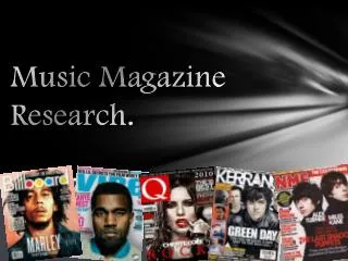
Music M agazine R esearch.
40 likes | 215 Vues
Music M agazine R esearch. The first magazine analysis:. The photograph of the featured group/band ‘You Me At Six’ is the main image on the magazine cover. The editors have positioned them quite simply, by having one

Music M agazine R esearch.
E N D
Presentation Transcript
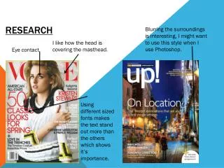
The first magazine analysis: The photograph of the featured group/band ‘You Me At Six’ is the main image on the magazine cover. The editors have positioned them quite simply, by having one member at the front two slightly behind and the final two are behind them but positioned between the gaps of the other members. They are all dressed in black to compliment the magazine’s colour scheme/style. The masthead is hidden slightly behind the groups/band’s heads which shows that it is such a popular magazine that their audience do not need to see the masthead because they already recognise it. However, it also uses a ‘black on white’ effect to make it stand out as well as an edgy font. This is the featured article within the magazine and is therefore shown in larger and separately coloured font to appeal to the reader and help towards grabbing attention. The magazine’s publishers have included this green sticker effect showing news for the readers. The editors of the magazine have included posters of different music artists and have emphasised the word ‘FREE’ to tell readers that if they buy Kerrang! then they get freebies too. The bar-code below does not blend I with the front cover which is a negative. It also shows the price for the audience.
The second magazine analysis: This magazine compared to he first one shows the masthead is not covered by the main photograph which could mean that the magazine is not as well known or that the editors and publishers just do not like the idea of covering the masthead. The style of the masthead is an animated speech bubble outlined in colour. The main photograph is of Katy Perry and shows her positioned front of but tilting with her body away and her head towards the masthead which fits in well with the text. She is on her own on the front cover as she is a solo artist. Her clothing is fairly simply with a white t-shirt in which camouflages in which the white background and the pattered skirt which does the opposite. This is an extra article featured within the magazine and is highlighted in a contrasting colour to the rest of the front cover so that it stands out. The main article of the magazine is about Katy Perry and they have another highlighted sell-line to grab audience attention. They have used the word “you” to make the magazine personal. This magazine seems to focus on not only the pop genre of music but the fashion and news side too.
The third magazine analysis: The font used for this music magazine for classical music pieces is very different and almost complete opposites compared to the fist and second front covers shown. It fits the style of the front cover and also the type of magazine that it is about which makes the whole magazine work well on appearance. Red, as a colour often used on magazine front covers (although usually for text) is bright and attractive to the target audience which in this case is for people who enjoy classical music. It can also symbolise danger which this flash does because it says “it shouldn’t happen to a cellist”. Pierre-Laurent Aimard is the person in the main story and is obviously well known considering his name is published in large font and italics so that people know he is included in the magazine. They also mention his nationality to inform people who did not know. The photograph on this front cover is of a man who is part of the feature story amongst the magazine and he is positioned naturally to maintain the calm identity of the magazine. These two extra articles are shown in the bottom left corner and surprisingly stand out with the ‘PLUS’ flash to help grab attention. The bar-code also shows the price and the publisher for customer knowledge.