Download
1 / 122
1.22k likes | 1.26k Vues
Learn to create & interpret frequency distributions, histograms, stem-and-leaf plots & central tendency statistics for data analysis. Increase your understanding of statistical methods.

E N D
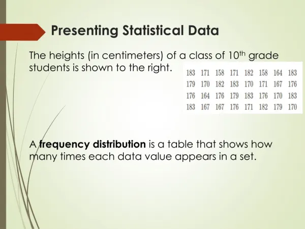
Presenting Statistical Data • The heights (in centimeters) of a class of 10th grade students is shown to the right. • A frequency distribution is a table that shows how many times each data value appears in a set.
Presenting Statistical Data • The heights (in centimeters) of a class of 10th grade students is shown to the right. • Part 1 – Create a frequency distribution.
Presenting Statistical Data • The heights (in centimeters) of a class of 10th grade students is shown to the right. • A histogram can be used to display the frequency of data in certain convenient intervals. It does not display the individual data.
Presenting Statistical Data • The heights (in centimeters) of a class of 10th grade students is shown to the right. • Part 2 – Create a histogram.
Presenting Statistical Data • The heights (in centimeters) of a class of 10th grade students is shown to the right. • Part 3 – Use the histogram to answer the questions: • What interval contains the most students? • What interval contains the fewest students? • How many students are 175 cm or taller? • How many students are less than 170 cm tall?
Presenting Statistical Data • The heights (in centimeters) of a class of 10th grade students is shown to the right. • A stem-and-leaf plot displays the actual data as the first part of the number (stem) and last digit (leaf).
Presenting Statistical Data • The heights (in centimeters) of a class of 10th grade students is shown to the right. • Part 4 – Create a stem-and-leaf plot.
Presenting Statistical Data • The heights (in centimeters) of a class of 10th grade students is shown to the right. Part 5 - Numbers used to describe a set of data are called statistics. Three different statistics used to measure the central tendencyof a distribution are mean, median, and mode.
Presenting Statistical Data • The heights (in centimeters) of a class of 10th grade students is shown to the right. The mode is the number that occurs most frequently. Find the mode of this data.
Presenting Statistical Data • The heights (in centimeters) of a class of 10th grade students is shown to the right. The median is the middle number of the orderedset of data. Find the median of this data.
Presenting Statistical Data • The heights (in centimeters) of a class of 10th grade students is shown to the right. The mean is the arithmetic average of the numbers. Find the mean of this data.
Presenting Statistical Data • Part 6 - Use the distribution of the number of sit-ups performed by students in a PE class in the stem-and leaf plot to: Find the mode: Find the median: Find the mean:
Learning Log Summary LT1– I can display data using a frequency distribution, histogram, and stem-and-leaf plot and compute the measures of central tendency. A histogram / stem-and-leaf plot is… The measures of central tendency are…
Closure Homework pg. 711 ~ 1-13 (All)
Presenting Statistical Data • The accompanying stem-and-leaf plot represents Ben’s test scores for the year. Find the median of the data: Find the median of the lower half of the data: Find the median of the upper half of the data:
Analyzing Statistical Data • The accompanying stem-and-leaf plot represents Ben’s test scores for the year. Dispersion describes how spread a data set is.
Analyzing Statistical Data • The accompanying stem-and-leaf plot represents Ben’s test scores for the year. One measure of dispersion is the range. It is the distance between the largest and smallest numbers in the data set. The range of Ben’s test scores is…
Analyzing Statistical Data • The accompanying stem-and-leaf plot represents Ben’s test scores for the year. A box-and-whiskerplot shows the median, first and third quartiles, and the range of a distribution.
Analyzing Statistical Data • Ex) The accompanying box-and-whisker plot represents the cost, in dollars, of twelve CD’s. Which cost is the upper quartile? What is the range of the costs? What is the median? Which cost represents the 100th percentile? How many CDs cost between How many CDs cost less than $14.50? $14.50 and $26?
Analyzing Statistical Data • The average number of hours of sleep of several people is shown in the table. Measures of dispersion describe how scattered a set of data is. Along with a measure of central tendency, you can provide a good description of a data set.
Analyzing Statistical Data • The average number of hours of sleep of several people is shown in the table. If are n numbers and M is their mean, then the variance of the distribution is…
Analyzing Statistical Data • The average number of hours of sleep of several people is shown in the table. Ex) Find the variance of the distribution of the number of hours slept by participants in the table.
Analyzing Statistical Data • The average number of hours of sleep of several people is shown in the table. The standard deviation is the square root of the variance.
Analyzing Statistical Data • Ex) The stem-and-leaf plot to the right shows the number of yards gained by several students on the football team. a) Find the mean of the distribution and explain its meaning.
Analyzing Statistical Data • Ex) The stem-and-leaf plot to the right shows the number of yards gained by several students on the football team. b) Find the standard deviation of the distribution.
Learning Log Summary LT2– I can compute measures of dispersion and use them describe a distribution. A measure of dispersion tells you… To find the variance and standard deviation…
Closure Homework pg. 717 ~ 1-13 (All)
Data can be distributed in different ways: The Normal Distribution
When it is distributed around a central value: The Normal Distribution
The data is distributed in the following way: The Normal Distribution
Likely to be within 1 standard deviation (68 out of 100 should be) Very likely to be within 2 standard deviations (95 out of 100 should be) Almost certainly within 3 standard deviations (997 out of 1000 should be)
The Normal Distribution Ex) A set of student test scores has a mean of 75 points and a standard deviation of 8 points. • What percentage of students scored between 67 and 83? • 19 out of 20 students has a score in between what two numbers? • What percentage of students scored below a 59?
The Normal Distribution Ex) Out of 300 high school students with normally distributed heights, 95% of students are between 61 and 73 inches tall. • How many students are between 64 and 70 in tall? • What percentage of students are taller than 70 in? • How many students are less than 61 in tall?
Ex. 1: Understanding Mean & Standard Deviation • Which normal curve has a greater mean? • Which normal curve has a greater standard deviation?
The Normal Distribution • Consider the normal curves shown below. Which normal curve has the greatest mean? Which normal curve has the greatest standard deviation? Justify your answers.
Learning Log Summary LT3– I can recognize a normal distribution and use it to determine the percentage of the data that falls within a given range. A normal distribution is… To find the percentage of data within a certain number of standard deviations of the mean…
Closure Homework Normal Distribution Worksheet
Correlation • A survey of several professionals in a neighborhood asked the number of years they have been working and what their current salary is. a)How do you expect years of experience to influence salary?
Correlation b) Draw a scatter plot of the data found in the table to the right.
Correlation A statistic called the correlation coefficient is used to characterize how closely the points in a scatter plot cluster about a line. Given a set of ordered pairs, the correlation coefficient, denoted by ‘r’, is: where and are the mean and S.D. of the x-values, and are the mean and S.D. of the y-values, And is the mean of the products of the ordered pairs.
Correlation A statistic called the correlation coefficient is used to characterize how closely the points in a scatter plot cluster about a line.
Correlation c) Using the scatter plot created for experience and salary, describe the nature of the correlation.
Correlation c) Using the scatter plot created for experience and salary, describe the nature of the correlation.
Correlation d) Suppose x represents experience and y represents salary. Determine the correlation coefficient of the ordered pairs from the table given that , , , , and .
Correlation • When correlation between two variables is high, you can draw a regression line, which is a line that best fits the known values of the variables. An example is shown below:
Correlation • The regression line contains the point and has a slope of .
Correlation e) Using part (d), determine an equation for the regression line of the salary data.
Correlation f) Find the expected salary of someone who works for 45 years.