What is Responsive Web Design
A website is considered u2018responsiveu2018 when a standard design starts adapting itself to the screen size of a visitoru2019s device. Technically, the website server sends the same HTML code to all devices and Common Command Set (CCS), automatically altering the layout and design to match the deviceu2019s size and resolution.

What is Responsive Web Design
E N D
Presentation Transcript
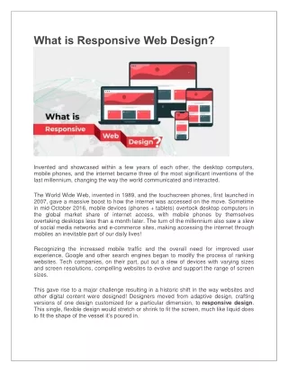
What is Responsive Web Design? Invented and showcased within a few years of each other, the desktop computers, mobile phones, and the internet became three of the most significant inventions of the last millennium, changing the way the world communicated and interacted. The World Wide Web, invented in 1989, and the touchscreen phones, first launched in 2007, gave a massive boost to how the internet was accessed on the move. Sometime in mid-October 2016, mobile devices (phones + tablets) overtook desktop computers in the global market share of internet access, with mobile phones by themselves overtaking desktops less than a month later. The turn of the millennium also saw a slew of social media networks and e-commerce sites, making accessing the internet through mobiles an inevitable part of our daily lives! Recognizing the increased mobile traffic and the overall need for improved user experience, Google and other search engines began to modify the process of ranking websites. Tech companies, on their part, put out a slew of devices with varying sizes and screen resolutions, compelling websites to evolve and support the range of screen sizes. This gave rise to a major challenge resulting in a historic shift in the way websites and other digital content were designed! Designers moved from adaptive design, crafting versions of one design customized for a particular dimension, to responsive design. This single, flexible design would stretch or shrink to fit the screen, much like liquid does to fit the shape of the vessel it’s poured in.
Defining Responsive Web Design A website is considered ‘responsive‘ when a standard design starts adapting itself to the screen size of a visitor’s device. Technically, the website server sends the same HTML code to all devices and Common Command Set (CCS), automatically altering the layout and design to match the device’s size and resolution. All images, text, and icons automatically adjust to be the perfect size to ensure that each element is attractive, legible, and usable. Read more….. https://digitalcatalyst.in/blog/what-is- responsive-web-design/