Download
1 / 3
30 likes | 170 Vues
Title Goes Here Do Not Use All Caps. First Column Here. Use only Helvetica Neue 45 for body text if available. Use only Helvetica Neue 65 for emphasis if available. If specific fonts not available, use only Arial. For printed documents, font should be at 9pt. Do not use decorative fonts.

E N D
Title Goes Here Do Not Use All Caps First Column Here. Use only Helvetica Neue 45 for body text if available. Use only Helvetica Neue 65 for emphasis if available. If specific fonts not available, use only Arial. For printed documents, font should be at 9pt. Do not use decorative fonts. Do not underline or italicize text. Never use shadow style text or word-art. For emphasis, please use Helvetica Neue 65 if available, otherwise, bold sparingly, or change the font color. Please only use black, white, and these approved NAI custom color mixes sparingly: Red: R=217 G=0 B=38 Blue: R=0 G=71 B=93 Light Blue: R=127 G=163 B=174 Gray: R=102 G=100 B=101 Light Gray: R=179 G=178 B=178 Green: R=144 G=161 B=6 Light Green: R=200 G=208 B=131 Please refrain from using more than 4 colors in a document (including black and white). For instance, this template is set up to use predominantly Greens and Grays, plus black and white.The red in the NAI logo must never be changed to another arbitrary color. Date Or Sub-Head Second Column Goes here Please leave these columns placed where they are. The first column is 3” down from the top, and .25” from the left side of the page. The second column is 4.3” from the left and 4.3” down. The first text box is 6.25” long and 3.95” wide. The second one is 4.9” long and 3.95” wide. Please leave at least .75” from the NAI logo on the bottom. When in doubt, please consult the style guide or call your marketing dept. Thank you. Delete this note: The logo must always appear at the left of the page. Do not alter the logo in any way (resize, stretch, change colors, etc.)
Title Goes Here Do Not Use All Caps First Column Here. Use only Helvetica Neue 45 for body text if available. Use only Helvetica Neue 65 for emphasis if available. If specific fonts not available, use only Arial. For printed documents, font should be at 9pt. Do not use decorative fonts. Do not underline or italicize text. Never use shadow style text or word-art. For emphasis, please use Helvetica Neue 65 if available, otherwise, bold sparingly, or change the font color. Please only use black, white, and these approved NAI custom color mixes sparingly: Red: R=217 G=0 B=38 Blue: R=0 G=71 B=93 Light Blue: R=127 G=163 B=174 Gray: R=102 G=100 B=101 Light Gray: R=179 G=178 B=178 Green: R=144 G=161 B=6 Light Green: R=200 G=208 B=131 Please refrain from using more than 4 colors in a document (including black and white). For instance, this template is set up to use predominantly Greens and Grays, plus black and white.The red in the NAI logo must never be changed to another arbitrary color. Second Column Goes here Please leave these columns placed where they are. The first column is 3” down from the top, and .25” from the left side of the page. The second column is 4.3” from the left and 3” down. The text boxes are 6.25” long and 3.95” wide. Please leave at least .75” from the NAI logo on the bottom. When in doubt, please consult the style guide or call your marketing dept. Thank you.
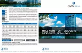
Title Goes Here Do Not Use All Caps You have slightly more leeway on these pages. Positioning does not have to be exact. Please try to leave a little room between text/data and the logo at the bottom of the page. You can use a text block like the 2 previous pages, or import data from an Excel spreadsheet. When setting up your spreadsheet in excel, please follow the same rules as mentioned previously, i.e,: Use only Helvetica Neue 45 for body text if available. Use only Helvetica Neue 65 for emphasis if available. If specific fonts not available, use only Arial. For printed documents, font should be at 9pt. Do not use decorative fonts. Do not underline or italicize text. Never use shadow style text or word-art. Bold text sparingly, make sure that when red is used, it is the custom NAI red. (see previous pages.) Additionally, in Excel, hide all cell borders, and use a light gray (see previous pages) background sparingly for emphasis. Please make certain charts and graphs also follow the guidelines and use only approved colors. Please refrain from drop shadows, borders and wordart. Thank you. PLACE PHOTO HERE CROP PHOTO TO EXACTLY 3” WIDE BY2” HIGH POSITION EXACTLY .25 FROM LEFT SIDE. PLEASE USE ONLY A ½ PT. BLACK BORDER AROUND PHOTOS PLACE PHOTO HERE CROP PHOTO TO EXACTLY 3” WIDE BY2” HIGH POSITION EXACTLY .25 FROM LEFT SIDE. PLEASE USE ONLY A ½ PT. BLACK BORDER AROUND PHOTOS PLACE PHOTO HERE CROP PHOTO TO EXACTLY 3” WIDE BY2” HIGH POSITION EXACTLY .25 FROM LEFT SIDE. PLEASE USE ONLY A ½ PT. BLACK BORDER AROUND PHOTOS