How to Prepare and Present a PowerPoint Presentation
150 likes | 442 Vues
How to Prepare and Present a PowerPoint Presentation. By: John Stillian and Kristin Donley Monarch High School. Part 1: Mechanics of Making a PowerPoint Presentation. Organization, Fonts, Color, Animation, Transition etc. Presentation Organization. Title slide

How to Prepare and Present a PowerPoint Presentation
E N D
Presentation Transcript
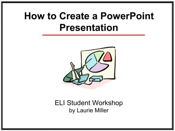
How to Prepare and Present a PowerPoint Presentation By: John Stillian and Kristin Donley Monarch High School
Part 1: Mechanics of Making a PowerPoint Presentation Organization, Fonts, Color, Animation, Transition etc.
Presentation Organization • Title slide • Introduction slide with 3 or 4 bullets • Body of paper slides • These slides present your information • Assume 60 seconds per slide for timing. • Conclusion slide • Wrap up, re-state the important points • References Slide. • Acknowledgements slide. • Acknowledge anyone who helped but was not a major contributor and any funding.
Setting up the Master Slide • It is best to define a master slide with preset: • Background color and images • Font size and color(s) • Bullets style and hierarchy • You can also choose one of the canned presentation styles. THEN DON’T CHANGE IT!
Recommendations • Heading: Arial or Veranda 32 - 40 pt bold • Subheadings 28-36 pt Bold • Body Copy 24-32 pt. - smaller than subheadings • Paragraph settings at 0.9 line spacing and 0.6 before a paragraph • One Indent – 20 – 24 pt. In general, Avoid further indents.
Be Consistent!! Use the same bullets, font, type size and color, and same background, on each slide. • Best to set up a slide master and stick to it • Make sure text contrasts with background • Becareful with color !!! • Notice how distracting all the bullets are on this slide! • Fancy fonts are hard to read • ALL CAPITAL LETTERS ARE HARD TO READ • Avoid abbreviations and acronyms, etc. • Limit - punctuation / marks;
Slides Should Clarify, not Confuse • The rule of 6 • No more than 6 words per line • No more than 6 lines a slide • Make slides easy to read. • Arial or Veranda font with good text to background contrast • Very short sentences are better than extremely long ones that are complicated and run on and on and on and on. Larger font for more important info!
PowerPoint Animation, Clip Art and Graphics • Should balance the slide. • Enhance and complement the text, not overwhelm • No more than two graphics per slide • Minimize animations, sounds, transitions they can distract and annoy the audience. • Avoid switching between programs.
Part 2: Presenting a PowerPoint Presentation How to prepare, and present
How to Present a PowerPoint Presentation • Tell them what you are going to tell them. (Introduction) • Tell them. (Body of talk) • Tell them what you told them. (Conclusion)
Steps to an Effective Presentation • Commit Yourself. Stand at the podium when the room is empty to see how it feels. • Analyze (know) Your Audience. • Organize Your Thoughts through your presentation. HAVE A STORY TO TELL. • Think Sight and Sound (remember they are reading your slides and listening to you) • Practice, Practice, Practice! • Relax and Enjoy!
Effective PowerPoint Presentations • Kung Fu Secrets of PowerPoint Masters • Beware the fonts of fury (to many fonts) • Don’t read your slides, have note cards or memorize what you want to say. • Plot your moves craftily (not to many changes) • Illuminate your words (be succinct) • Make brevity a virtue. • Control your impulse to go Hollywood! • Source: Business 2.0, September 2003, p. 163-164
References How to Make a PowerPoint Presentation: http://www.cew.wisc.edu/accessibility/tutorials/pptscratch.htm www.healthsci.utas.edu.au/trsu/pdf/powerpoint.pdf PowerPoint Templates: (some are free, some cost $) http://www.capeannpics.com/powerpoint/ http://www.presentationhelper.co.uk/free_powerpoint_template.htm http://powerbacks.com/ http://www.digitallabz.com/powerpoint-background.html?gclid=CKyc4d3055ACFQibggodCjXEVw
