Enhancing Business Insights with Interactive Dashboards for Optimal Decision-Making
Discover the power of Interactive Dashboards that allow users to gain insights effortlessly. These dashboards offer a visual representation of essential data, enabling management to monitor key performance indicators effectively. With user-friendly features like real-time updates, drilldowns, and customizable controls, you can tailor your dashboard to answer critical business questions, such as customer behavior, product performance, and distribution effectiveness. Leverage actionable Business Intelligence to drive results and optimize margins through informed decision-making.

Enhancing Business Insights with Interactive Dashboards for Optimal Decision-Making
E N D
Presentation Transcript
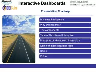
Interactive Dashboards ISO 9001:2000 , ISO 27001 CMMI Level 3 appraised at Class B Presentation Roadmap
Which are our lowest/highest margin customers ? Who are my customers and what products are they buying? What is the most effective distribution channel? What product prom--otions have the biggest impact on revenue? Which customers are most likely to go to the competition ? What impact will new products/services have on revenue and margins? Business Intelligence Business Intelligence (BI) is about getting the right information, to the right decision makers, at the right time.
Why Dashboards? • Allows users to consume large amounts of information in a simple, graphical view • Enables management to monitor key performance indicators company-wide • Enables users to standardize on one common language…single version of the truth • Great for driving specific behavior (actionable BI)
Dashboard Components • Chart: • Pie, Line, Bar • Table: • Sort by label or value with max values displayed • Metric: • Stackable with colors ex. Compare multiple reports • Gauge: • Custom breakpoints and colors ex. Quota or Goal attainment
Interactive Dashboards Give your users power to discover hidden insights in their data rather than forcing them to focus on navigation. Develop a dashboard with hover, drilldowns, filters and smart controls.
“As single-screen displays, dashboards do not always provide all the information needed to perform a job or to pursue a particular set of objectives. They can provide the initial overview…, but they need to be supplemented with additional information for more comprehensive understanding and response. Dashboards should almost always be designed for interaction.”--Stephen Few (2006, Information Dashboard Design, O’Reilly)
Types Dashboards Interaction • Dashboards with real-time updates – Weather, Stocks • Using controls like sliders to do “What-if” analysis: predicting the outcome of an event • Dynamic Filters: Simplify by removing the data of lesser interest • Using Slicers: Slice and Dice data • Drill down – from a higher level to more detail • Drill across – move laterally through your data • Downloads: From Strategic Insight to Operational Data • Ad-hoc Reporting: Generate your own
Principles of dashboard interaction • Direct – initiate action by clicking on the data itself • Discoverable – hover, highlighting, underline • Lightweight – Update smallest possible object (KPI) • Stay on the Page whenever possible • Consistent – symmetry of interaction
Application Demo DEMO