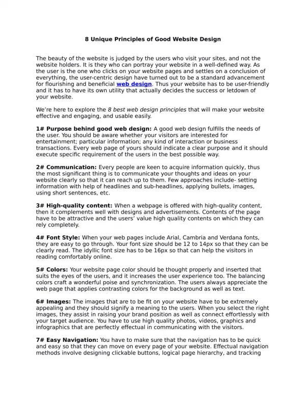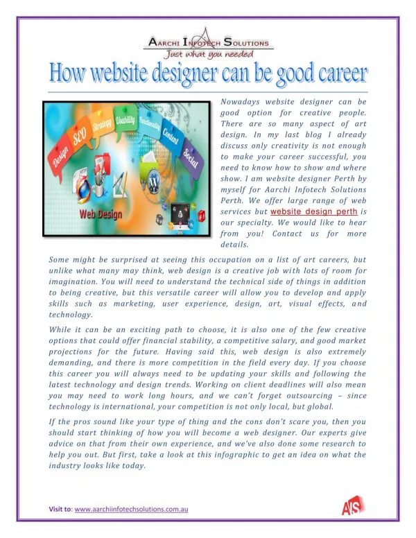
Professional Website Design Essentials
Learn the key elements for a successful website: easy navigation, suitable color scheme, effective tool bar, clear content, user-friendly search box, legible text, relevant pictures, and accessible links. Follow these guidelines to create a website that is informative, engaging, and visually appealing for your target audience.

Professional Website Design Essentials
E N D
Presentation Transcript
Easy Navigation / Easy to browse- not to many options to click onGood/Suitable Colour Scheme - not clashing- colours like white and navey blue which go together should be used.Effective Tool Bar- not complicated, easy to read, in an obvious placeClear Content- clear font, good coloursPictures – big one to intrigue the user It fits target audience- its pointless having a website aimed at adults with a childish appearance.Attention grabbing title- not distracting or unprofessional but obviousSearch box to enable a user friendly website- so if they don’t’ find what they need straight away they can find it quicklyLegible Text - Good font and text size Different categories to maximize amount of information- so text is not cluttered • Needs to look professional • Great, informative pictures- not blurred and are relevant • Links to the other pages of the website easily accessible- links that work • Neat / clear layout • Transition/animation must be simple- not over the top or on everything you click on, also should use only 2 different types at the most • Images that are relevant to the website • User-friendly Good Website
Bad Website • Unreadable Website- text is too bright for example neon green on neon pinkNavigation too small- un readable Not for target audience- for example a adult website with a childish imageNo consistency for fonts- all fonts are different which is hard to read and messyCluttered- too much information in one place or in random placesToo much animation- distracting multimedia Distracting background – textured Bad SPAGIrrelevant content- the website may be about weddings but starts to mention horses for example • Underlined words which look like links but aren’t- confusing and time wasting • Bad blurred images- pointless and unprofessional • Irritating sound effects-these can be distracting and are unnesesary • Links to the other pages don’t work- very unprofessional, should be checked often to insure this doesn’t happen • Videos you can’t stop or mute- distracting and annoying • Bad, hard to read text- lots of different fonts with colours that don’t go in very small size • Bright or dull colour scheme- not interesting • Distracting/irrelevant images or multimedia • There is no point to the website • No menu or more than one • Bad layout