Download
1 / 35
350 likes | 375 Vues
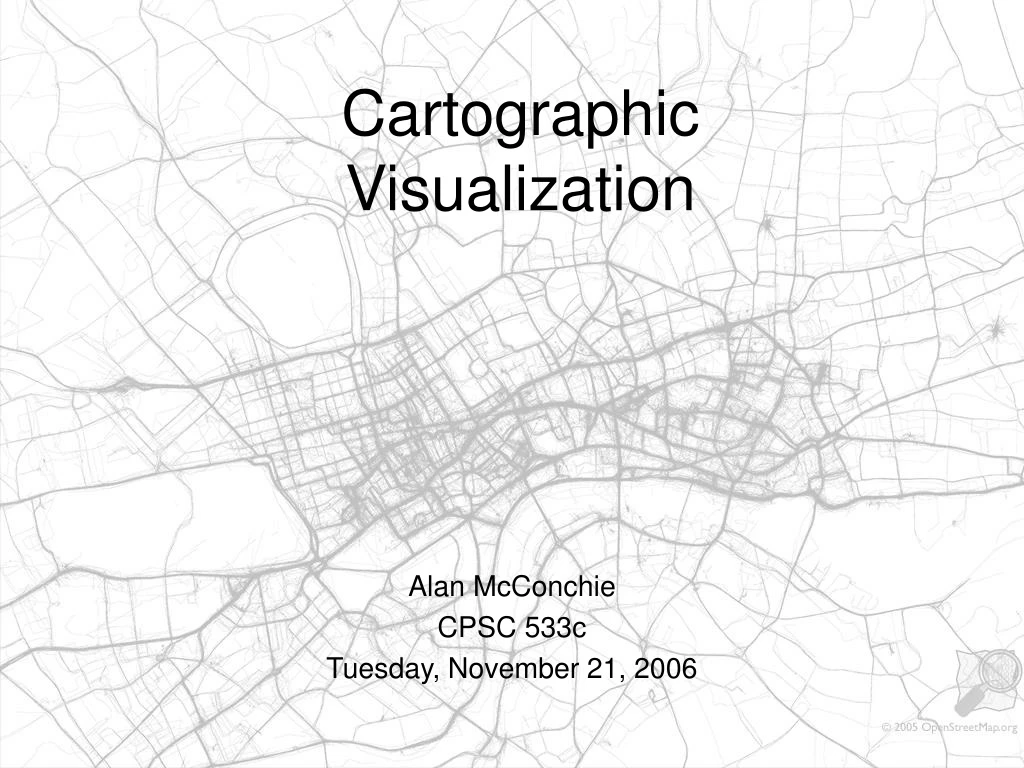
Cartographic Visualization. Alan McConchie CPSC 533c Tuesday, November 21, 2006. Papers covered. Geographic visualization: designing manipulable maps for exploring temporally varying georeferenced statistics. MacEachren, A.M. Boscoe, F.P. Haug, D. Pickle, L.W. InfoVis 1998, pp. 87-94.

E N D
CartographicVisualization Alan McConchie CPSC 533c Tuesday, November 21, 2006
Papers covered • Geographic visualization: designing manipulable maps for exploring temporally varying georeferenced statistics. MacEachren, A.M. Boscoe, F.P. Haug, D. Pickle, L.W. InfoVis 1998, pp. 87-94. • Conditioned Choropleth Maps and Hypothesis Generation. Carr, D.B., White, D., and MacEachren, A.M., Annals of the Association of American Geographers, 95(1), 2005, pp. 32-53 • CartoDraw: A Fast Algorithm for Generating Contiguous Cartograms. Keim, D.A, North, S.C., Panse, C., IEEE Transactions on Visualization and Computer Graphics (TVCG), Vol. 10, No. 1, 2004, pp. 95-110 • The space-time cube revisited from a geovisualization perspective. Kraak, M.J., Proceedings of the 21st International Cartographic Conference (ICC), 2003, pp. 1988-96
“Everything is related to everything else, but closer things are more closely related.” - Waldo Tobler How does geographic/cartographic visualization relate to the SciVis/InfoVis continuum? A bridge? A separate third category?
Designing Manipulable Maps for Exploring Temporally Varying Georeferenced StatisticsMacEachren et al. (1998) Knowledge construction via Geographic Visualization (GVis) Four conceptual goals of GVis • Exploration • Analysis • Synthesis • Presentation Foundations • Map Animation • Multivariate Representation • Interactivity
User study: domain experts 1) Find spatial min and max in first time period 2) Find temporal shift in one disease 3) Compare time trend between two diseases
User study: conclusions • People preferred to use only animation or only time-stepping, few used both. • Those who used animation spotted more patterns than those who used time-stepping. • Interactively focusing the cross map is more effective than standard 7-class maps
Critique of MacEachren • Interactive classification solves a major problem in cartography: choosing the best category breaks. • What if there were more than 4 or 5 time slices? • Both animation and time-stepping require user to keep patterns in memory.
Conditioned Choropleth Maps Carr, White & MacEachren (2005) • What is a choropleth map? • Statistical data aggregated over previously defined regions • Each region is displayed with a uniform value • What is conditioning? • Another variable is used to divide the data. • Data satisfying each condition is displayed separately using small multiples
Critique of Conditioned Choropleth Maps • Is all the wasted screen space worth it? • Use of hexagons is an important step away from pure choropleth maps • No longer based on arbitrary regions that may be irrelevant to the analysis • However, still aggregate statistics, possibility of patterns being missed that straddle boundaries between areas
CartoDraw: A Fast Algorithm for Generating Contiguous Cartograms Keim, North & Panse (2004) A cartogram is a map where area on the map represents some value other than real-world area Important trade-off between retaining familiar shapes and representing area accurately (and in a useful way) Computer generated cartograms are: • often not aesthetically pleasing • computationally intensive
Types of contiguous cartograms Tobler’s Pseudo-cartogram Gusein-Zade & Tikunov’s line integral method (Similar results from Dougenik’s force field method and Gastner & Newman’s diffusion method) Kocmoud & House’s constraint-based method
Kocmoud and House: • Repeated iterations to adjust area • Vertices have “spring effect” to maintain original orientation
3. Expand or Contract CartoDraw: Keim, North, Panse • Make cuts in shape, then add or subtract • Most of the shape’s edge remains intact • Reduces need to frequently recalculate edges • Orders of magnitude faster than previous algorithms 1. Scanlines 2. Cutting Lines
Scanline placement Automatic Scanlines Interactive Scanlines Poor results Better results, but requires human intervention
Solution: medial axes Medial-axes-based scanlines:
Possible use of a fast cartogram algorithm:Long-distancecall volumeduring one day
CartoDrawKeim, North, Panse • What is a “good” cartogram? • Tradeoff between area error and shape error. • Few or no studies have been done to determine what are the most important parts of a map for recognition: Size? Proportion? Edge detail? • Are cartograms really that useful? • Do people remember what the original shapes looked like? • Very hard to make fair areal comparisons between irregular shapes. • Cartograms can easily be used badly. • Do not use cartograms to show average values, per capita values, etc • People are not only looking at what’s on the map, but they’re comparing to what’s in their head.
The Space-Time Cube Revisited From a Geovisualization PerspectiveKraak (2003) • Torsten Hägerstrand, “Time geography”, 1970 • Map daily paths of individuals in space-time • 3-dimensional space: x, y and time mapped onto z axis • Shifted geographers’ focus onto individual people and experience • Disaggregated human behaviour • Ideas of “space-time cube” with “paths” and “prisms” within it • Kraak’s paper is a survey: • How has the space-time cube returned with new visualization tools? • Attempt at a classsification of interactions • What are possible applications today?
Space-Time Paths I. Space-time path: movement and “stations”. “Activity bundles” with others. • Projection of path’s footprint on base map. III. Space-time prism of potential path space .
Space-Time Cube in Interactive Environment Napoleon’s march into Russia: building linked views
Space-Time Cube Interactions • Drag axes into cube for measurement • Rotate view III. Select and query
Kraak, Space-Time Cube Proposed applications: • Real-time or retrospective visualization of an orienteering event • Archaeological finds plotted in S-T cube, showing time uncertainty Critiques: • Is this truly useful, or just a toy? Are we learning anything? • Uninspiring examples. Doesn’t show more than one person’s path. • What about objects with higher dimensions than a moving point, such as moving lines or areas?
Space-Time Aquarium, Kwan (2003) Space-time paths of Asian American women and African American women in Portland, Oregon
The Future of Space-Time Point Data • Rapidly increasing availability of point-based geodata from GPS systems • GPS apps that don’t use the space-time cube (yet) • Geocoded photos: Flickr, Geograph.org.uk • Real-time photos and GPS traces and photos: geotracing.com • Collaborative GPS mapping: openstreetmap.org