Explore Scatter Plots: Height and Weight Among 9th Grade Boys
Analyze the heights and weights of 12 boys to create and interpret scatter plots. Learn about correlations and outliers in bivariate data.


Explore Scatter Plots: Height and Weight Among 9th Grade Boys
E N D
Presentation Transcript
Height and weight Theo has done a survey of the heights and weights of twelve 9th grade boys. Boy Height (cm) Weight (lbs) Theo 159 115 Finley 175 119 Connor 167 115 Ben 171 119 Who is the tallest boy?Who is the shortest boy? Liam 154 108 Joshua 162 106 Is the tallest boy the heaviest? Is the shortest boy the lightest? Aiden 181 126 Nasir 173 123 Zac 150 100 How could we graph this data? Peter 179 132 Tristan 164 119 Max 169 121
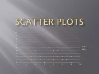
Drawing a scatter plot A scatter plot can be drawn to show the relationship between two variables (i.e. a set of bivariate data.) When drawing a scatter plot: give the graph a title draw a small cross on the graph for each data pair draw an x-axis and a y-axis, both with appropriate scales and labels
Interpreting scatter plots What does this scatter graph show about the relationship between the height and weight of twenty 9th grade boys? In general, as weight increases, height also increases. This is called apositive correlation.
Interpreting scatter plots What does this scatter plot show about the relationship between life expectancy and cigarettes smoked? It shows that as the number of cigarettes smoked increases, life expectancy decreases. This is anegative correlation.
Using a graphing calculator You can use your graphing calculator to make a scatter plot of a set of paired data. Press “STAT” then select “Edit” to enter your two data sets. Use the “STAT PLOT” feature to select the type of graph and the lists you want to use. Turn Plot1 “On”. Press “GRAPH” to plot the data.
Correlation Scatter plots can show a relationship between two variables. This relationship is called correlation. • Correlation is a general trend. • Some data items, the outliers, will not fit this trend. • Correlation can be weak or strong. Scatter plots can show: positive correlation: as one variable increases, so does the other variable negative correlation: as one variable increases, the other variable decreases zero correlation: no linear relationship between the variables