Scatter Plots
Scatter Plots. Scatter Plots. Scatter plots are used when data from an experiment or test have a wide range of values. You do not connect the points in a scatter plot, but you do make predictions from scatter plots. Draw a scatter plot using the data from the table.

Scatter Plots
E N D
Presentation Transcript
Scatter Plots • Scatter plots are used when data from an experiment or test have a wide range of values. • You do not connect the points in a scatter plot, but you do make predictions from scatter plots. Draw a scatter plot using the data from the table. Identify the independent and dependent variables.
Scatter Plots • There are 3 ways that lists of data can relate to each other in scatter plots. • Positive Correlation – one variable increase while the other variable increase. This is similar to a positive slope. • Negative Correlation – one variable increases while the other variable decreases. This is similar to a negative slope. • No Correlation - the points do not relate at all.
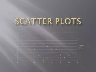
Scatter Plots • What correlation do each of these scatter plots show?
Scatter Plots • Let’s make another scatter plot. Use the data from the table. How is the data correlated?