Download
1 / 32
320 likes | 342 Vues
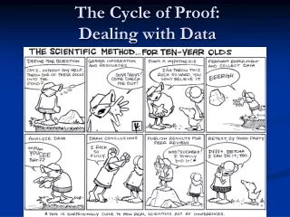
Learn how to compile and interpret data using tables and graphs. Understand the difference between qualitative and quantitative data and how to present them effectively. Master the guidelines for creating tables and graphs.

E N D
Dealing with Data:Daily Learning Goal The student will be able to compile and interpret data using appropriate formats, including tables and graphs. (A1.6)
Qualitative vs. Quantitative • Qualitative observations are descriptive: e.g., “The amplitude of the pendulum decreased slowly over 10 swings.” • Quantitative observations contain numerical measurements: e.g., “The mass of the pendulum was 150 g.”
Qualitative Data Qualitative data should still be specific and exact. e.g., • Do NOT say “the solution bubbled and fizzed;” say “a gas was produced.” • Do NOT say “the solution got cloudy with chunky bits;” say “a precipitate formed.”
Quantitative Data Quantitative data should contain all the digits that were measured. E.g., if a length is measured to the nearest millimetre, the nearest millimetre needs to be recorded: 10.0 cm should NOT be recorded as 10 cm. That .0 was measured!
Tables Both qualitative and quantitative data can be recorded and presented in tables. e.g.
Tables Guidelines for creating tables: • Tables are numbered in the order in which they appear in the experiment. • A title explains in detail what information is presented in the table.
Tables Guidelines for creating tables: • Tables are numbered in the order in which they appear in the experiment. • A title explains in detail what information is presented in the table. • The table is divided into columns and rows outlined by solid, ruler-drawn borders. • The rows and/or columns have identifying headings. • The units used in the table are shown in the headings.
Units Never forget your units! Units are important. . . .
Graphs Quantitative data may be presented and analysed using graphs. E.g., Graph 1: Distance-time information for a cart travelling along a track
Graphs Guidelines for creating graphs: • Graphs are also numbered and titled.
Graphs Guidelines for creating graphs: • Graphs are also numbered and titled. • A graph takes up at least ½ a page and preferably an entire page. The horizontal and vertical ruler-drawn axes should be placed approximately 2 cm from the edge of the page.
Graphs Guidelines for creating graphs: • Graphs are also numbered and titled. • A graph takes up at least ½ a page and preferably an entire page. The horizontal and vertical ruler-drawn axes should be placed approximately 2 cm from the edge of the page. • The axes are labeled with the variables (including units). Unless otherwise directed, the independent variable is placed on the horizontal axis and the dependent variable on the vertical axis.
Graphs More guidelines for creating graphs: • The scale is chosen so that all of the points plotted fit on the graph and take up as much space as possible on the graph. The increments of the scale should be in multiples of 1, 2, or 5.
Graphs More guidelines for creating graphs: • The scale is chosen so that all of the points plotted fit on the graph and take up as much space as possible on the graph. The increments of the scale should be in multiples of 1, 2, or 5. • The points are plotted in pencil with a circle surrounding each sharp dot. A ruler-drawn line of best fit (or if appropriate, a curve of best fit) is drawn through the points.
The Line/Curve of Best Fit Remember that a line of best fit should have as many points above the line as below the line and that the displacements between the points and the line should not form a trend (i.e. all points below the line should not be the points to the left and all points above the line should not be the points to the right).
The Line/Curve of Best Fit Remember that a line of best fit should have as many points above the line as below the line and that the displacements between the points and the line should not form a trend (i.e. all points below the line should not be the points to the left and all points above the line should not be the points to the right). If (0, 0) is a known data point, use that information when drawing the line. Note also that the line should extend beyond the points to allow for extrapolation.
Trends in Graphs After the data is graphed, the trend in the data may be analysed.
Linear Increase This graph shows a linear increase: as the independent variable increases, the dependent variable increases linearly.
Linear Decrease Here, as the independent variable increases, the dependent variable decreases linearly.
Increase at an increasing rate Here, as the independent variable increases, the dependent variable increases at an increasing rate.
Increase at an increasing rate Here, as the independent variable increases, the dependent variable increases at an increasing rate. This is not necessarily an exponential increase. It could be a quadratic increase. The two are not the same thing!
Increase at an decreasing rate Here, as the independent variable increases, the dependent variable increases at a decreasing rate.
Decrease at an increasing rate Here, as the independent variable increases, the dependent variable decreases at an increasing rate.
Decrease at an decreasing rate Here, as the independent variable increases, the dependent variable decreases at a decreasing rate.
No Relationship This graph shows NO RELATIONSHIP between the independent and dependent variables.
Observations vs. Conclusions Statements like “as the independent variable increases, the dependent variable increases linearly,” are conclusions, not observations, and appear in the Discussion or the Conclusion section(s).