Identifying Misleading Graphs: Time-Series and Cross-Sectional Analysis
This section focuses on analyzing graphs, specifically how to identify misleading characteristics. It explains the appropriateness of different graph types, such as time-series graphs that display variable changes over time and cross-sectional graphs that represent information at a single point in time. An example of the US federal minimum wage graph illustrates common errors in scaling, highlighting the importance of consistent axis intervals to avoid distortion. Additionally, symmetric shapes in graphs are explored, demonstrating the importance of accurate representation in data visualization.


Identifying Misleading Graphs: Time-Series and Cross-Sectional Analysis
E N D
Presentation Transcript
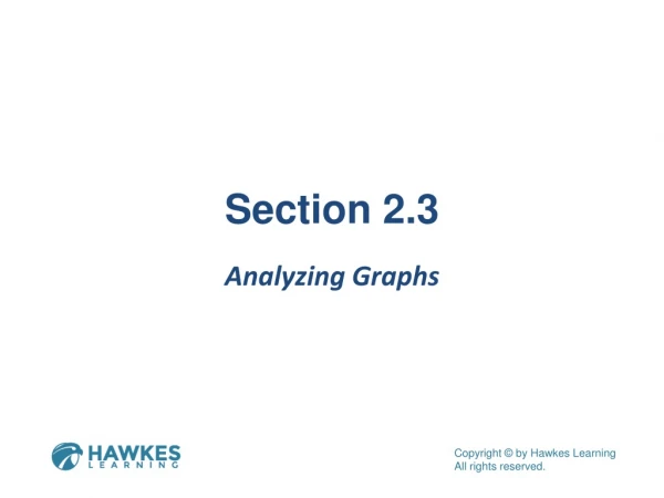
Section 2.3 Analyzing Graphs
Objectives Identify misleading characteristics of a graph.
Appropriateness of the Graph A time-series graphis a line graph that is used to display a variable whose values change over time. A cross-sectional graph displays information collected at only one point in time.
Example 2.18: Scaling of Graphs Consider the graph below on US federal minimum hourly wage rates, unadjusted for inflation. What errors can you find in the graph? How should they be fixed? Source: US Department of Labor, Wage and Hour Division (WHD). “History of Federal Minimum Wage Rates Under the Fair Labor Standards Act, 1938-2009.” http:// www.dol.gov/whd/minwage/chart.htm (24 Jan. 2012).
Example 2.18: Scaling of Graphs (cont.) Solution Notice that the x-axis does not have a consistent scale. The years are sometimes one year apart and sometimes even ten years apart, so the shape of the graph is distorted. To correct this graph, the x-axis needs to be changed to use a consistent scale. The corrected graph can be found in Exercise 10 in the Chapter 2 Exercises.
Example 2.19: Shapes of Graphs Describe the overall shape of the following distribution.
Example 2.19: Shapes of Graphs (cont.) Solution Notice that if we draw a smooth curve skimming the top of the histogram, we begin to see a curve similar to the shape of the symmetric curve. To be symmetric, the left and right sides of the graph should be close to mirror images. Drawing a line down the center of the graph, we can see that both sides of the graph are indeed mirror images of each other.
Example 2.19: Shapes of Graphs (cont.) Thus, this histogram has a symmetric shape.