Analyzing Graphs: Identifying Misleading Characteristics and Distribution Shapes
This section focuses on analyzing graphs to identify misleading characteristics and the shapes of different distributions. It explains the differences between time-series graphs and cross-sectional graphs, including how scaling errors can distort data representation. Specific examples, like the US federal minimum wage graph, demonstrate the impact of inconsistent axes. Readers will learn how to accurately interpret graphical data, comparing various representations of the same dataset, and recognizing symmetrical and skewed distribution shapes.
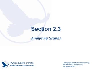

Analyzing Graphs: Identifying Misleading Characteristics and Distribution Shapes
E N D
Presentation Transcript
Section 2.3 Analyzing Graphs
Objectives Identify misleading characteristics of a graph. ALSO – identify shape of a distribution.
Appropriateness of the Graph A time-series graphis a line graph that is used to display a variable whose values change over time. A cross-sectional graph displays information collected at only one point in time.
Example 2.18: Scaling of Graphs Consider the graph below on US federal minimum hourly wage rates, unadjusted for inflation. What errors can you find in the graph? How should they be fixed? Source: US Department of Labor, Wage and Hour Division (WHD). “History of Federal Minimum Wage Rates Under the Fair Labor Standards Act, 1938-2009.” http:// www.dol.gov/whd/minwage/chart.htm (24 Jan. 2012).
Example 2.18: Scaling of Graphs (cont.) Solution Notice that the x-axis does not have a consistent scale. The years are sometimes one year apart and sometimes even ten years apart, so the shape of the graph is distorted. To correct this graph, the x-axis needs to be changed to use a consistent scale. The corrected graph can be found in Exercise 10 in the Chapter 2 Exercises.
HAWKES LEARNING SYSTEMS math courseware specialists Graphical Descriptions of Data 2.3 Analyzing Graphs Look at the two graphs shown below depicting the same data on people’s satisfaction level with their local shopping mall. Which graph is more accurate and why?
Note the pies’ sizes are different, and for the right reason, too
Shapes of Distributions Change of topic now – next: What shape does this distribution have? The configuration is like this: What’s the shape of the graph of the data in here in the chart? Quantities (or relative quantity) along the vertical axis Number values or classes along the horizontal axis
HAWKES LEARNING SYSTEMS math courseware specialists Graphical Descriptions of Data 2.3 Analyzing Graphs Shapes of Distribution: • Uniform – the frequency of each class is relatively the same. • Symmetrical – the data lies evenly on both sides of the distribution. • Skewed to the Right – the majority of the data falls on the left of the distribution. • Skewed to the Left – the majority of the data falls on the right of the distribution.
Example 2.19: Shapes of Graphs Describe the overall shape of the following distribution.
Example 2.19: Shapes of Graphs (cont.) Solution Notice that if we draw a smooth curve skimming the top of the histogram, we begin to see a curve similar to the shape of the symmetric curve. To be symmetric, the left and right sides of the graph should be close to mirror images. Drawing a line down the center of the graph, we can see that both sides of the graph are indeed mirror images of each other.
Example 2.19: Shapes of Graphs (cont.) Thus, this histogram has a symmetric shape.