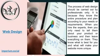
Effective Web Design for Climate Change Awareness
This guide outlines the essential skills and roles involved in web design, focusing on creating an informative and engaging website dedicated to climate change. Key roles include production manager, editor, designer, and programmer. The web design process involves stages like information design, content creation, interaction design, and presentation. Emphasis is placed on creating user-friendly navigation, legible content, and appealing visuals. By producing a cohesive site structure and utilizing effective design techniques, students can develop a platform to raise awareness about climate change initiatives.

Effective Web Design for Climate Change Awareness
E N D
Presentation Transcript
Web Design www.LTScotland.org.uk/sustainabledevelopment/climatechange
Web Design Personnel Web design involves a range of skills. Everyone in the class can be involved in planning the website structure and in researching, locating and creating text, images and multimedia content. However you will also need to utilise the special skills and aptitudes of class members and assign people to the following roles: • Production manager: in charge of the whole production. They need to have organisation and social skills • Editor: in charge of proofing, sub-editing, headlines, captions. They need to have good language skills. • Designer: in charge of presentation design and image creation. They should have art and design skills. • Programmer: in charge of processing multimedia elements and constructing page templates, cascading style sheets, final testing. They should have on-line computing skills. It is advisable to have at least two people in these roles so that absence does not hold up the whole production process.
Stages in Web Design • Information design • Content design • Interaction design • Presentation design • Technical design • Marketing design • Evaluation and maintenance
Stage 1. Information Design • You should have established the following: • What communication problems the site is intended to solve • The target audiences • The objectives of the website • This should allow you to construct a structure for your website in the form of a site map • You should aim for a maximum of three clicks to find any item of information • Use the site map to plan the home page in the form of a wireframe (storyboard) • Use the homepage wireframe to structure the other pages in the website – this unifies the site and makes navigation easy for the user.
Climate Change Site Map Climate Change Homepage Climate change: the facts Carbon footprint reduction School campaign Sign the pledge Links page Mission statement Achievements Contacts Events
Wireframe Homepage Banner (Logo and Campaign title) School name and logo What is Climate Change? Text which tells the reader about the website and the school campaign Dramatic photograph(s) of local effects of climate change What is Carbon Footprint Reduction? What is the Cool School Campaign? Sign the pledge
Stage 2.1 Content Design: Text In creating text for web pages you should: • Use short headlines of no more than one line • Use short sentences of no more than 20 words • Vary sentence length to avoid monotony • Use short paragraphs of no more than 2 sentences • Write concisely and simply • Omit unnecessary words • Avoid foreign words or technical jargon or slang or texting abbreviations • Avoid clichés (e.g. ‘It rained cats and dogs.’) • Be positive in your use of language • Keep text concise so that vertical scrolling is either unnecessary or minimised • Chunk longer material and separate with subheads • Summarise lengthy text and hyperlink to a downloadable full version • Proof to correct spelling, grammar and punctuation.
Stage 2.2 Content Design: Photographs In selecting images you should ask questions such as: • Is the image relevant to the body text? • Does a photograph show people’s emotions or actions? • Does it show a critical moment? • Does it have an interesting composition? • Does it show an interesting contrast or repetition? • Is the image attractive or dramatic? When combining several images on the same page you should ask: • Is there an idea or concept which links the images?
Stage 2.3 Content Design: Multimedia • Overuse of motion and sound can make a website an irritating and slow experience • Sound, video or animation elements should only be added to the website if they add value • For example, an animation explaining how greenhouse gases lead to global warming may explain the concept better than a still image or text.
Stage 3. Interaction Design • Your wireframe will set out how text, graphic, hyperlinks are to be arranged on the page • You should aim for ease-of-use, for example: • consistent navigation across pages • legibility of text against backgrounds • understandable language • a link to the home page from any sub-page • minimal vertical scrolling • no horizontal scrolling
Stage 4.1 Presentation Design: Colour • Unite the page and website by using a limited number of websafe colours (http://en.wikipedia.org/wiki/Websafe) • Avoid background images which obscure or distract from the text • Colours should carry appropriate connotations for the audience (greens and blues are common on environmental websites as these colours connote ‘nature’) • Make sure text is easy to read against its background colour • Multiple use of the same graphic elements unifies the website e.g. banner, logo, buttons.
Stage 4.2 Presentation Design: Typography • Use standard serif or sans serif fonts (if the user does not have a font on their system it will render it in a different font of the same kind) • Use a maximum of 2 different fonts on the page • Sans serif is preferred to serif on computer screens as the serif strokes do not render well on screen • Verdana is the most readable sans serif font on screen • Georgia is the most readable serif font on screen • Don’t use all UPPER CASE • Headlines should use Title Case rather than UPPER CASE • Left justify text • If you know how, establish a consistent text style through CSS (cascading style sheets).
Stage 4.3 Presentation Design: Layout • When you design a web page you should consider four aspects of presentation: • Contrast • Repetition • Alignment • Proximity • These are illustrated in the following webpages from environmental organisations.
Stage 4.4 Presentation Design: Contrast • Contrast means that elements that are different should look different. • This is part of a page on the Stop Climate Change Scotland website (http://www.stopclimatechaosscotland.org) on 4 August 2007. • Colour is used to differentiate parts of the page – the top part has an orange background; the menu bar is multicoloured and the main story is on a light blue background which rhymes with the blue grey smoke of the accompanying photograph • Text: The headline (“the facts”) and subhead (“Global warming”) are emboldened to stand out from the body text.
Stage 4.5 Presentation Design: Repetition • Repetition means repeating elements so that each page - and the whole website - are unified. • This is part of a page on the Royal Society for the Protection of Birds website (http://www.rspb.org.uk) on 4 August 2007. • The colours blue, white and green are used in background, images, buttons and text. Blue and white predominate and this reflects the colours of the RSPB logo top left. Similar colour schemes are used throughout the website. • Text: A sans serif typeface is used throughout. • Navigation: The same menu bar and logo appear on every page of the website.
Stage 4.6 Presentation Design: Alignment • Alignment means lining elements up with each other. This leads the eye along the content and makes it easy for the reader to identify the desired information. In general, centre alignment should be avoided. It is best to use no more than 3 vertical lines for alignment. • This is part of a page on the Royal Society for the Protection of Birds website (http://www.rspb.org.uk) on 4 August 2007. • Vertical alignment: two vertical lines are used to align the main content of the page. • Horizontal alignment: three horizontal lines are used to align menu options, images and headlines.
Stage 4.7 Presentation Design: Proximity • Proximity means that related elements should be close together on a web page. • This is part of a page on the Stop Climate Change Scotland website (http://www.stopclimatechaosscotland.org) on 4 August 2007. • The page uses a modular layout with three horizontal modules: • Top: this contains logo, organisation name and text expressing their concern over climate change • Menu bar: Horizontal menu bar providing links to other pages on the website. • Bottom: Single column of text about global warming with dramatic photograph of burning forest
Stage 5.1 Technical Design • Save images files as GIFs or JPEGs for quick loading • for JPEGs this is a trade-off between quality and file size • Aim for pages that download within 10 seconds • Stick to websafe colours • Ensure windows are titled • Make sure images, buttons and hyperlinks have informative alt tags
Stage 5.2 Technical Design: Testing • Validate your web pages’ HTML, links, CSS at http://www.w3.org/QA/Tools/ (free) • Upload and test with different browsers & platforms (PC/Mac) • Register with search engines • Use SEOs (search engine optimisation tools) to increase the chances of your site appearing in a keyword search.
Stage 6. Marketing Design • Create an easy-to-remember web address • Publicise the website address in press releases, posters, blog postings, articles…
Stage 7. Evaluation & Maintenance • Does the website meet its objectives? • Is the information design satisfactory? e.g. is it easy to locate all necessary information? Are all text, images and multimedia relevant? • Is the navigation design satisfactory? e.g. is the site easy to use and do all the hyperlinks work? • Is the presentation satisfactory? e.g. does it make effective use of colour, typography, contrast, repetition, alignment, proximity? • Is the technical design satisfactory? e.g. are pages fast to download? • If there are any faults, maintain the website to correct them immediately • Maintain the website regularly to keep it fresh and up-to-date.