12.2 Stem-and-Leaf Plots, Histograms, and Circle Graphs
140 likes | 571 Vues
12.2 Stem-and-Leaf Plots, Histograms, and Circle Graphs. Objectives: Make a stem-and-leaf plot, a histogram, or a circle graph for a data set. Find and use relative frequencies to solve probability problems.

12.2 Stem-and-Leaf Plots, Histograms, and Circle Graphs
E N D
Presentation Transcript
12.2 Stem-and-Leaf Plots, Histograms, and Circle Graphs Objectives: Make a stem-and-leaf plot, a histogram, or a circle graph for a data set. Find and use relative frequencies to solve probability problems. Standards: 2.6.5A Organize and display data using pictures, tallies, tables, charts, bar and circle graphs. 2.6.8E Analyze and display data in a stem-and-leaf plot.
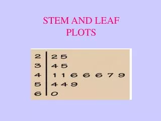
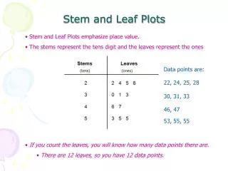
I. A stem-and-leafplot of the Internet data is shown below. A stem-and-leaf plot is a quick way to arrange a set of data and view its shape, or general distribution. In a stem-and-leafplot each data value is split into 2 parts: a stem and leaf.
TRY THIS: A bakery collected the following data about the number of loaves of fresh bread sold on each of 24 business days: • Make a Stem and Leaf Plot • Find the median and mode • How should the bakery owner use the data to plan production?
Median: 49.5 Mode: 47, 50, 52
A histogram is a bar graph that gives the frequency of each value. In a histogram, the horizontal axis is like a number line divided into equal widths. Each width represents a data value or range of values. The height of each bar represents the frequency of that data value or range of data values.
Make a frequency table and a histogram for the data set below:
Circle Graphs • Yippee!