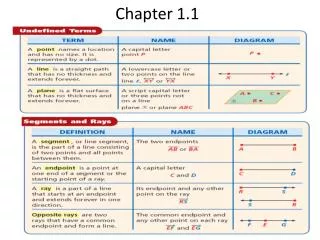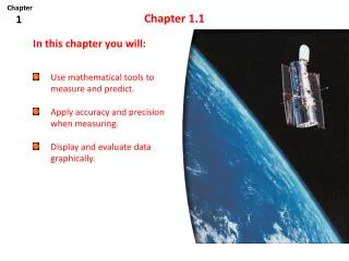
Chapter 1.1
Chapter 1.1. Displaying Distributions With Graphs!. Displaying Categorical Variables : Bar Graphs & Pie Charts.

Chapter 1.1
E N D
Presentation Transcript
Chapter 1.1 Displaying Distributions With Graphs!
Displaying Categorical Variables: Bar Graphs & Pie Charts Would you vote for or against a new federal law that would strictly limit the kinds of food that can be served in school meals or sold elsewhere in public schools to food that meets certain standards for nutritional value?
Hints: • Always label you axes. Also, title the bars for bar charts and include a key for pie charts. • Leave spaces between each bar. (Without spaces, the chart is a histogram. • The vertical axes on a bar chart can be a count or a percent. When reading a bar chart, be sure to determine which is being used. • Pie charts require percentages. All of the categories must total to 100%. Sometimes you can make an “other” category. • When trying to compare two sets of categorical data, the bar chart is usually more effective than two pie charts.
Would you vote for or against a new federal law that would strictly limit the kinds of food that can be served in school meals or sold in vending machines, at snack bars and bake salesin public schools to food that meets certain standards for high nutritional value?
Displaying Quantitative Data:Dotplots& Stemplots title label • A dotplot can be a quick and easy way to display quantitative data. • It’s best for: • Small, simple data sets… • With a small range • Remember to _______ your dotplot and ______ both axes.
Stemplots • The “stem” is all but the final (right-most) digit • The “leaf” is the final digit (only one per #!) • Provide a title and a key. A stemplot(or stem and leaf plot) is another good way to quickly display small data sets. A stemplot is often useful for data with a small range.
Stemplots Cont. You may trim (truncate) or round if there are too many digits You may “split stems” into two or five parts to get a better idea of the shape of the distribution.
Splitting 23 55699 03 58 1 56 2 1 1 2 2 3 3 4 4 5 5 12, 13, 15, 15, 16, 19, 19, 20, 23, 25, 28, 31, 35, 36, 52
Describing Distributions • Describe the ________ of the distribution • State the ________ and _________ of the distribution • Look for and describe _____________________________. SHAPE CENTER SPREAD Deviations from the pattern! Both dotplots and stemplots are designed to be a visual aid to get information about the general pattern of a distribution. After drawing the graph, DESCRIBE what you see:
Chemical Engineering $65,700 Electrical Engineering $60,200 Computer Science $56,400 Economics $50,200 Statistics $48,600 Environmental Science $43,300 Business Administration $43,300 Political Science $41,300 • From www.payscale.com/best-colleges/degrees.asp • July, 2009 Philosophy $40,000 Biology $39,500 Communications $38,700 Fashion Design $36,700 Journalism $36,300 Education $36,200 Graphic Design $36,000 Psychology $36,000 Social Work $33,400 Example: The data* below shows the median starting salary of college graduates with Bachelors Degrees in various fields. Create an appropriate graphical display and describe what you see.