
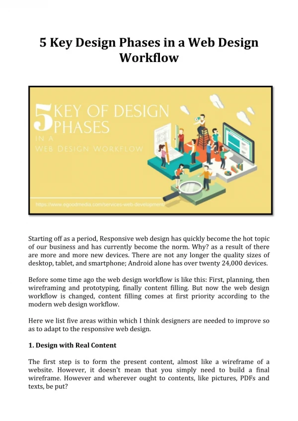
5 Web Design
5 Web Design. Learning Outcomes. Describe Common Types of Website Organization Describe Principles of Visual Design Design for Target Audience Create Clear, Easy-to-use Navigation Improve the Readability of Text on Web Pages Apply Universal Design to Web Pages

5 Web Design
E N D
Presentation Transcript
5 Web Design
Learning Outcomes • Describe Common Types of Website Organization • Describe Principles of Visual Design • Design for Target Audience • Create Clear, Easy-to-use Navigation • Improve the Readability of Text on Web Pages • Apply Universal Design to Web Pages • Describe Web Page Layout Design Techniques
Web Site Structure • Hierarchical • General to Detail Progression • Linear • Purchasing Sequence of E-Commerce Site • Book • Star • Multiple Unified Sets of Information • e.g., Destinations, Accommodations, Air Travel, Cruise, Rentals • Mesh • Every Page is Accessible to Every Other Page
Web Site Structure • Shallow • Too Many Choices; Confusing & Less Usable Web Site • Deep • Too Many Clicks to Navigate to Desired Page • Three Click Rule • From a Page to Any Other Page in a Maximum of Three Clicks
Importance of Compliance ? • W3C’s WAI (Web Accessibility Initiative) • http://www.w3.org/WAI • Web Content Accessibility Guidelines • http://www.w3.org/WAI/WCAG20/quickref/ • Accessible Website • Provides Accommodations for Individuals with: • Visual, Auditory, Physical, & Neurological Disabilities
Importance of Compliance ? • Federal Law • Americans with Disabilities Act (ADA) • Prohibits Discrimination Against People with Disabilities • Section 508 of US Rehabilitation Act • Mirrors Web Accessibility Initiative of W3C • Web Projects Funded by Government • Took Effect 2001
W3C WAI Guidelines • Guideline 1 • Provide Equivalent Alternatives to Auditory & Visual Content • Provide Text Equivalent for Every Non-text Element • Images, Image Maps, Animations, Graphical Buttons, Sounds, Audio, Audio Tracks of Video, Video • Provide Redundant Text Links for Image Links • Provide Auditory Description for Visual Multimedia Content
W3C WAI Guidelines • Guideline 2 • Do Not Rely on Color Alone • All Information Conveyed with Color is Available without Color • Ensure Foreground & Background Provide Sufficient Contrast • Guideline 3 • Use Markup & Style Sheets Properly • Use Markup Rather than Images to Convey Information • Create Documents that Validate to Published Formal Grammars • Use Relative Rather than Absolute Units in Markup • Use Header Elements to Convey Document Structure
W3C WAI Guidelines • Guideline 4 • Clarify Natural Language Usage • Clearly Identify in Text • Captions • Specify Expansion of Abbreviation/Acronym When it First Occurs • Guideline 5 • Create Pages that Transform Gracefully • For Data Tables, Identify Row & Column Headers
W3C WAI Guidelines • Guideline 6 • Ensure Pages with New Technologies Transform Gracefully • Organize Documents So They May be Read Without Styles • Ensure Pages are Usable When Scripts, Applets, etc. are • Turned Off • Not Supported
W3C WAI Guidelines • Guideline 7 • Ensure User Control of Time-sensitive Content Changes • Avoid Causing the Screen to Flicker • Avoid Causing Content to Blink • Avoid Movement in Pages • Do Not Create Periodically Auto-refreshing Pages • Do Not Use Markup to Redirect Pages Automatically • Configure the Server to Perform Redirects
W3C WAI Guidelines • Guideline 8 • Ensure Direct Accessibility of Embedded User Interfaces • Embedded Objects with Their Own Interface Must be Accessible • Guideline 9 • Design for Device-independence • Provide Client-side Image Maps Vs. Server-side Image Maps • Create a Logical Tab Order Through Links & Form Controls • Provide Keyboard Shortcuts To • Important Links • Form Controls • Groups of Form Controls
W3C WAI Guidelines • Guideline 10 • Use Interim Solutions • Do Not Cause Pop-ups or Other Windows to Appear • Do Not Change the Current Window Without Informing User • Ensure Proper Position For Form Controls With Labels • Label Must Immediately Precede Its Control On The Same Line • Allowing More Than One Control/Label Per Line • Be in the Line Preceding the Control • With Only One Label & One Control Per Line • Provide a Linear Text Alternative for Tables that Use Parallel, Word-wrapped Columns
W3C WAI Guidelines • Guideline 11 • Use W3C Technologies & Guidelines • Use W3C Technologies When Available & Appropriate For Tasks • Use Latest Versions • Avoid Deprecated Features of W3C Technologies • Provide Info to Users According To Their Preferences • Language, Content Type • If You Cannot Create an Accessible Page • Provide a Link to an Alternative Page That • Uses W3C Technologies • Is Accessible • Has Equivalent Information or Functionality
W3C Guidelines • Guideline 12 • Provide Context & Orientation Information • Divide Large Content Areas into More Manageable Groups • Use OPTGROUP to Group OPTION Elements Inside a SELECT • Group Form Controls with FIELDSET & LEGEND • Use Nested Lists where Appropriate • Use Headings to Structure Documents • Associate Labels Explicitly with Their Controls • Use LABEL & its FOR Attribute
W3C WAI Guidelines • Guideline 13 • Provide Clear Navigation Mechanisms • Clearly Identify the Target of Each Link • “Information About Version 4.3” Vs. “Click Here” • Use of TITLE Attribute • Use Navigation Mechanisms in a Consistent Manner • Group Related Links, Identify the Group
W3C WAI Guidelines • Guideline 14 • Ensure that Documents are Clear & Simple • Use Clearest & Simplest Language Appropriate For Site • Supplement Text With Graphic or Auditory Presentations • Only Where They Will Facilitate Comprehension of Page • Create a Style of Presentation that is Consistent Across Pages
Three Levels of Emotional Design • Behavioral • Usability • Visceral • Appearance • “Hardwired” • Reflective • Branding
Underlying Principles of Design • Subjective • Communication • Visual Appeal • Objective • Utility • Engagement
Underlying Principles of Design • Communication • User Interaction • First Seconds • Site Must Clearly Communicate Why it is Useful • 10 Seconds • Convince User Site can be Navigated Easily • 1 Minute • Content is of Real Interest & Value
Underlying Principles of Design • Communication • Clarity • Logical Organization • Opening Content that can be Scanned v. Read • Concisely Stated, Without Extraneous Material • Benefit to User • Clear v. Obscure • Error Free • Spelling & Grammar • Accurate & Current • Link Rot, Link Quality, & Link Descriptions
Underlying Principles of Design • Communication • Legibility • High Contrast • Color • Text Size • Typeface • Density • Use Headings & Lists • Images • Meaningful Relationship to Content • White Space
Underlying Principles of Design • Communication • Readability • Understanding • Familiar Terms & Phrases • Language • Vivid • Active • Personable
Underlying Principles of Design • Visual Appeal • Richness • Uncluttered • White Space • Balance • Images Complement Content & Each Other • Images • High Quality
Underlying Principles of Design • Visual Appeal • Style • Suitable for Purpose • Convey Mood or Tone • Formal/Informal, Youthful/Mature, Playful/Serious • Stylistic Elements Fit Together • Color Combinations • http://paletton.com/ • Typefaces • Images
Underlying Principles of Design • Visual Appeal • Unity • Organization • Consistency & Repetition • Color, Navigational Elements, Logo • Makes Each Page Appear to be Part of the Whole • Creates a Sense of Order • Immediately Obvious Which Elements Relate to Each Other
Underlying Principles of Design • Utility • Intuitive Interface • Easy to Use • Clear as to How to Perform Tasks • Predictable • Lack of Frustration • Successful Accomplishment of Tasks
Underlying Principles of Design • Utility • Navigability • Clearly Identified Links • Describes Link Destination • Should NOT Have to Backtrack to Home • Where You Are, Where You Can Go, Where You’ve Been • Logical Organization of Content
Underlying Principles of Design • Utility • Value • What is Benefit for User? • Remember Site • Return Visitors
Underlying Principles of Design • Engagement • User Awareness • Types of Visitors Site Hopes to Engage • Anticipate What Users Want & Expect • Clearly Recognize Benefits
Underlying Principles of Design • Engagement • User-Centered Purpose • Does the Site Have a Purpose? • Knowledge • Decision Support • Accomplishing Tasks • Interconnectedness • Enjoyment • Is Purpose Immediately Apparent?
Underlying Principles of Design • Engagement • Interpersonal Rapport • Visitors Feel • Comfort • Trust • Understanding • Duration • Return to Site?
Layout Design Techniques • Ice • Rigid or Fixed • Fixed-width, Usually at Left Margin • Jello • Typically Centered • Configured with a Fixed or Percentage Width • Liquid • Expands to Fill Browser Window at All Resolutions
Mobile Web Design Considerations • Small Screen Size • Low Bandwidth • Font, Color, & Media Issues • Awkward Controls, Limited Processor & Memory • Functionality
Typography (Sans Serif v. Serif) Lorem Ipsum Lorem ipsum dolor sit amet, consectetuer adipiscing elit. Nunc placerat ante in libero. Vivamus sed enim. Nunc malesuada. Sed facilisis. Pellentesque et odio. Cras tortor. Etiam consequat diam at ligula. Sed vestibulum diam sed pede. In hendrerit nulla et justo. Donec ullamcorper mattis pede. Donec lectus pede, aliquet et, nonummy eu, sagittis sit amet, est. Lorem Ipsum Lorem ipsum dolor sit amet, consectetuer adipiscing elit. Nunc placerat ante in libero. Vivamus sed enim. Nunc malesuada. Sed facilisis. Pellentesque et odio. Cras tortor. Etiam consequat diam at ligula. Sed vestibulum diam sed pede. In hendrerit nulla et justo. Donec ullamcorper mattis pede. Donec lectus pede, aliquet et, nonummy eu, sagittis sit amet, est.
Heading / Body Size Contrast Lorem Ipsum Lorem ipsum dolor sit amet, consectetuer adipiscing elit. Nunc placerat ante in libero. Vivamus sed enim. Nunc malesuada. Sed facilisis. Pellentesque et odio. Cras tortor. Etiam consequat diam at ligula. Sed vestibulum diam sed pede. In hendrerit nulla et justo. Donec ullamcorper mattis pede. Donec lectus pede, aliquet et, nonummy eu, sagittis sit amet, est. Nam faucibus nulla nec nulla. Lorem Ipsum Lorem ipsum dolor sit amet, consectetuer adipiscing elit. Nunc placerat ante in libero. Vivamus sed enim. Nunc malesuada. Sed facilisis. Pellentesque et odio. Cras tortor. Etiam consequat diam at ligula. Sed vestibulum diam sed pede. In hendrerit nulla et justo. Donec ullamcorper mattis pede. Donec lectus pede, aliquet et, nonummy eu, sagittis sit amet, est. Nam faucibus nulla nec nulla.
Headings (Fewer & Larger) Lorem Ipsum Dolor Sit Amet Lorem ipsum dolor sit amet, consectetuer adipiscing elit. Nunc placerat ante in libero. Vivamus sed enim. Nunc malesuada. Sed facilisis. Pellentesque et odio. Cras tortor. Etiam consequat diam at ligula. Sed vestibulum diam sed pede. In hendrerit nulla et justo. Donec ullamcorper mattis pede. Donec lectus pede, aliquet et, nonummy eu, sagittis sit amet, est. Lorem Ipsum Lorem ipsum dolor sit amet, consectetuer adipiscing elit. Nunc placerat ante in libero. Vivamus sed enim. Nunc malesuada. Sed facilisis. Pellentesque et odio. Cras tortor. Etiam consequat diam at ligula. Sed vestibulum diam sed pede. In hendrerit nulla et justo. Donec ullamcorper mattis pede. Donec lectus pede, aliquet et, nonummy eu, sagittis sit amet, est.
Subheads As Named Anchors Lorem Ipsum Lorem ipsum dolor sit amet, consectetuer adipiscing elit. Nunc placerat ante in libero. Vivamus sed enim. Nunc malesuada. Sed facilisis. Pellentesque et odio. Cras tortor. Etiam consequat diam at ligula. Sed vestibulum diam sed pede. In hendrerit nulla et justo. Donec ullamcorper mattis pede. Dolor Sit Amet Nam faucibus nulla nec nulla. Praesent porttitor ultricies eros. Nam mauris. Proin augue libero, convallis non, hendrerit sed, condimentum at, magna. In convallis, ligula ac interdum adipiscing, lorem leo ultrices dolor, id tincidunt odio dolor at nibh. Aliquam nisl ante, vestibulum sed, ultricies a, ullamcorper id, turpis. Pellentesque quam lacus, dapibus vitae, interdum at, viverra non, orci.
Leading Lorem ipsum Lorem ipsum dolor sit amet, consectetuer adipiscing elit. Nunc placerat ante in libero. Vivamus sed enim. Nunc malesuada. Sed facilisis. Pellentesque et odio. Cras tortor. Etiam consequat diam at ligula. Sed vestibulum diam sed pede. In hendrerit nulla et justo. Donec ullamcorper mattis pede. Lorem ipsum Lorem ipsum dolor sit amet, consectetuer adipiscing elit. Nunc placerat ante in libero. Vivamus sed enim. Nunc malesuada. Sed facilisis. Pellentesque et odio. Cras tortor. Etiam consequat diam at ligula. Sed vestibulum diam sed pede. In hendrerit nulla et justo. Donec ullamcorper mattis pede. http://www.typetester.org/
White Space • Space Between Visual Elements • The Part of the Design that “Isn't" There • Just as Important as the Elements that are There
White Space Testing Wichita State University 2006
Graphic Placement Lorem ipsum dolor sit amet, consectetuer adipiscing elit. Nunc placerat ante in libero. Vivamus sed enim. Nunc malesuada. Sed facilisis. Pellentesque et odio. Cras tortor. Etiam consequat diam at ligula. Sed vestibulum diam sed pede. In hendrerit nulla et justo. Donec ullamcorper mattis pede. Donec lectus pede, aliquet et.
Layout (Conservative / Dynamic) Well-defined, rectangular areas on the page Warm greens accompanied by cool blues Balance intimacy with professionalism Overlapping panels Imagery evokes customer service & technology Entertain the eye & communicate innovation
Balance (Symmetrical / Asymmetrical ) • Provide Sense of / Lack of Equilibrium • Create Tension & Visual Weight Use of Approximate Horizontal Symmetry Imagery Incorporates Good Amount of White Graphic Text is Thin & Unobtrusive Elements Blend into Background Not Dominant in Any One Place Subtle Greens Used Sparingly
Diagonal Balance • Upper Left to Lower Right • POA (Primary Optical Area) to TA (Terminal Anchor) • Natural Eye Movement • Use Color to Draw Attention • Guides the Eye • Creates Focal Area LOGO LOGO Button
Dominance • Emphasis & Visual Weight in a Composition • Where the Eye is First Led to When Looking at a Design • Right-most Column is Dominant • Largest Area of Color • Uses Big, Reversed Text for Major Headings • Center Column is Subdominant • Uses Less Color & Smaller Text in Less Space • Left-most Column is Subordinate
Color • Eye’s Response to Wavelengths of Radiation • Hue, Value, Saturation • All Hues Brought Down to a Mid-range Value • Surrounded by Red & Orange • Plays Off of Natural Complements • Very Warm, Very Rich Set of Tones • Feel Full & Vibrant • http://paletton.com/
Psychological Response Red Power, Energy, Warmth, Passion, Aggression, Danger Green Nature, Health, Renewal, Good Luck, Jealousy Problems in Global Market Blue Trust, Conservative, Security, Order Color


