Choosing Fonts: Impact and Evaluation Techniques
Learn about the importance of selecting the right font. Discover how fonts communicate different meanings and how to evaluate fonts effectively with techniques like the Jagen Test. Explore the relationship between font anatomy, style, and audience perception. Gain insights from Mackiewicz's study on font evaluation and suitability in different contexts.

Choosing Fonts: Impact and Evaluation Techniques
E N D
Presentation Transcript
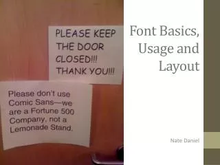
Font Basics, Usage and Layout Nate Daniel
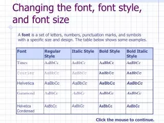
The Basics • Fonts (also called typefaces) are a complete set of letters, numbers, and symbols – each with a similar style. • Typography is the technique of creating fonts, as well as the study of their creation. • Creating fonts is a difficult process. All of a font’scharacters (all of its letters, numbers, and symbols) must conform to the font’s overall style. This is often a matter of intensive tweaking.
When the NMSU Brand Identity Program needed to choose a font to represent the university’s logo, slogans, and header texts, they did so based on five tonal criteria: authentic, personal, vibrant, first-rate, and global. They chose a semi-serif version of Rotis.
Okay, so… Why is it important to use a good font? Well, to be more precise… …it’s important NOT to use a BAD font. Because fonts communicate a lot more than just the words they form.
More Bad Fonts! (from Douglas Bonneville’s “23 Really Bad Fonts” [bonfx.com/23-really-bad-font-choices])
To put it one way… …fonts have “personalities”. They can convey different meanings to the exact same sentence. The left advertisement’s font definitely “fits” the advertisement better. But why?
The Intuition Problem • We know that some fonts are definitely better choices than others based on intuition. Sometimes, however, it’s not so clear-cut. • For example, here I’m going back to Times New Roman. Normally, this font is a “safe” choice for everyday documents, but its contrast to the above font (Calibri) makes for a surprisingly jarring transition. • Why exactly is that? Is it possible to determine the optimal font for something in a more quantifiable manner? Do good fonts have similar anatomical qualities?
The “Anatomy” of a Font Changing the style of small font elements can change the font dramatically. Mackiewicz’s study looks at the elements of fonts at this level to determine which typefaces work and which ones don’t,and also why.
The “Jagen” Test (or so I like to call it) • Mackiewiczchose five letters she believed could exemplify most of the unique elements of a font: the uppercase letter J, and the lowercase letters a, g, e, and n. We’ll call this the “Jagen Test”. • Using the Jagen test, participants were able to much more easily pick apart what they liked or disliked about a font. J a g e n
Mackiewicz’s Study • Mackiewicz surveyed 62 undergraduate students from four different writing classes (two freshman-level, two upper division). None of the students had any formal experience with typography. • The students were given 15 different font samples (shown below) and asked to evaluate them based on simple descriptive criteria.
Mackiewicz – Study Summary • In general, Mackiewicz found that the students’ evaluation of the fifteen typefaces matched their “role” (i.e., their typical usage by typographers and graphic designers). Additionally, she was able to find a connection between font roles and their basic anatomical elements. • “Professional” fonts tended to have serifs, and more angular and conservative anatomical elements. “Friendly” fonts tended to be sans-serif, and their anatomies were creative and varied. • Overall, she reinforced the belief that a good choice of font can come from an observable and qualitative analysis of a font, not just a typographer’s intuition. The study can also help typographers more easily design fonts that are suited to specific purposes.
Relevance toDin Magazine • The Din logo uses a good font to communicate its purpose. The letters are strong and bold; their radial motion blur, while not technically a part of the font, also help to convey the chaotic “din” feel that the magazine obviously wants to provide through its wide range (and often subject material) of its content.
Activity • Open Microsoft Word. • Write a sentence. Any sentence. It can be about anything in particular; just make sure it has an argument of some kind. • Copy and paste the sentence ten times on ten different lines. • Choose a different font for each sentence. Try to pick fonts that are different from each other. Pick fonts that work well. Pick fonts that really don’t work well. Pick some that might work well under the right circumstances. Experiment! • Save and upload your sentence(s) to the wiki on the page marked “font sentences”.

