Acknowledgments (Arial, 36 points, bold)
Title of Poster in Helvetica, 60-80 Points. Phrase Headline That Is Set in Initial Capital Letters. For posters that present one main result, a good design is to cast the title as a sentence that states the result. Phrase Headline That Is Set in Initial Capital Letters.

Acknowledgments (Arial, 36 points, bold)
E N D
Presentation Transcript
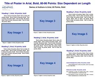
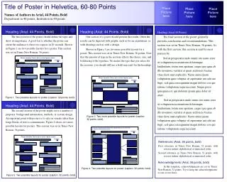
Title of Poster in Helvetica, 60-80 Points Phrase Headline That Is Set in Initial Capital Letters For posters that present one main result, a good design is to cast the title as a sentence that states the result Phrase Headline That Is Set in Initial Capital Letters Phrase Headline That Is Set in Initial Capital Letters Place Picture here Place Picture here Place Picture here Names of Authors in Arial, 44 Points, Bold Department in 40 points, Institution in 40 points ] ] ] Heading (Arial: 44 Points, Bold) The first section of the poster should define the topic and show its importance. A good test is whether the poster can orient the audience to these two aspects in 20 seconds. Shown in Figure 1 are two possible layouts for a poster. This section was set in Times New Roman, 36 points. Heading (Arial: 44 Points, Bold) One section of a poster should present the results. Often the results can be depicted with graphs, such as for an experiment, or with drawings such as with a design. Shown in Figure 3 are two more possible layouts for a poster. This section was set in Times New Roman, 36 points. Note that the amount of type in the sections affects the choice, size, and boldfacing of the typeface. No matter the type that you select for the sections, you should still use a bold sans serif for the headings. Heading (Arial 44 Points) The final section of the poster generally provides conclusions and recommendations. This section was set in Times New Roman, 36 points. As with the first section, this section is read by most passers-by. Sed ut perspiciatis unde omnis iste natus error sit voluptatem accusantium doloremque laudantium, totam rem aperiam, eaque ipsa quae ab illo inventore veritatis et quasi architecto beatae vitae dicta sunt explicabo. Nemo enim ipsam voluptatem quia voluptas sit aspernatur aut odit aut fugit, sed quia consequuntur magni dolores eos qui ratione voluptatem sequi nesciunt. Neque porro quisquam est, qui dolorem ipsum quia dolor sit amet. Sed ut perspiciatis unde omnis iste natus error sit voluptatem accusantium doloremque laudantium, totam rem aperiam, eaque ipsa quae ab illo inventore veritatis et quasi architecto beatae vitae dicta sunt explicabo. Nemo enim ipsam voluptatem quia voluptas sit aspernatur aut odit aut fugit, sed quia consequuntur magni dolores eos qui ratione voluptatem sequi nesciunt. Figure 1. Two possible layouts for poster (caption: 32 points, bold). ] Heading (Arial: 44 Points, Bold) The second section of the poster might serve a number of purposes: background information, methods, or system design. An important point with posters is to rely on visuals rather than longs blocks of text to communicate. Figure 2 shows two more possible layouts for posters. This section was set in Times New Roman, 36 points. Figure 3. Two more possible layouts for poster (caption: 32 points, bold). References (Arial, 36 points, bold) First reference in Times New Roman, 32 points, with reverse indent: alphabetical or numerical order. Second reference in Times New Roman, 32 points, with reverse indent: alphabetical or numerical order. Acknowledgments (Arial, 36 points, bold) In this template, acknowledgments are set in Times New Roman, 32 points. Try to keep the acknowledgments to one or two lines. Figure 4. Two possible layouts for poster (caption: 32 points, bold). Figure 2. Two possible layouts for poster (caption: 32 points, bold).