Enhancing Data Visualization: Classification and Symbolization Techniques
Discover effective techniques to classify and symbolize your geospatial datasets for better visualization. This guide covers qualitative and quantitative data classifications, including categorical and unique values, as well as numeric measures like counts and ratios. Learn about various classification methods such as Natural Breaks, Equal Intervals, and Quantiles to group your data effectively. Once classified, explore how to enhance your maps with color, symbols, and fill patterns. Ideal for anyone looking to improve their data display methods.

Enhancing Data Visualization: Classification and Symbolization Techniques
E N D
Presentation Transcript
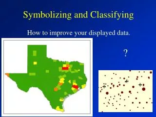
Symbolizing and Classifying ? How to improve your displayed data.
Your geodatasets can have numerous fields of information. For example, this dataset for the contiguous U.S. has 48 fields. The question is, how do you classify the data for display?
Qualitative Data • Categorical Data • Name e.g. Southwest, West • Type e.g. concrete, asphalt, gravel • Condition e.g. good, fair, poor • A numeric ID e.g. 3427, 3433, 2700 • Grouped measurements • e.g. 0-25, 26-50, 51-75 ……. • Unique Values • e.g. Texas, Oklahoma, California
Quantitative Data:How much of something is there?Working with numeric values. • Counts or amounts e.g. total sales • Ratios e.g. Population / area • Ranked or ordinal data e.g. 2nd, 3rd, 4th
Classification Methodsfor Quantitative Data:How do you group data? • Natural Breaks (Jenks – default) • Equal Interval • Quantile • Standard Deviation
Equal IntervalEqual range of values regardless of the number of features per class.
Equal Interval Notice that the values are grouped into equal ranges. There are not an equal Number of states per class.
QuantileAn equal number of features regardless of the range of values There are 5 states in each category – the top most populated, the next 5 most populated ….. The 5 least populated states.
Once you have classified the data, you can change the colors, symbols, and or the fill patterns as much as you please.Experiment with colors and patterns. We will discuss this in a future class.