Visualizing Data: Box-and-Whisker Plots and Other Graphical Representations
170 likes | 306 Vues
Explore the significance of various data display techniques, including box-and-whisker plots, bar graphs, histograms, and line graphs! Learn how to effectively choose and create these visualizations to represent data sets, compare categories, and show frequency distributions or changes over time. Whether illustrating the number of boys in various age ranges, the distribution of home runs by baseball players, or the median age of a community band, these tools enhance understanding and interpretation of data.

Visualizing Data: Box-and-Whisker Plots and Other Graphical Representations
E N D
Presentation Transcript
If you hear a voice within you say “you cannot paint,” then by all means paint and that voice will be silenced. –Vincent Van Gogh
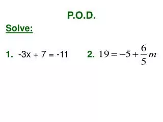
P.O.D. #6 basic advanced Use a box-and-whisker plot to represent the following set of data. (This is the same data as yesterday’s POD.) Use a box-and-whisker plot to represent the following set of data. (This is the same data as yesterday’s POD.) {3, 5, 1, 9, 2, 4, 3, 3, 6, 11, 12} {1, 2, 5, 9, 2, 4, 3, 3, 6, 11, 12, 8} 1, 2, 3, 3, 3, 4, 5, 6, 9, 11, 12 1, 2, 2, 3, 3, 4, 5, 6, 8, 9, 11, 12 Min = Q1 = Q2 = Q3 = Max = 1 3 4 9 12 Min = Q1 = Q2 = Q3 = Max = 1 2.5 4.5 8.5 12
Selecting an Appropriate Data Display
Bar Graph Show the number of items in specific categories • Categories on horizontal axis • Quantity on vertical axis • Space separating the bars
Box-and-Whisker Plot Show measures of variation for a set of data • Should be drawn above the number line • Used for numerical data
Circle Graph Compare parts of the data to the whole • Used for categorical data • Percentages must add up to 100%
Double Bar Graph Compare two sets of categorical data • Categories on horizontal axis • Quantity on vertical axis • Space separating pairs of bars
Histogram Show frequency of data divided into equal intervals • Intervals on horizontal axis • Quantity on vertical axis • No space between bars • Used for numerical data
Line Graph Show change over a period of time • Time on horizontal axis • Quantity on vertical axis • A line connects each data point to the next data point
Line Plot Show frequency of data with a number line • Draw a dot or “x” above the line for each piece of data. • Used for numerical data
Example: Select an appropriate display to show the number of boys of different age ranges that participate in athletics Intervals Quantity Histogram • x-axis = age ranges • y-axis = number of boys
Example: Select an appropriate display to show the percent of students in each grade at a middle school. Part of a whole Circle Graph • Each section is one of the grades at the middle school
Example: The number of home runs hit by each player on a high school baseball team is shown in the list below. Select an appropriate display to show the frequency of data. Number of Home Runs: 10, 15, 5, 10, 12, 5, 12, 12, 4, 5, 10, 7. Numerical Data Line Plot • Number line = home runs
Example: Select an appropriate display to show the median age of member in a community band. Measure of Variation Box-and-Whisker Plot • Number line = ages
Example: Select an appropriate display to show the number of people who have different kinds of pets. Quantity Categories Bar Graph • x-axis = categories • y-axis = number of people
2 sets of data Example: Select an appropriate display to compare the number of men versus women that chose specific careers. Quantity Categories Double Bar Graph • x-axis = career choices • y-axis = number of people
Example: Select an appropriate display to show the resale value of a person’s car over time. Change over time Line Graph • x-axis = time (years) • y-axis = value of car