Download
1 / 16
160 likes | 303 Vues
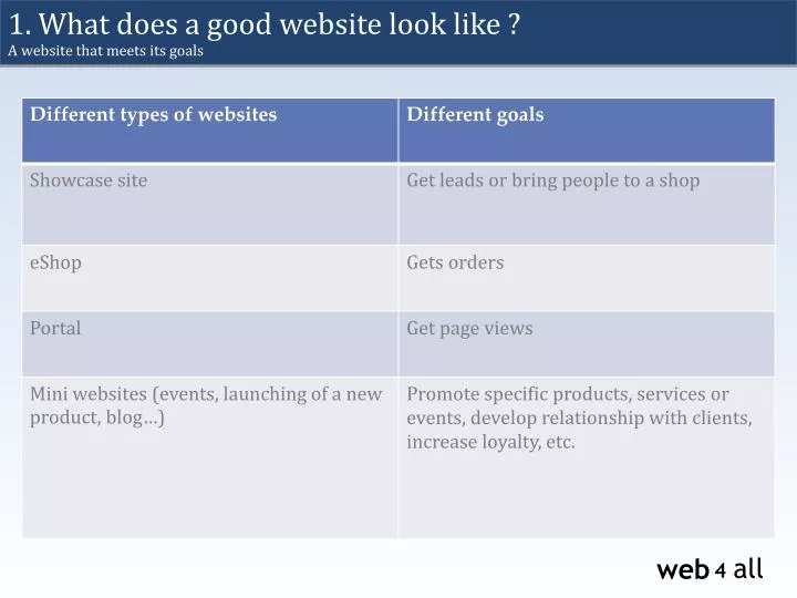
1. What does a good website look like ? A website that meets its goals. 1. What does a good website look like ? A website which makes your content efficient. Content comes first:

E N D
1. Whatdoes a good website look like ? A websitethatmeetsits goals
1. Whatdoes a good website look like ? A websitewhichmakesyour content efficient • Content comes first: Nobody will come to a website because the design is great, but will come because the content is interesting. • Design supports the content: The design is also an important point with its own empiric rules. • Years of AB testing have led to some convention of design
Essential content • Should be “huge” for search engines, but clear for visitors
2. Essential content For the homepage • The visitor must understand at first glace which is the business domain of your company • Make visible a short sentence of introduction • Tease with your services and products • Present arguments • What makes you different from your competitors • Make your happy customers visible => testimonials / references (better to let your clients speak about you than to display a big “About Us” block…) • Highlight the content that leads your visitors to your goals • Contact form • Telephone/address • Purchase button • Essential content should be essential for your visitors, not for you
2. Essential content Examples Quick presentation of the company Quick access to the services Testimonial
3. What you DO NOT want on your home page (biggest web mistakes) Avoiddiscriminatingelements • Introduction page • Music • Flash animation (except for advertising) • Aggressive design with blinking items • Too many colors and information • Request for registration • Intrusive pop-up • Terrible compatibility with different browsers • Huge size and heavy background image
3. What you DO NOT want on your home page (biggest web mistakes) Mistakes collection
3. What you DO NOT want on your home page (biggest web mistakes) Mistakes collection
3. What you DO NOT want on your home page (biggest web mistakes) Mistakes collection
4. Design & colors Trends for the last 10 years • years ago: • lots of content, use of large gradients and shadows, adapted to low resolution screens (800px width) 2013: light patterns and CSS3 effects with light shadows and round corners, average content, full size 5 years ago: the opposite: solid colors and very light design. Average resolution (1024px width)
4. Design & colors Basics Colours and design according to logo Conventional: will save your visitors cognitive efforts Few colours; one for clickable items (links, buttons, etc.) Usability: direct access to main information Use icons and images to make the understanding more intuitive Lightweight
4. Design & Colours Colours Red: passion, heat, power/violence Green: sharing, patience, ecology, rest Blue: serious, protection, wisdom Yellow: creativity, curiosity, wealth, heat, party Orange: communication, optimism, leisure, creativity, security Black: luxury, sobriety, mystery
5. How to avoid making your page too “busy” ? Structure Clear and easy structure with Titles and subtitles Short and efficient sentences Highlight keywords with bold Space, breath. Highlight only the main information
6. The right way to get information across ? Eyetracking • 1st horizontal line • 2nd horizontal line • Vertical line • Eyebehaviouris not linear • People go to the essential Heat-map: F Pattern
6. And what part of the page will naturally get noticed the most ? Call to action buttons: Encourage your visitors to act immediately Contrasted button Use of an icon increases the efficency of the button Warm colors catch the eye more easily
6. And what part of the page will naturally get noticed the most ? Importance of white (empty) spaces Elegant & clean look Highlight the content