Download
1 / 6
60 likes | 76 Vues
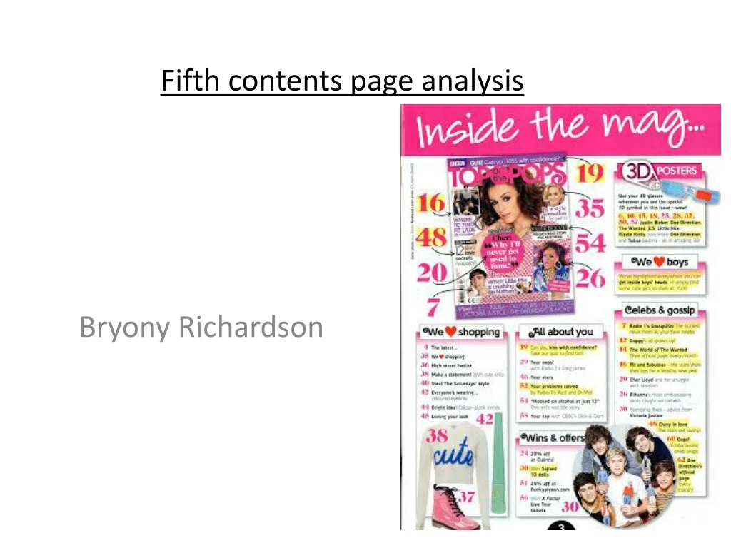
Top of the Pops Magazine presents a unique and captivating contents page designed to appeal to teenage readers. Through innovative design choices, subheadings, and highlighted articles, the magazine effectively engages its target audience. Featuring popular boy band One Direction, the contents page offers a preview of the magazine's articles and generates interest among readers. With its feminine color scheme and relatable content, Top of the Pops Magazine delivers an enjoyable reading experience.

E N D
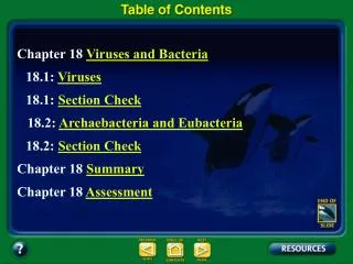
Fifth contents page analysis Bryony Richardson
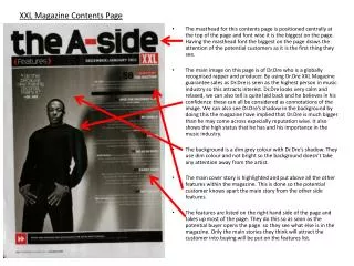
Masthead This contents page doesn’t refer to itself as a proper contents, instead it uses ‘Inside the mag..’. I believe Top of the Pops have done this because it links in with trying to relate to the demographic of teenagers and prevent the readers from becoming bored. For example the use of ‘Contents’ is used frequently in novels that teenagers may normally not even bother reading and actually skip and find the chapters for themselves. The reason why Top of the Pops have gone against the idea of writing ‘Contents’ across the page is because they wouldn’t want their readers to compare this magazine to a novel. By just having written ‘inside the mag’ like Top of the Pops have done, makes it more enjoyable for the readers and actually makes them want to read the contents page and find out what pages certain stories/articles are on.
Main image Top of the Pops have used a different idea and shows the front cover in a smaller version on the actual contents page. This reminds the readers what the main articles will be throughout the magazine and the page numbers they will be able to find them on. This makes Top of the Pops magazine different from others because it shows the article and then arrows indicating what page they can be found on. Making the contents page more interesting and enjoyable to look at because it goes against the idea of using simple chapters/articles in bullet points and the page number next to it. Finally, this makes it easier to refer to what articles the readers have seen on the actual front cover.
Use of subtitles As the house colours include various different shades of pink and yellow, we assume the demographic is very feminine. This is reinforced by the subtitles that show ‘We Love Shopping’ and ‘We Love Boys’, obviously the writers feel what would interest their readers. The writers have also changed the word love and replaced it with a symbol of a heart, representing how young teenagers may write. However by have the subheadings titled like this, it shows that the people who read this magazine must enjoy shopping and be heterosexual. This shows the ideal world of what most people would think teenagers live like. They have got examples of some of the fashion items that feature in the magazine along with the page numbers. This helps the audience to know what the page the articles are on if they are interested.
Use of subtitles The articles are split under subheadings to try and keep the contents page well structured and organised. Certain parts of the columns are highlighted, indicating which articles may be more interesting/significant than others. By having a few articles highlighted, it helps someone who may be interested in a particular subject for example celebs & gossip etc. This makes the contents page a lot easier to find articles rather than having to read the whole contents page.
Secondary image Top of the Pops have used an image of the popular boy band One Direction. This links in with the competition under the Wins and offers subheading. This is effective because as One Direction has an extremely wide fan base that are mostly teenage girls, more teenagers are likely to buy this magazine. Especially as One Direction are the biggest boy band in the world. As it features One Direction on the contents page it will attract people to that particular section, this will then lead to more people reading the whole contents page since the readers particular interest is already featured on the page. Lastly, I believe the editors at Top of the Pops have done this because it shows One Direction who are very relevant on the pop scene.