Download
1 / 5
50 likes | 268 Vues
Media Analysis for Front Cover ,Contents Page and Double Spread page . Music Magazine . By Tawanda Matongo . Front Cover Analysis.

E N D
Media Analysis forFront Cover ,Contents Page and Double Spread page Music Magazine By Tawanda Matongo
Front Cover Analysis On my front cover I focused mainly on the text and the colour of the font. I did this because the audience find the main image eye catching on the front of a magazine and then they read the text, the look I used is bold and different and makes the main image stand out more, as your eyes are immediately drawn to the pages. I spent time choosing and editing the best picture for my magazine. My Front Cover ‘CHAOTIC’ My media magazine uses conventions from existing magazines for example I thoroughly analysed ’KERRANG!’ magazine for my textual analysis. I believe what really makes ‘KERRANG!’ stand out, is its Logo/title, its logo really suggests that Kerrang! is different, hard, and perhaps loud and messy. The cracks in the letters shows danger and carelessness. This links to ‘Kerrang!’s music genre which is hard/heavy metal and punk music . And as you can tell I followed ‘KERRANG’s logo but I pushed the idea further by adding colour to it which connects and flows well with my magazine colour scheme. I felt that by having a similar logo to ‘KERRANG!’ It would give my magazine a real rocky and indie look which would appeal to my target audience. When producing my magazine I wanted to show my audience that my magazines style follows the same structure and three colour scheme of red, black white and yellow as ‘VIBE’ to make my own magazine look more professional and conventional. The black and white photo of T.I from ‘VIBE’magazine gives the magazine class and more of a high profile look. Putting the red against the running theme helps important elements stand out to the audience, making conventions such as the masthead and cover lines become more noticeable. So I did this in my own magazine intending to make the same effect as my model is also in black and white since it helps to show the seriousness of the magazine and image more clearer whilst also giving it class.
My Magazine Masthead & Logo Development The masthead/logo is very important to the magazine and it has to express a lot without being too hard to read. The title has to be memorable and show an original message . I like ‘KERRANG!’ because its different, hard, and perhaps loud and messy. The cracks in the letters shows danger and carelessness. This links to ‘KERRANG!'s music genre which is hard/heavy metal and punk music . I Also like NME as the colours are plain and simple, which I might use in my own magazine. Below are the title fonts which i got from Dafont.com I had to select the one which looks the most chaotic and would symbolise the genre of music that my magazine covered which is Indie/Rock. for this. I eventually chose number .3 "Broken 74" because it implies that CHAOTIC is different, tough, loud and messy. The cracks in the letters are actually barbed wire which again shows danger and carelessness. I also chose this font because I wanted my magazine title/logo to stand out but i didn't want it to become too unusual or messy that readers would be put off, i want it to capture the views eyes so that it would make them want to pick up my magazine and i this font is perfect for this.
Contents Page Analysis My Contents Page ‘CHAOTIC’ The convention that inspired me was the layout on the contents page of NME’s more modern magazine. I liked how simple they layed out the different parts to the magazine like the News, Radar, Reviews and icons section. On my contents page I did include an advertisement for my ‘CHAOTIC RADIO’ and ‘CHAOTIC T.V’ because I felt that my audience should be more involved in my magazine. My contents page is divided into four parts News, Radar, Reviews, Live and C! Icons. Page numbers are next to the articles as this helps the reader find what they are looking for. The features on the contents page would appeal to their target audience because they would be band they are familiar with and information they would be interested in. NME music magazines contents page, the main story for this contents page is about the band Kasabian, with a brief paragraph and picture . NME uses sub-headings so the reader can easily find the article they want to read. This is a convention most magazines use and is excatly what in going to do with mu own magazine.
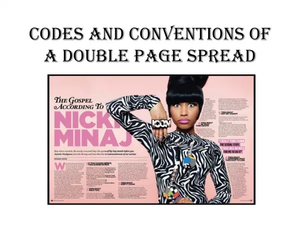
Double Page Spread Analysis Double Page ‘CHAOTIC’ Also like ‘KERRANG’ The main text on the is on one page. The text in ‘KERRANG’ is a good amount of text. But I wished I put more text in mine as I feel like its little for my target aunce who would want more information on their favourate artist. On the top left, the spread mentions ‘world exclusive’. Whicj is what I’ve also done in mine becuae it gives the impression that the spread is highly important and so it attractes the reader into wanting to read on. Just like ‘VIBE’ magazine the artist name is in a bright colour but in mine its in capital letters and the letters ‘C’ are in red which puts emphasis on the artist as well as telling the reader straight away that the article is going to be about RoCa Chick. I used black and white images at the top of the double page as it adds variety and shows a better representation of the artist. I’ve used the idea from VIBE by having lines through the page as it helps divide the page rather than having images and texts scattered on the pages.