Download
1 / 6
60 likes | 185 Vues
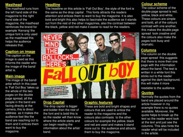
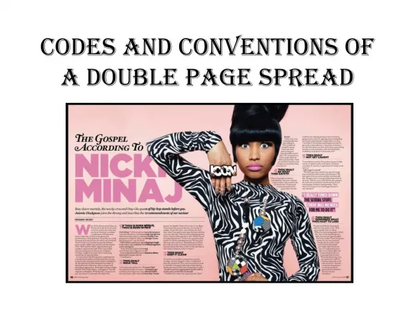
Construction of double page spread. Firstly, when making my double page spread, I added the main picture and decided where it should be put on the page. With the background of the image being cut out and deleted, leaving just the artist.

E N D
Firstly, when making my double page spread, I added the main picture and decided where it should be put on the page. With the background of the image being cut out and deleted, leaving just the artist.
I have next added a plan black background, and my text with the title, in a strong green colour. I used contrasting green and black as the text can easily be seen, and also it is a main dark black colour which adds the atmosphere of a gig or place that a concert would occur. Therefore adding a representation onto the page. I chose not to add the artists name onto the page because it adds more effect and drama, as to making it seem as if the reader should know the artist and he is too well known for an introduction. I made some of the main body of text in a bigger font, this makes parts stand out and seem more important that another, to therefore overall add effect and importance to the page.
I chose next to add a box in the bottom right of the page, telling readers where the can download the artists music from. I stayed with the same colour of the box and the font to keep with the theme of the page. However, I changed the website address to red to make it stand out more, as this is the magazines website, this will also be important in terms of the magazine for them to promote the magazine. I added an image of the artist overlapping the box and text going around the image, to add interest and make the page better flowing with all the different components added.
I have added white lights around the page, to brighten up the page making it look more interesting. Also adding the effect of a concert, because they look like camera flashes that would be seen in a audience. Therefore these adds a more interesting effect to the page. Being underneath the badge at the bottom right of the page, also makes this box stand out and look more interesting. And also as if parts of the page stick out to the reader more than others, adding attractiveness.
Finally I added another heading to the page, this adds attitude and sticks right out in the middle of the page. Adding interest and busyness to the double page spread. For the page, I adopted a traditional style, in which having a big main image on one side of the page and writing on the other. This is down very often in all music magazines in the industry.