Download
1 / 4
50 likes | 457 Vues
This is a presentation I created to show the process of creating my school magazines contents page for Media Studies.

E N D
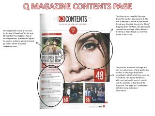
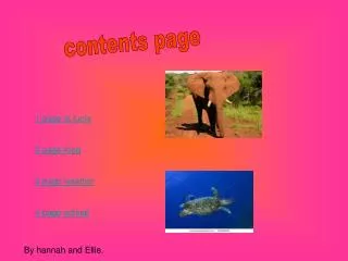
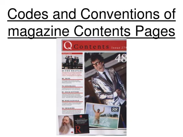
When creating this page, I had to put layout and organisation into place. I knew I had to make sure the page was nicely spaced out, clear to read and easy for the eyes to navigate around, ensuring an accurate reading process. I went round school and collected images of our school that I thought would be positive and ‘happy’ images to put on the page, because dull, depressing ones aren’t going to attract the attention of a teenager; they need encouragement and enthusiasm. The images to the right are the photo’s that have been taken and used in my final contents page, as images that represent the school and the magazines topics. I then began to look at the draft copy I had made and take inspiration and ideas from that, as it had a very clear layout and idea to it that would be a successful contents page for a magazine… Creating a Contents Page
These 3 images show the short process of creating the Contents Page. I first started by importing the photo’s I had taken into Photoshop, then adding layer effects and filers to one of them to make it blend with the background. I then started creating boxes and arranging the photo’s to look neat and organised so people could see them nicely. The then proceeded by adding more boxes ( for credits) and the actual writing for the page. I chose the same font as was on the front cover, as it still looked really nice and smart, proving to be an effective way of presenting the words.
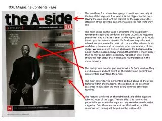
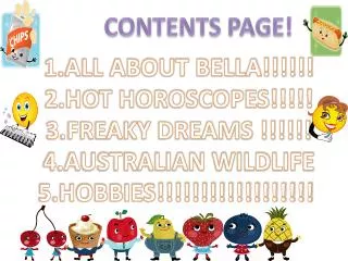
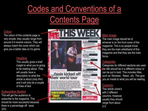
Final Contents Page This is the final version of the Contents page. Regardless to the short amount of time it took to create (around half an hour), it still looks really effective and professional/like effort has been put into it. It’s strong structure and colour scheme are confident and make the magazine seem interesting and worth reading. I’m really glad about how this turned out; it looks very smart and interesting. It’s easy on the eyes and I instantly draw my attention to the important parts such as the writing and photo’s. I think it is a successful piece. The final contents page can also be viewed below, at a bigger size.